Drawn In by Julia Rothman

julia rothman

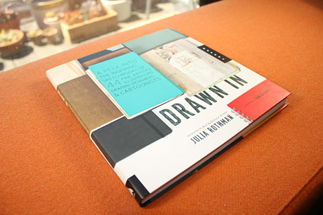
In our current day and age we have a plethora of opportunities to view designers’ sparkling clean, polished work. It’s not as often that we get to view the process or beginnings of this work. Julia Rothman‘s new book, Drawn In takes us into the pages of sketchbooks from 44 artists, designers and cartoonists.

(more…)

Book Gems from the South of France

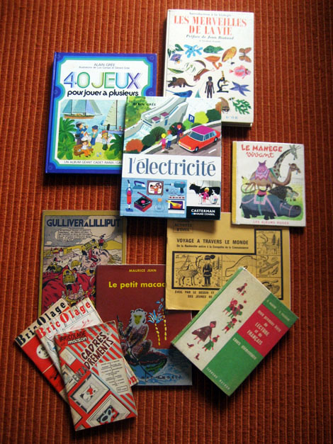
On a recent and most adventurous trip to the South of France, I had the pleasure of visiting the small village of Montolieu. Known as the “Village of Books,” Montolieu has a grand array of artisans that specialize in book binding and printing as well as antiquarian bookstores specializing in everything from vintage periodicals and antiquities to comics, art and kids books.

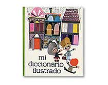
Today’s post will unearth some of my favorite finds from my trip, including books illustrated by J.P. Miller, Charley Harper, and Alain Gree.

(more…)

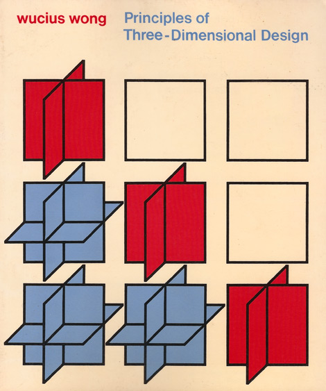
Principles of Three-Dimensional Design

Wucius Wong

Wucius Wong’s 1976 release, Principles of Three-Dimensional Design, is an educational book aimed at helping designers and artists wrap their heads around the physical space of objects. Concentrating on the use of simple planes and lines in geometric constructions combined with a thorough breakdown of our understanding of three-dimensional objects, Wong demonstrates how seemingly complex configurations can be easy to plan and construct. What I really want to share with you, however, are the tremendous images of models and diagrams created for the pages of this publication. (more…)

Keating & Keating

keating & keating

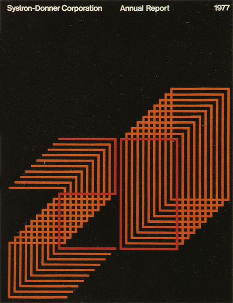
Taking another look back into San Francisco design studios as they stood in the late ’70s, I bring you the second in a series of posts from the book Graphic Design San Francisco. Today, we’ll take a look at Keating & Keating, who in present day is known as Kate Keating Associates, Inc., a heavy hitting SF corporate design firm.

“Keating & Keating have an attitude toward their work that can be stated in a definition of graphic design as ‘the architecture of visual communication.’ They believe that a project should entail not just applied cosmetics, but rather must be approached from a thorough problem-solving process in order to be successful.” (more…)

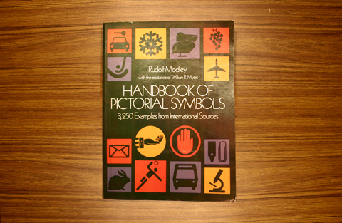
Handbook of Pictorial Symbols

Handbook of Pictorial Symbols

With a collection of 3,250 glorious icons, Handbook of Pictorial Symbols is great inspiration for any designer. Gathered from sources from around the world, these elegant yet minimal icons are a reminder that simplicity is truly key. Below is a small selection of my favorites from the book.

(more…)

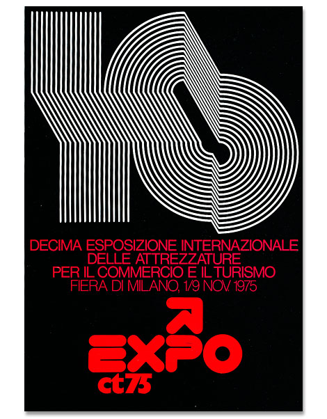
Mimmo Castellano: Posters and Packaging

Mimmo Castellano

Mimmo Castellano is an award-winning graphic designer and photographer who got his start in the port city of Bari located in the South-East corner of Italy. It was here that he landed a position with Laterza, a prominent publishing house, where he designed many of the book covers. This collaboration would last for over twenty years. In the late 60s he moved to Milan to further his career as a designer and taught at the European Institute of Design. In more recent years he has been researching digital imaging connected with photography and photomechanics.

(more…)

Harry Murphy + Friends


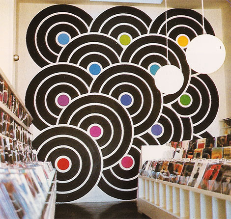
“The Gap Records and Tapes, San Francisco.”

Graphic Design San Francisco is a book that was published in the late ’70s by the Institute for Graphic Design (which would later become AIGA SF) and Chronicle Books. For the first in a series of posts about the works of San Francisco Bay Area designers and firms, as their portfolios stood on the brink of the ’80s, I present to you Harry Murphy + Friends.

“The Philosophy of Harry Murphy + Friends is to maintain design work of consistently high quality, while producing a large volume of projects involving an exceptionally wide range of related disciplines, frequently with rigorous deadlines.

Since locating in the San Francisco area in 1966, Harry Murphy + Friends has won over 700 national and international design awards for architectural graphics, space design, environmental art, corporate identity, print graphics, and packaging.”

(more…)

American Trademark Designs

American Trademark Designs

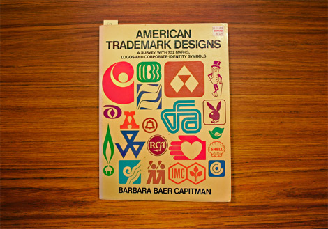
For my first post here at Grain Edit, I’m going to share one of my favorite design books from my bookshelf: American Trademark Designs. Published in 1976 by Dover Books and written and compiled by Barbara Baer Capitman, this book is chock full of 732 delicious black, bold, and inky vintage logos. My favorite aspect of this book is that it showcases extremely recognizable logos that have been stamped into the back of our eyelids (IBM, Mr. Peanut, Pepsi-Cola, Playboy) right alongside rarely seen identities created by tiny firms for tiny companies. Some marks are also showcased next to their former, replaced versions, displaying the brand’s evolution.

I’ve scanned some of my favorite graphics to share with you. A portion of this book is also available for view in Google Books, but it’s much more interesting on paper.

(more…)

Gottschalk + Ash

Fritz Gottschalk

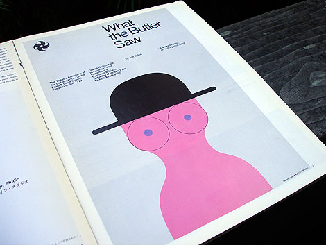
Poster for the Theatre Company at the St. Lawrence Centre

Gottschalk + Ash was founded in Montreal in 1966 by Swiss-born Fritz Gottschalk and Canadian native Stuart Ash. Independently and collaboratively, the two have racked up numerous design awards and honors over the last 40 years, with highlights that include identity work for Ciba and a re-design of the Swiss passport. Their work shown above is a great example of Swiss precision and a playful, more humanized take on design.

(more…)

Born Modern: The Life and Design of Alvin Lustig

alvin lustig born modern

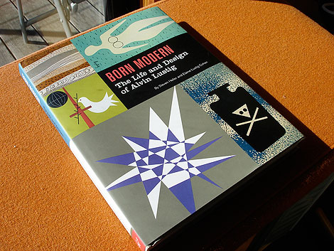
I’m so excited, I just got my hands on a copy of Born Modern: The Life and Design of Alvin Lustig. After several years in the making, the highly anticipated book by Steven Heller & Elaine Lustig Cohen (Alvin’s wife) was finally released by Chronicle books last week. This is the first monograph devoted to this master of modern design, whose brief but prolific career had a profound and lasting influence on a generation of designers to come.

(more…)