Jonathan Bennett : design and comics

jonathan Bennett art,illustration and comics

I love when people send me packages, especially when they contain cool design work. Comic artist and designer Jonathan Bennett recently sent me a fat package of goodies including not one, but TWO Gocco prints! In addition, he included several magazines that feature his cartoons. I enjoyed his work, I just wish he had a website so I could see more.

MOME Winter 2006 features one of Jon’s cartoons. You can pick up a copy at Fantagraphics Books.

Ladislav Sutnar : Sweets Catalog promo design

[pictobrowser 10159078@N03 72157603707692202]

What? Why? How? Essential Product Information – Sweet’s Catalogue Service
©1942 Design by Ladislav Sutnar

Sweet’s Catalog Service provided catalogs of building and plumbing supplies to architects and contractors. Ladislav along with Knud Lönberg-Holm were responsible for presenting the information within these catalogs in a clear, concise manner.

The promotional, folded sheet above explains the need for easily accessible product information especially during times of war (this was written in the midst of World War 2). As Sweets maintained, providing essential product information in an effecient way could eliminate waste and speed production:

The increasing need for speed in war production is reflected in increasing demand for product information.

In order to be useful such product information should be comprehensive, concise, coordinated

Prefiling of catalogs has been developed as a means for controlling the flow of essential product information

Beautiful layout, far ahead of its time.
For further reading, I suggest Steven Heller’s article Ladislav Sutnar and Knud Lönberg-Holm

Finnish graphic design : annual report

finnish graphic design corporate annual report

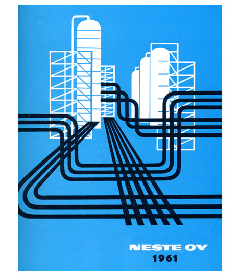
1961 Neste Oy Corporate annual report designed by Olli Stelander. Great use of limited color.  This was when drilling for oil was hip, the indie rock (Get your shale on!)  of the energy industries. This annual probably doubled as their tour poster.

For more design work from Finland check my post on Finnish book design.

Deberny & Peignot type specimens

[pictobrowser 10159078@N03 72157603653386438]

Deberny & Peignot – Types from Paris c1960s?

Deberny and Peignot Type specimen booklet imported and distrubuted by Amsterdam Continental.

Includes:
Peignot – created by A.M. Cassandre and Charles Peignot, issued in 1937 for the Paris International Exhibition.

Meridien – Introduced in Europe in 1958-1959, created by Swiss type designer Adrian Frutiger.

Cristal – Designed by Remy Peignot, issued in Europe in 1957.

Jacno – Issued in Europe in 1952, designed by Marcel Jacno.

Ondine – By Adrian Frutiger, issued in 1957.

Rudolf Schucht cover design for Hoechst

rudolf_schucht-design.jpg

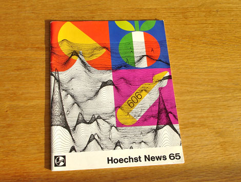
Cool cover by Rudolf Schucht for Hoechst News 65. I believe Hoechst News 65 was the in house magazine for the German life science company Hoechst AG (now Sanofi-Aventis). For the cover design Rudolf pulled elements from the articles contained within the magazine. The top two icons refer to Italian cuisine. The item below is an ampule of Salvarsan used in clinical testing against Syphilis. The background graph refers to work by Dr. Walter Seifried.

I couldn’t find much information on the graphic design work of Rudolf Schucht. If anyone knows anything about him, please send me an email or leave a comment.

Ringing in the new years with a hairy stamp

belgium stamp 1970s.jpg

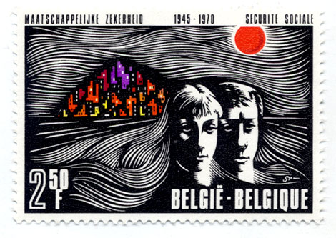
Belgium stamp – 1970s – Lots of hair!

Happy New Years!
I hope everyone had a good time last night. Unfortunately, it was a chill night at home for myself, since I picked up a cold over the weekend.

We have some exciting new interviews and features that we will be posting over the next few weeks and months. Stay Tuned!

Happy Holidays! we’ll be back tuesday

Happy Holidays!
Grain Edit will be back to the regular posting schedule on Tuesday Jan. 1st

Have a great New Years eve!

Israel : Electronic computer stamp 1964

israel first day cover stamp electronic computer.jpg

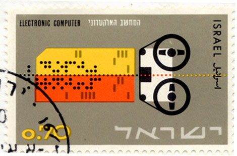
Israeli first day cover stamp from 1964. Reel to reel electronic computer and punch card. This looks like some weird instrument that only Simeon from the Silver apples would know how to play or maybe Zamfir the pan flute guy. I bet he could play anything.

Swiss Modern ski resort brochure

[pictobrowser 10159078@N03 72157603481288169]

Grisons is the largest canton (state) in Switzerland. It is home to some of the best ski resorts in the Swiss Alps. The promotional brochure seen above serves as a guide to the ski resorts in the area.

No date listed, but most likely from the early 1950s. Printed by Orell Fussli in Zurich. We posted a map of Zurich produced by Orell Fussli a month ago. If you haven’t seen it yet, it’s worth a look.

Bauer Alphabets : Fortuna Type Specimen

bauer fortuna-type-specimen-2.jpg
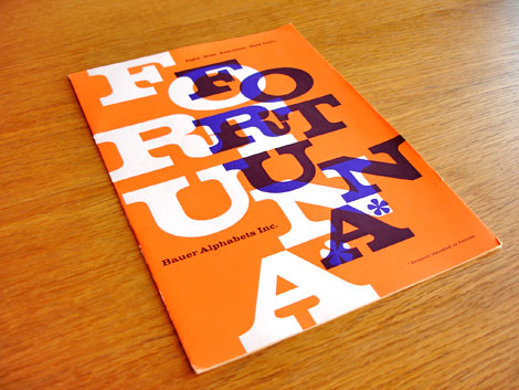
Fortuna or the typeface formerly known as Fortune also known as Volta first arrived on the scene in 1955. No wonder why the layout of the type specimen booklet seen above is yodeling with schizophrenia. This type face is having an identity crisis! Even if the name is confusing, the design is still beautiful.

(more…)