Deutsche Bundespost got five on it
Deutsche Bundespost Internationale Polizeiausstellung IPA 1956
Giving a big hi five to the world y’all.


Deutsche Bundespost Internationale Polizeiausstellung IPA 1956
Giving a big hi five to the world y’all.
Italia Modern Design – Published by PIE Books c2007
Japanese publisher PIE Books has put together some excellent design related books over the past couple years including Book Design of Graphic Designers in the World, Olle Eksell and Book Design of Graphic Designers in Japan. I picked up Italia Modern Design recently and it doesn’t disappoint. The book focuses on Italian graphic design from the 1950s-1970s and includes many of the heavyweights like Bruno Munari, Giovanni Pintori, Max Huber, Enzo Mari, Pino Tovaglia, Albe Steiner etc. It also includes a fair amount of work from Olivetti and Pirelli.
The people at PIE Books do a great job of sourcing and presenting the materials. They always dig up a few posters/books/magazines that I’ve never seen before. I just wish they would include an English translation (all the text is in Japanese) so, I can follow along with the notes.
Bag for Polish handicraft store Cepelia 1970s?
Breaking out that case of premium rooster loot. Found this a while back at the local dirt mall. The type is nice, but really its all about that rooster tail. Even the rooster can’t get his eyes off it. I’d be having a how ya doing all day too if I had a tail like that.
SAS Airlines dinner menu 1958
Dinner Menu celebrating the 1st Anniversary of the Scandinavian Airlines North Pole Route from Copenhagen to Tokyo.
Found this 1968 yearbook for Depauw University a month ago. I have no idea how the island looking thingys tie in with the school, but I’m really digging it. I think I’m going to chop the front cover off and frame it. Anyone else have any ideas? Maybe I could use the top to make a series of designer trap doors. Mirage might be a fitting title for that. Trap doors will be the hot thing in 2009, just wait and see. I’m also looking to heavily invest in secret underground passageways and fish sticks. If you have a cave and box of Gorton’s….let’s talk.
LAX map designed by Dotan & Associates in 1982
Just found this LAX map. The pictograms on the front are very similar to the identity work of Otl Aicher for the 1972 Munich Olympics.
Whats with the obnoxious use of question marks? That’s really ruining my mello.
This is every cat’s nightmare.
Very similar in style to this 70s Japanese poster. Has to be the same designer.
de openbare bibliotheek poster, amsterdam 1968
This is absolutely one of my favorite posters of all time. Design by Harry Sierman.
Harry studied at the Amsterdam Institute for Arts Education and later the Gerrit Rietveld Academy. After graduation he got a job with the Dutch publishing house: Querido He worked there for many years and became well known for his book design skills.
Back in January I had the chance to trade a few emails with Harry’s daughter in law. She was nice enough to send me a copy of a small book that focuses on Harry’s graphic design and typography work from the 1940s till 2003. I’ve attached a few scans from the book below.
Grady McFerrin moving announcement circa 2001
This one goes out to all the Grady Mcferrin fans up in this piece!
With the recent release of Grady’s line of products on Chronicle books, I dug up this golden corn from my nugget bank. This moving announcement dates back to 2001 and marks his transition to San Francisco (I think he lives in Brooklyn now). It’s hard to believe, but I found this at a yard sale a few years ago. I have no idea how many he printed, but my guess is that it’s pretty limited.
The announcement looks like it was silkscreened. The dimensions are 7.25″ x 5″. To the Gocco experts out there: are those dimensions achievable with the large Gocco model?
Holla if you love Grady, Holla if you love Gocco, Holla if just love hollaring!
**Note – I erased the address and phone number, so all you McFerrin stalkers couldn’t go to the SF address looking for his old clothes and used pencil shavings.

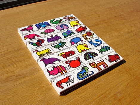
Fosforos Del Pirineo – Abcdario Animal (Animal Alphabet) Spain 1970s?
I found these recently. Super cool matchbox covers designed by Cruz Novillo + Olmos. The matchboxes feature an illustration of an animal for each letter of the alphabet. Hard to pick a favorite, but I think I have to go with the yellow oso (bear) loco. I think he cloned himself, because I notice I have two of the letter “O”.
Animal roll call. What’s your favorite matchbook cover from the set?