July 2011

You are currently browsing the monthly archive for July 2011.

Justin Gabbard

justin Gabbard

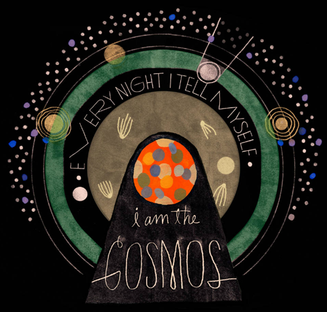
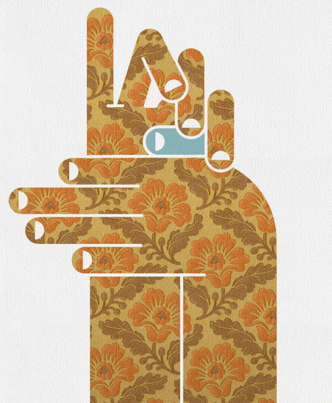
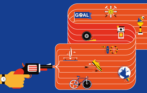
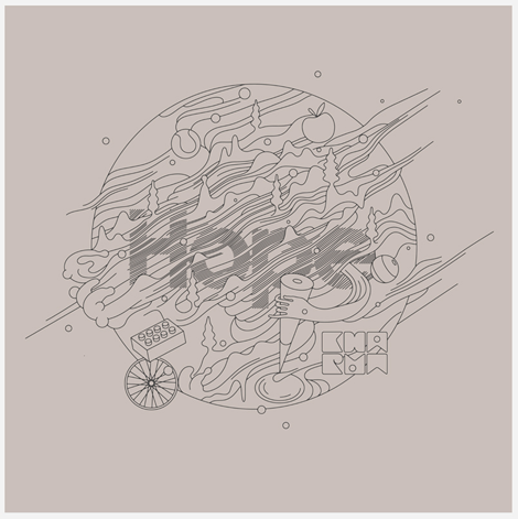
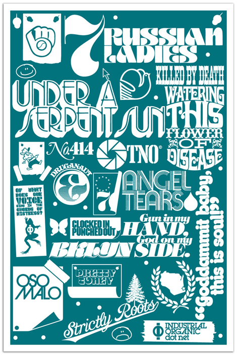
Justin Gabbard is an illustrator operating out of the East Village in NYC. He has a great sense of self in his work, and it seems that everything he does is entirely natural. Justin has been fortunate enough to work on major advertising campaigns (for companies like Kiehl’s & Microsoft) and is featured in some of the nations top magazines (such as Wired, The New Yorker & Businessweek). And while his lettering is impressive in itself, he also has an amazing illustration portfolio which compliments his personal style perfectly. Read the rest of this entry »

Recently Received

the modernist
The Modernist / Published by Gestalten

Looking for some new inspiration or something to add to your summer reading list? Here’s a few of the titles that we’ve received within the last month or so.

Read the rest of this entry »

Raise No Chicken

raise no chicken

Daddy worked hard and Mama didn’t raise no chicken.

Such is the quote that opens Kirk’s portfolio. Delightfully, following sections of the site contain equally awkward colloquial articulations.

Read the rest of this entry »

Studiofolk — Denis Carrier

Dennis Carrier

Denis Carrier, working under the moniker Studiofolk, is an Illustrator from France who makes images that are full of good feelings. His work is a great balance of both digital and analog approaches to illustration and exists 50/50 in vector and hand-drawn formats. Denis is also a co-founder of design studio PNTS.

Read the rest of this entry »

Ana Albero

ana albero

Ana Albero has an incredible illustration style that I can’t get enough of. Working primarily in graphite and colored pencil, Ana creates vibrant textured images of fine ladies and gents from a distantly familiar era often intermingling in an unknown time setting. This particular illustration for the German publication LE MONDE Diplomatique perfectly displays this style, with a dapper man stepping into an eerie office setting where women are steadfastly working with strange stamps. Ana carefully weaves many details in this piece, and successfully does so throughout her portfolio of work, creating memorable and often times humorous images.

Read the rest of this entry »

Mario Hugo

Mario Hugo

Each new piece that I see from Mario Hugo is better than his last. Perhaps it is his unique grasp of what makes a composition beautiful, or the way he uses his incredible drawing ability to render incredibly intricate works of art. Most artists stray from typography in a rebellion of (literally) spelling out their idea to the viewer, but I love how Mario has embraced type and made it a central focus in his work.

Read the rest of this entry »

Gavin Potenza — New Work!

Gavin Potenza

Great friend of Grain Edit and infinitely talented designer Gavin Potenza has just updated his online portfolio with a number of strong editorial pieces. You may know of Gavin’s grainy work through these solo projects, or as one half of creative duo Script & Seal with our very own Liz Meyer.

Read the rest of this entry »

Recently Added to the Grain Edit Job Board

graphic design jobs

Interactive Designer – ATTIK (San Francisco, CA)
Lead Web Designer – Everlane (San Francisco, CA)
Graphic Designer – fred flare (Brooklyn, NY)
Photo Internship – fred flare (Brooklyn, NY)

You can subscribe to our job listings via RSS, Email or follow at Twitter and Facebook.

Kevin Dart’s Looks that Kill

Looks that Kill is the latest installment in the Yuki 7 book series created by one of our contemporary illustration favorites, Kevin Dart. In this new adventure book written by story artist Elizabeth Ito, we get the opportunity to tag along with Yuki 7 and the Gadget Girls, her special task force of ladies, on one of their missions, immersing us in their thrilling world of seduction, espionage, and glamour. Accompanying the fantastic story are new and energetic illustrations by Kevin and 14 other talented artists, such as Meg Hunt and Matthew Lyons. This book is definitely one worth adding to your collection!

Read the rest of this entry »

Justin Thomas Kay

Justin Thomas Kay has been a staple in the elusive editorial side of the type world since graduating from Milwaukee Institute of Art & Design in 2004. With clear influences from 70’s display typography (à la Lubalin), J.T.K. really captures an era of typography that focused on the potential of using type as image. As a new venture, he recently opened the Version Type Foundry, and I’m excited to see where this new chapter takes him.

Read the rest of this entry »

Drawn In by Julia Rothman

julia rothman

In our current day and age we have a plethora of opportunities to view designers’ sparkling clean, polished work. It’s not as often that we get to view the process or beginnings of this work. Julia Rothman‘s new book, Drawn In takes us into the pages of sketchbooks from 44 artists, designers and cartoonists.

Read the rest of this entry »

Louis Swart — Dutch Packaging

Louis Swart

Louis Swart was a packaging Designer in the Netherlands in the 1960s and 70s. Working in the design industry between the young ages of 13 and 40, Swart greatly paved the way for the future of Dutch package design. You can read more about the life and work of Louis Swart as well as view more of his great work at the Graphic Design Museum Blog.

Read the rest of this entry »

Lufthansa + Graphic Design

Joplin posters

The beginning of the 1960s saw one of the most important steps in the development of corporate communication. Lufthansa employed the designer Otl Aicher and his Gruppe E5 student group to develop a visual identity for for the airline. It was substantially realized in 1963 and up until the present day counts as one of the most groundbreaking corporate design solutions of the 20th century. With a focus on the famous brand identity, the design and advertising history of Deutsche Lufthansa from the 1920s to today is comprehensively documented here for the first time. This volume contains numerous illustrations from the corporate archive and background articles and interviews.

Read the rest of this entry »

Book Gems from the South of France

On a recent and most adventurous trip to the South of France, I had the pleasure of visiting the small village of Montolieu. Known as the “Village of Books,” Montolieu has a grand array of artisans that specialize in book binding and printing as well as antiquarian bookstores specializing in everything from vintage periodicals and antiquities to comics, art and kids books.

Today’s post will unearth some of my favorite finds from my trip, including books illustrated by J.P. Miller, Charley Harper, and Alain Gree.

Read the rest of this entry »

Duane Dalton

duane dalton

Love the quality and breadth of work from Ireland-based designer, Duane Dalton. Mr. Dalton has a great minimal, restrained style which relies heavily on a strict adherence to the grid and the sparse use of color.

Read the rest of this entry »

Grady McFerrin

The name Grady McFerrin should be easily recognizable if you’re a reader of The New Yorker or New York Times, where his illustration work shows up frequently. But, what I like to (of course) focus on is his lovely lettering style. The thing that makes Grady’s work unique is the un-rendered, folk quality of his text; paired with his minimal color palette, he manages to create pieces that could have come straight out of early Americana. What Grady does is highlight the old and oft-forgotten, and sends the viewer a beautifully nostalgic feeling of the past.

Read the rest of this entry »

Page 1 of 198123...Last »