Sponsor // Wallpapered Maps

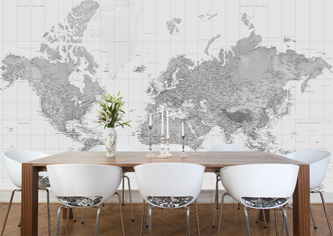
wallpaper maps via grainedit.com

Over the last couple of years we’ve seen an increased interest in cartography. More and more books are being produced on the subject and there has been a rise in the amount of designers and illustrators choosing to focus in this area of work.  London-based Wallpapered.com has captured some of this excitement around map related imagery in their latest round of product offerings. Recognizing that large scale map graphics lend itself well to the modern home/office aesthetic they have created a series of wallpapers that can be easily applied to any room.  There is a diverse collection to choose from, but of special iinterest is the black and white relief map and the full color world map. See the complete collection here.


Read the rest of this entry »

Exquisite Corpse

Exquisite Corpse via grainedit.com

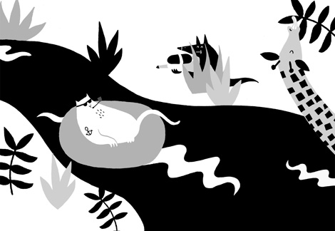
Remember playing the game Telephone as a child? The game that consisted of people passing around a phrase and then laughing at how the phrase gets distorted from one person to the other? Illustration project Exquisite Corpse is like the visual version of Telephone. The collaborative project invites illustrators to participate in a “never-ending” abstract illustration.  Each illustrator adds to the piece in sequence while only being allowed to see a small part of what the previous illustrator contributed.  The effect is a single, unifying illustration that seamlessly morphs into different ideas and interpretations.


Read the rest of this entry »

Brent Couchman Interview

Brent Couchman Interview #designinprocess

Born and bred in the Lone-Star state, Brent Couchman is a designer and illustrator that now calls San Francisco his home.  Noted for his generous use of color, he employs vibrant yet sophisticated palettes that elevate and accentuate the playfulness and meticulous nature of his work. He has received awards and accolades from distinguished publications including Graphis and Print and has established himself as an accomplished designer with a distinct visual voice. After stints at Fossil and Hatch Design he recently decided to venture out on his own with the launching of Moniker – a design and branding studio focused on timeless work and strong client relationships.  In our latest addition to the Design in Process series we chat with Brent on his creative process and the challenges of managing a studio.

Read the rest of this entry »

Kokoro & Moi

Kokoro & Moi via grainedit.com

Established in 2001, Kokoro & Moi is a multidisciplinary design studio with a focus on brand identity and interactive work. With a penchant for the curious and the extraordinary; they love asking questions, challenging accepted explanations and inferring possible new worlds.


Read the rest of this entry »

Sponsor // Bootstrap Responsive Templates

mighty deals responsive templates

Twitter Bootstrap framework is a popular choice these days due to its ease of use and quick, clean results.  With Starter KIT from Bootstraptor.com you’ll receive a robust collection of the 35+ useful Bootstrap templates to incorporate into your site! From landing pages to blog posts to scrollers, you’ll find everything that you need to finish your site design for only $9. See all the details here.


Read the rest of this entry »

Nada

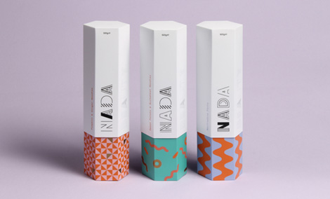
Nada packaging via grainedit.com


Leeds-based designers Eve Warren and Thomas Squire have teamed up for an exciting project for Nada. The colorful packaging consists of distinct patterns which have been developed to reflect both differing pasta forms and flavours within the Nada product range.


Read the rest of this entry »

Font Men


Font Men is a short film about the work of Jonathan Hoefler and Tobias Frere-Jones, who collectively ran the most successful and well respected type design studio in the world. Produced before their recent and very public split, the film provides a rare glimpse into the forces that brought them together and the successful empire they built together.

Read the rest of this entry »

Hong Kong’s neon signs

Neon Signs of Hong Kong via grainedit.com

Hong Kong’s visual culture museum M+ recently released a fascinating documentary on the local neon sign industry. The short film titled “the Making of Neon Signs” features candid interviews with the craftsmen of this now dying art. Accompanying the documentary is an online exhibition that includes historical photos, articles and an interactive map that allows the public to upload images of their favorite signs.

Read the rest of this entry »

Sponsor // Marigny Typeface

Marigny via grainedit.com
Type Supply is thrilled to introduce Marigny, a casual typeface drawn with serious typography in mind. The family combines the warmth of handwriting, the confidence of lettering and the functionality of typography into one package. It is distinctively legible at small sizes and lovingly distinctive at large sizes. Marigny is an excellent choice for any text that you want to feel warm, welcoming and alive.

Marigny has five weights, each with expressive italics, plus all styles have a variety of OpenType features that enable truly sophisticated typography. It looks as great on screen as it does in print. Want to see more? Head on over to typesupply.com.


Read the rest of this entry »

Inca Pan

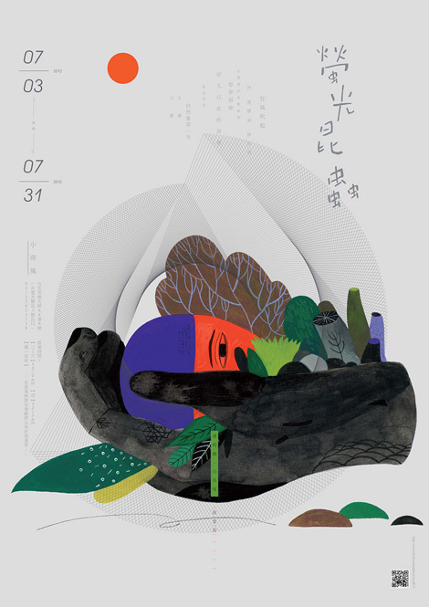
Inca Pan via grainedit.com

Inca Pan is a Taiwanese illustrator with a knack for creating powerful imagery. Working with gouache and ink he conjures fantastical landscapes filled with bold colors and lush vegetation.


Read the rest of this entry »