Maria Keil : Infante Santo mural

maria keil infante santo mural

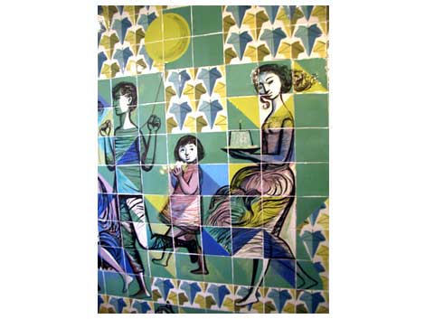
While I was researching information on the Hotel Infante Santo, I came across the mural seen above. It is entitled Paredao da Avenida Santo and was completed in 1958. It took artist Maria Keil two years to complete this piece and boy was it worth it. I’m not sure why, but the way she painted the main figure slightly reminds me of the work of Doze Green.

Read the rest of this entry »

Maria Keil : Please adopt me

maria keil mural Lisboa
Just found this mural. Sweet mother! This is good. I’m not sure if Maria Keil has grandchildren, but if not she can adopt me. She could teach me how to make murals and I could teach her how to throw sheep on Facebook.

(via amnesia)

Jim Brair – modern dutch poster

jim_brair_umbrella_poster.jpg

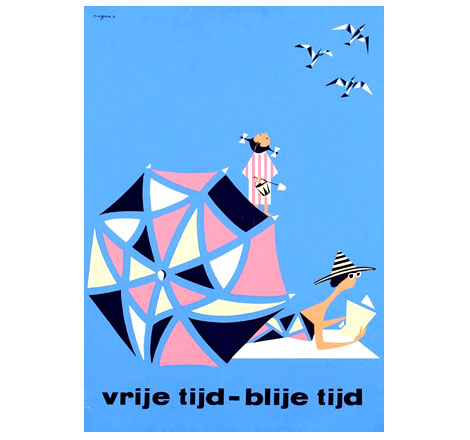
vrije tijd-blije tijd c1960

Modern dutch poster from graphic designer Jim Brair. Killer example of early sixties design. Wow, Thats all I can say.

(via VanSabben on ebay)

Hot girl with no nose poster

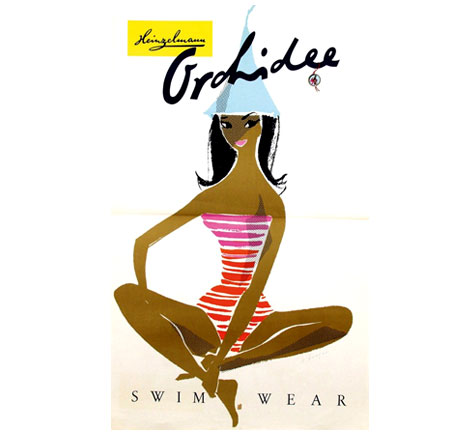
orchidee_swim_wear_poster.jpg

Beautiful Orchidee Swim Wear poster from 1960. This could be the hottest girl I’ve seen that doesn’t have a nose.

(via VanSabben on ebay)

Henri’s walk to Paris : Designed by Saul Bass

[pictobrowser 10159078@N03 72157600940947322]


* Update – The long-awaited reissue is now available. Pick up a copy at Amazon or your local book store.

As far as I know this is the only kids picture book illustrated by designer Saul Bass. Saul provides a 60s pop color backdrop for the text written by Leonore Klein. The book was published by Young Scott books in 1962.

Henri’s walk to Paris is the story of young boy who lives in Reboul, France that dreams of going to Paris. One day, after reading a book about Paris he decides to pack up a lunch and head for the city. Along the way he gets tired and falls asleep under a tree. This is when the story really gets good. I’m not sure if I should spoil the end for you, but lets just say it involves a pencil stealing bird with a band aid on its face.

Read the rest of this entry »

Alvin Lustig : Exposition brochure cover design

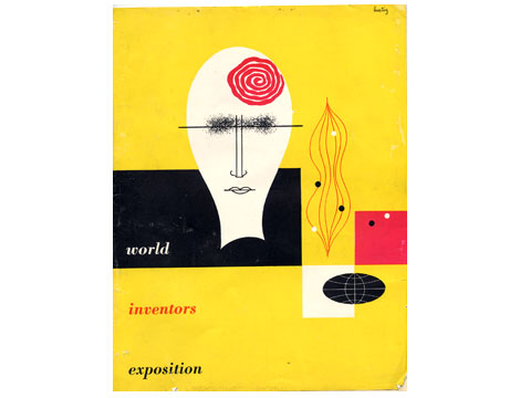
alvin lustig cover for world inventors exposition 1947
World inventors exposition 1947 : Cover design by Alvin Lustig

I found this brochure recently at a flea market near my house. I have never seen this Lustig design before. His use of simple organic shapes reminds me of the cover of Anatomy for interior designers ,which he created 2 years previous, as well as his work for the new classics series published by New Directions.

If you like the cover design above, I highly recommend you visit the official Alvin Lustig website.

Hotel Infante Santo : luggage label

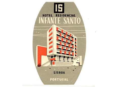
luggage_label_portugal-1.jpg
This is one of my favorite luggage labels out of portugal. Most likely from the late 1950s. I love the colors. Who wouldn’t want to stay in a hotel with bright orange panels as part of the facade? This hotel still exists and it really does have orange panels. At openline Portugal you can see a photo of the Hotel Infante Santo as it exists today (scroll halfway down the site).

Son of a gun its Peter Max !

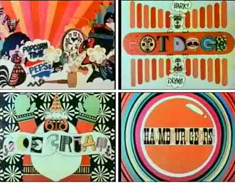
peter_max_psychedelic_animation_video.jpg
Flying hot dogs, Cows turning into hamburgers and a 2000 pound stick of butter turning into the most disgustingly awesome popcorn you’ve ever seen. You’ll get it all in this animated psychedelic Pepsi commercial from Peter Max.

(via Made in England)

Viva la Bruno Bozzetto!

bruno_bozzetto_book_illustration.gif
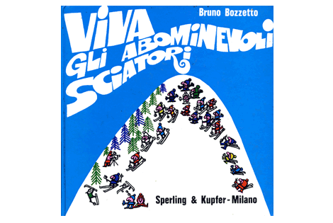
Bruno Bozzetto : Viva Gli Abominevoli Sciatori
Cool cover for this obscure kids book by Mr. Bozzetto from the 1970s. Bruno is mostly know for his contributions to animated film. He has created hundreds of animated shorts and was nominated for an oscar in 1991 for a film entitled “grasshoppers”. You can read his complete biography at the official Bruno Bozzetto website.

Holy hot dog water! label sickness

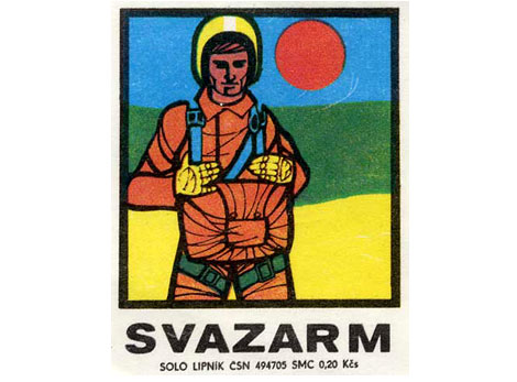
czech_matchbox_label-astronaut.jpg
I go bananas for these Eastern European matchbox labels. I bought a complete run from 1958-1978 about a year ago and I still can’t get over how sick these things are. Most of these labels are 2-3 tones and some are completely off register. They look like little silkscreen posters (Most of these labels are 1.5 inches wide by 1.75 inches tall) . These labels make perfect posters for your kid’s doll house or inspirational art for your hamster to look at as he is jogging in his exercise wheel.

Plenty more of these little guys coming!