Maxwell Loren Holyoke Hirsch

Loren Holyoke

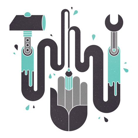
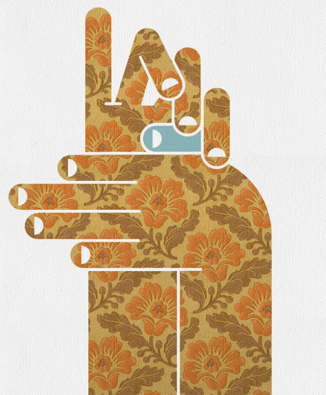
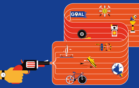
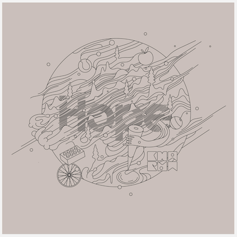
Maxwell Loren Holyoke Hirsch is an extremely hard working illustrator with a client list as almost long as his name. Maxwell moved East from West a little over a year ago and has not slowed his momentum one bit. With a style that is crunchy and organic while maintaining digital shine and freshness, he continues to regularly submit work to such editorial powers as The New York Times, Bloomberg, The New Yorker, and more and more and more.

(more…)

Josh Cochran

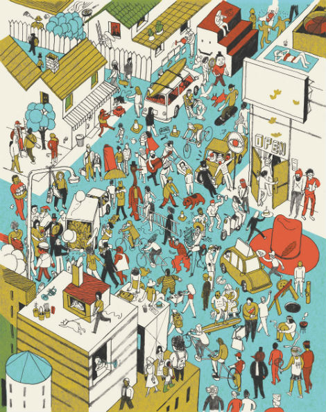
Josh Cochran’s work continually blows my mind. His concepts are thoughtfully executed, as he constructs images with filled with intricate details and pleasing color palettes. This particular piece, created with Cactus Communication for Charter Media, is filled to the brim with all sorts of characters. Some of my favorites include the cake head, dignified bird man, and the dude mowing the sidewalk. Can you spot them? It’s all the fun of “Where’s Waldo” without having to find Waldo.

(more…)

Tim Boelaars

Graphic Design’s hometown, the Netherlands, has no shortage of fantastic designers, illustrators, or artists. Tim Boelaars is one of the many standouts from that fine country.

(more…)

ReckerHouse

ReckerHouse

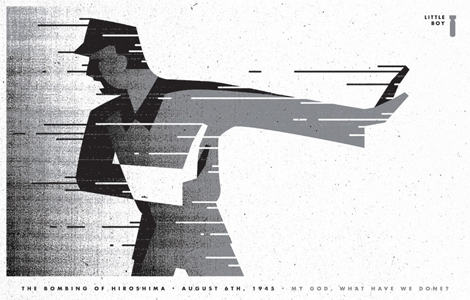
Hailing from Arizona, Chaz Russo, also known by his studio moniker ReckerHouse, creates some really nice visuals. The image above is an illustration depicting the bombing of Hiroshima for the wonderful Momentus Project. His works which showcase a use of faceted geometry combined with a muted and restrained palette are my favorites of his. Take some time today to check out more of Chaz’s imagery.

(more…)

Justin Gabbard

justin Gabbard

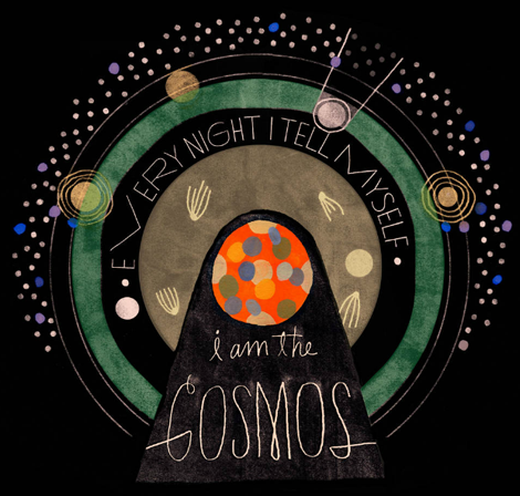
Justin Gabbard is an illustrator operating out of the East Village in NYC. He has a great sense of self in his work, and it seems that everything he does is entirely natural. Justin has been fortunate enough to work on major advertising campaigns (for companies like Kiehl’s & Microsoft) and is featured in some of the nations top magazines (such as Wired, The New Yorker & Businessweek). And while his lettering is impressive in itself, he also has an amazing illustration portfolio which compliments his personal style perfectly. (more…)

Raise No Chicken

raise no chicken

Daddy worked hard and Mama didn’t raise no chicken.

Such is the quote that opens Kirk’s portfolio. Delightfully, following sections of the site contain equally awkward colloquial articulations.

(more…)

Studiofolk — Denis Carrier

Dennis Carrier

Denis Carrier, working under the moniker Studiofolk, is an Illustrator from France who makes images that are full of good feelings. His work is a great balance of both digital and analog approaches to illustration and exists 50/50 in vector and hand-drawn formats. Denis is also a co-founder of design studio PNTS.

(more…)

Ana Albero

ana albero

Ana Albero has an incredible illustration style that I can’t get enough of. Working primarily in graphite and colored pencil, Ana creates vibrant textured images of fine ladies and gents from a distantly familiar era often intermingling in an unknown time setting. This particular illustration for the German publication LE MONDE Diplomatique perfectly displays this style, with a dapper man stepping into an eerie office setting where women are steadfastly working with strange stamps. Ana carefully weaves many details in this piece, and successfully does so throughout her portfolio of work, creating memorable and often times humorous images.

(more…)

Mario Hugo

Mario Hugo

Each new piece that I see from Mario Hugo is better than his last. Perhaps it is his unique grasp of what makes a composition beautiful, or the way he uses his incredible drawing ability to render incredibly intricate works of art. Most artists stray from typography in a rebellion of (literally) spelling out their idea to the viewer, but I love how Mario has embraced type and made it a central focus in his work.

(more…)

Justin Thomas Kay

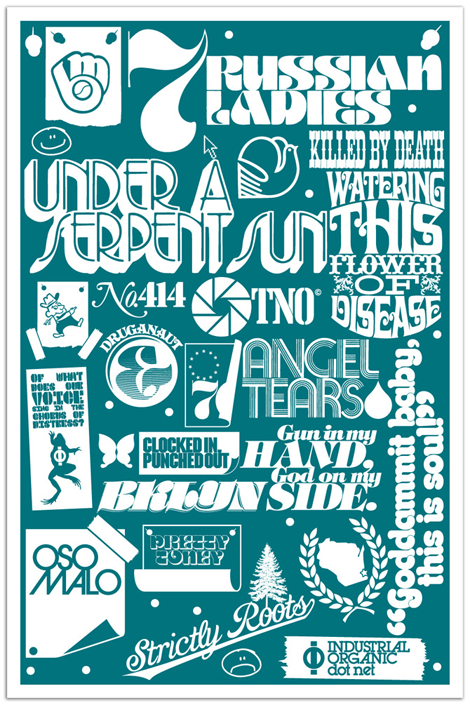
Justin Thomas Kay has been a staple in the elusive editorial side of the type world since graduating from Milwaukee Institute of Art & Design in 2004. With clear influences from 70’s display typography (à la Lubalin), J.T.K. really captures an era of typography that focused on the potential of using type as image. As a new venture, he recently opened the Version Type Foundry, and I’m excited to see where this new chapter takes him.

(more…)