Tony Dispigna

tony dispigna

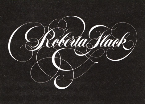
Tony Dispigna may be a very influential craftsman to today’s “throwback” design connoisseurs without many realizing. In 1969, shortly after graduating from Pratt, Tony joined forces at the legendary Lubalin Smith & Carnase. He has worked to produce notable classic typefaces like Lubalin Graph and Serif Gothic. Tony is currently a professor at Pratt and the New York Institute of Technology, and has also taught at SVA. Although much of Tony’s work is based on type, he also has a really good sense for creating wonderful logos, as you will see below.
(more…)

Jen Mussari

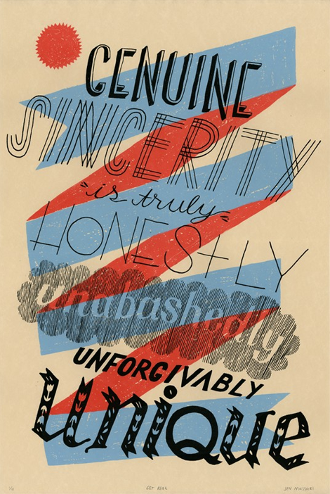
The portfolio of Jen Mussari is an refreshing mix of quirky handrawn lettering and illustration. What I really enjoy about her style is that it seems very personal and focuses on art-making rather than the production of a commercial product. Jen, with some of her friends, recently launched a really cool project, S Magazine, featuring a lovely cover illustration. (more…)

Foundry Collective

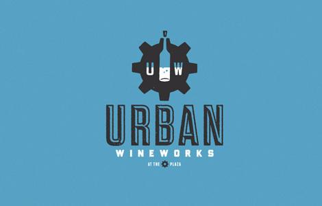
Fun work from the Denver/Dallas group Foundry Collective. These guys have a steady hand in Americana-vintage that translates really well to their identity, packaging and typography. I love their use of color, texture and illustration — their work has loads of personality.

(more…)

Raymond Lemstra

Raymond Lemstra

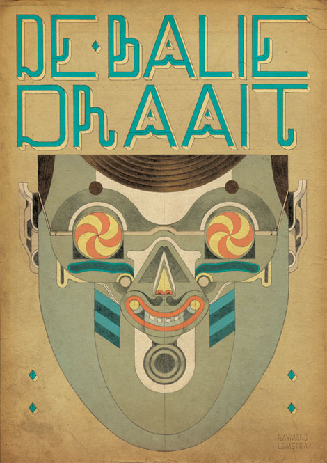
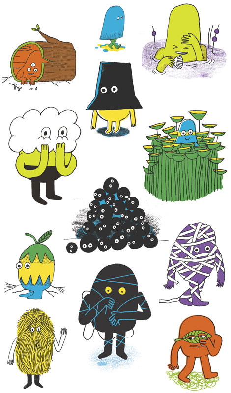
Raymond Lemstra is a Dutch illustrator based in Amsterdam with a unique and playful aesthetic that thematically explores primitivism through character design and masks. He takes great care in every illustration he creates, which is evident in the assiduous details of his line work and compositions. Raymond plays with soft colors, geometric figures, and crosshatching techniques to create strikingly peculiar images that I can’t get enough of.

(more…)

Château Vacant

Château Vacant

Château Vacant is Yannick Calvez, Lémuel Malicoutis and Baptiste Alchourroun, a group of French creatives who have hopped the Atlantic and set up their collective in Montréal, QC. As it states on their website, “We create images and videos thinking with objects and spaces.” Their work is eclectic, cutting edge, and slick, with media ranging from graphics and video to photography, illustration, and installation.

(more…)

Jesse Lefkowitz

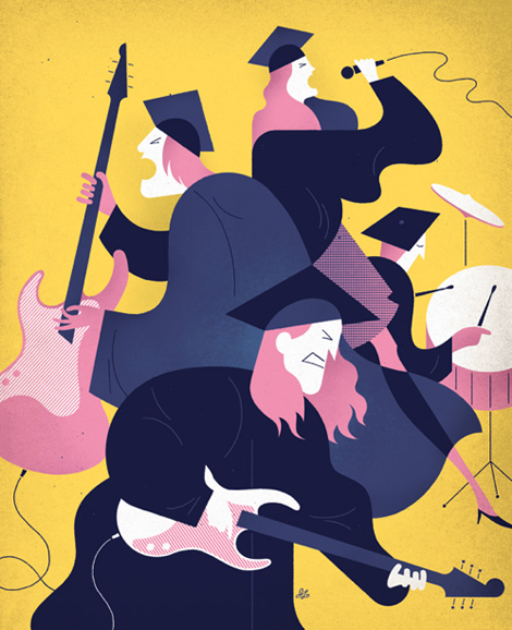
Though I’ve been a fan of Jesse Lefkowitz for some time now by sheer chance of spotting his editorial illustrations in publications like Money, Village Voice and Fortune, I’ve only recently discovered his portfolio. His full body of work has a seriously cohesive style that embraces both digital and traditional illustration, but has such a unique updated twist that allows it to fit beautifully as conceptual editorial work. For more of Jesse’s work visit his site & check out his shop to get a few pieces for your own!

(more…)

Day-After-Day in NOD by Andy J. Miller

Andy J. Miller, NOD

2011 has proven to be quite the busy year for our friend Andy J. Miller. This year, he’s taken on a new and exciting personal project with a simple premise: create a new character, every weekday, for one year. The resulting project is Day-After-Day in NOD. As of today, 104 different characters with a variety of emotions and personalities have been created, each one of them representing an aspect of human nature we can all relate to.

(more…)

Ross Gunter

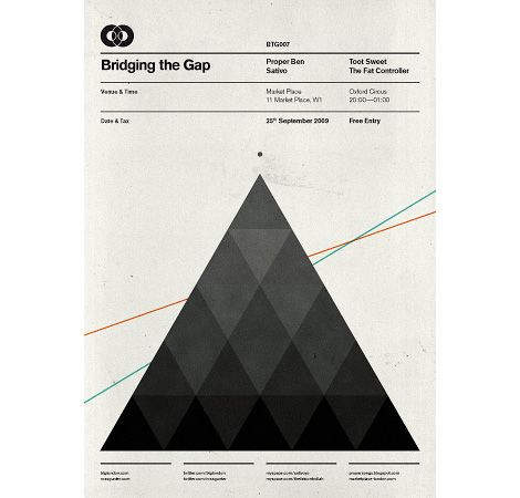
Holy gridness! Very slick work from Ross Gunter, a London-based designer and music lover. Ross is a co-founder of Bridging the Gap, the music and art collective for which this and the following posters were designed.

(more…)

Familytree Design

Familytree Design

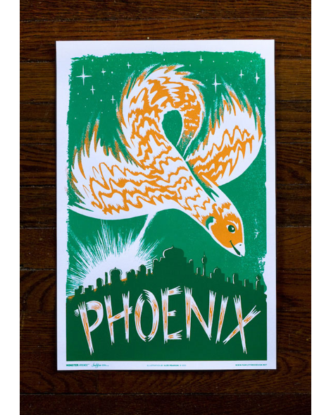
I recently stumbled upon a poster series by a group of four friends who run an illustration studio, Familytree Design. Besides these posters being extremely cute, I really like the way they use lettering as a story-telling device alternate to the actual illustrations. Each of the posters in the series are illustrated and lettered by a different studio mates, which makes for really great variations in style while maintaining the same color palette to keep the look consistent.

(more…)

DKNG Studios

DKNG

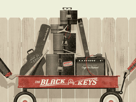
This Black Keys Radio Flyer inspired poster was made by DKNG, the LA-based design crew. They do great work, and are also (awesomely) the resident poster artists for the world famous Troubadour in Hollywood. What a great gig.

I love the concepts and especially the detail within their work. The posters tend to be bold and straightforward concept-wise, but they really pull everything together with fine-tuned details.

(more…)