Sébastien Plassard

Sebastien Plassard

Filled with muted colors and old-fashioned technology, Sébastien Plassard’s illustrations have a vintage flair. The nostalgic imagery often turns surreal and dreamlike as he depicts melting automobiles and horse-car-robot amalgamations. His alluring pieces have added a dash of whimsicality to popular publications such as The New York Times and Télérama.

(more…)

Studio Jimbo

Studio Jimbo

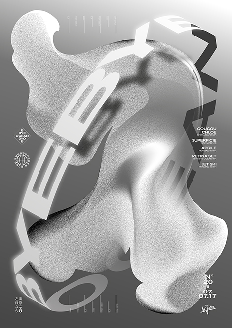
Studio Jimbo often lends its talents to the fashion and music industries. Its ongoing collaboration with the Parisian club night Bye Bye Ocean is exceptionally intriguing. Not afraid of exploration, the studio crafts promotional posters by layering bold letterforms over complex gradients and textures. The unique compositions are just as experimental and vibrant as the electronic music that is played at the event.

(more…)

Keith Negley

Keith Negley

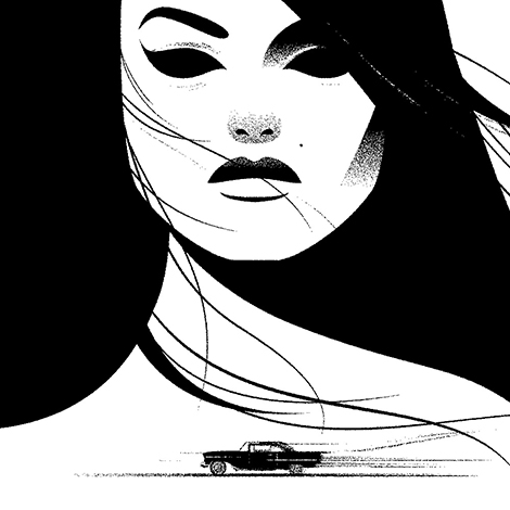
Keith Negley is an award-winning illustrator whose drawings easily transition between organic line work and rigid collaged compositions. His illustrations have appeared in national magazines, such as the New Yorker and Newsweek, where he’s covered subjects such as racial discrimination, medicine, and entertainment. In addition to his editorial work, he’s designed striking book covers and contributed to collaborative zines and gallery shows. He’s also published two books of his own titled My Dad Used to Be so Cool and Tough Guys (Have Feelings Too).

(more…)

Ricardo Gonzalez

Ricardo Gonzalez

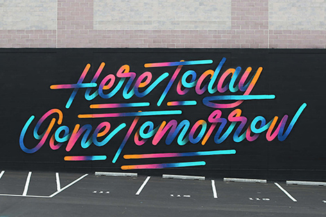
Feast your eyes on the work of Ricardo Gonzalez, a talented graphic designer and calligrapher. His passion for lettering was formed at a young age as he grew up admiring his grandfather’s Spencerian handwriting. Today, he creates gorgeous letterforms out of a variety of mediums ranging from spray paint to neon. His scripts have graced the pages of the Washington Post and Oprah Magazine, as well as campaigns for popular brands like Nike and Mercedes Benz. In addition to his commercial work, he crafts colorful murals around the world for festivals and art shows.

(more…)

ITAL/C

Italic Studio

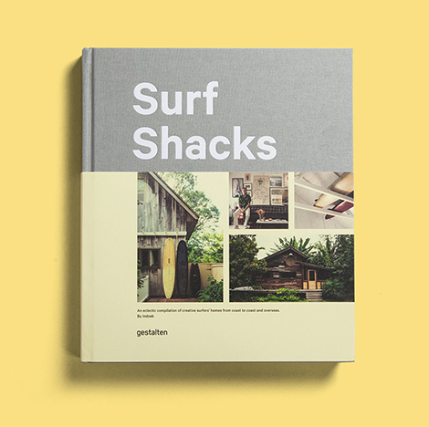
ITAL/C is a multidisciplinary studio that prides themselves on their diverse array of projects. From wine labels for small vineyards to global campaigns for large corporations, the studio has collaborated on ventures of all sizes. Adding to this varied collection is their assortment of side projects that express the shared interests of their designers. This work has taken on many forms including board games, animations, and silk screened notecards. Most impressive is Indoek, a surf-centric blog run by the studio’s founders. For the website, they’ve designed apparel, zines, surfboard wax packaging, and even curated a photography show. The blog’s most recent design endeavor is Surf Shacks, a book that documents the homes of surfers around the world and features ITAL/C’s original photography and illustrations.

(more…)

Simone Noronha

Simone Noronha

The speckled textures of Simone Noronha’s illustrations give her work the eccentricity of an airbrushed painting, yet the drama of a vintage grainy film. This aesthetic is perfect for clients, such as The New York Times and Vanity Fair, for whom she crafts illustrations for their inviting, yet serious articles. This visual style was also fitting for her submission for The 69 Project, an online group art show that celebrated music from 1969. While illustrating Led Zeppelin’s song, “Babe I’m Gonna Leave You”, she merged simple forms with intricate stippled shading. The combination of these elements capture the bittersweet lyrics and tone of the ballad.

(more…)

Icinori

Icinori

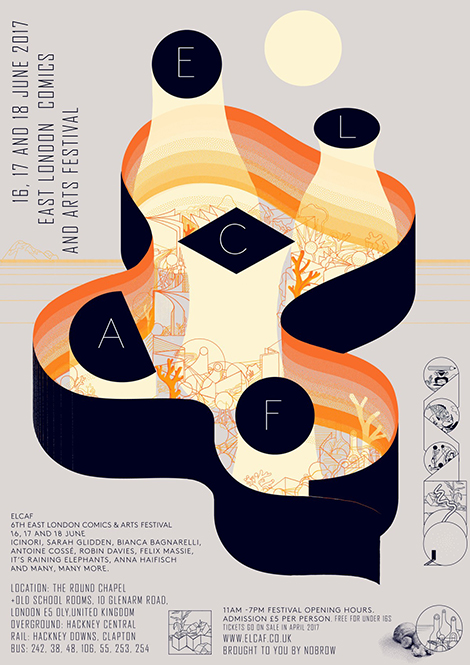
Icinori is the moniker of the design and illustration team Raphael Urwiller and Mayumi Otero. Since 2007, the duo has collaborated on drawings for advertisements and editorial pieces. In addition to their commercial work, they focus on Icinori Publishing, a non-profit that has produced over 30 books and a large collection of prints. Utilizing limited color palettes, speckled shading, and fluid line work, their books illustrate original stories and traditional folktales. To get your hands on their gorgeous products, make sure to check out their shop.

(more…)

Shrimp Chung

Shrimp Chung

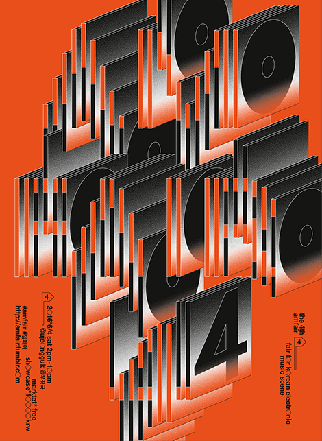
Shrimp Chung is a graphic designer by day and DJ by night. She combines her two passions by crafting promotional materials for Seoul’s vibrant music scene. I’m particularly fond of her work for the fourth annual AMFAIR Showcase, a celebration of Korean electronica. To advertise the event online, she created an animated poster that features unique letterforms made of record sleeves. The poster’s smaller text is also quite striking. She replaced the letter O with large circles that resemble the vinyl albums spun by DJs. To see the poster in action, along with her other animated designs, make sure to visit her site.

(more…)

Francesca Sanna

Francesca Sanna

Francesca Sanna is an illustrator and author who illuminates serious issues in a welcoming and endearing way. Through her book and side projects, she tackles subjects such as immigration, education, politics, and body image. Her drawings have a strong sense of narrative and feature lovable characters that confront their battles with strength and positivity. Her recent masterpiece is her book The Journey. With simple sentences and enthralling illustrations, she tells the story of a young family who flees their country to live in a safer area. The book’s fantastic imagery and clever use of color beautifully teaches children about the emotions and struggles that refugees often encounter.

(more…)

Fanette Mellier

Fenette Mellier

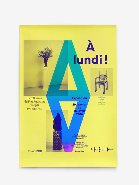
Brimming with bright hues and bold forms, the work of French designer, Fanette Mellier, is hard to ignore. I’m especially drawn to the identity system she crafted for Frac Aquitaine, an art museum in Bordeaux. At its center is a logo made from a reflected “A”. This emblem resembles the arrows of a compass and guides the viewer’s eye throughout the documents. It is also used to mark gutter folds in brochures, separate paragraphs, and is often superimposed over photos.

(more…)