British Railways Memorabilia

british railways memorabilia

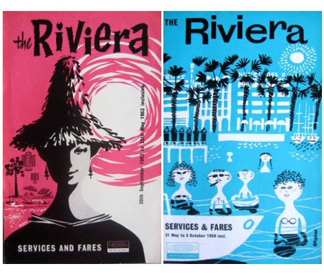
British Railways Services and Fares booklets for the Riviera (L) Sept 1962 (R) May 1959

Tony Hillman has put together an amazing collection of British Railways publicity material. His site features posters, menus, booklets, brochures, tickets, timetables and commercials. Put some time aside because there is plenty of good stuff too look at here.

(Huge round of thanks goes to Tika Viker-Bloss for sending this my way)

(more…)

Sandra Juto

Sandra Juto

Gothenburg, Sweden’s own Sandra Juto has a great collection of work up on her site. Her work is a mix of illustration, collage, crochet, and design. I love her illustration style; simplistic with nice details, and some cool type!

She also has a shop, a blog, and a flickr. Her “At home” flickr set it pretty fun.

1960s – 1980s Which? Magazine Covers

which-magazine-covers

Which? magazine offers reviews and advice for various products and services. It looks like it’s a British version of Consumer Reports magazine. In addition, to the cool cover each issue features interesting information graphics and illustrations. Some of the illustrations remind me of the work of Bill Sokol. Anyone know who the art director for the magazine was?

You can check out some of the issues over at the always yummy Delicious Industries.

Morten Iveland

Morten Iveland
I love this image of Morten Iveland’s new typeface, Bolda. Apparently it’s inspired by 1970’s tennis, dart, and ping-pong fashion — a grossly under-represented field of design, in my opinion. Morten lives in Oslo, Norway, where he is a designer at Apt. I was immediately drawn to the design of his site, and his mad photo skills.

Check out Bolda in action.

Sebastião Rodrigues: Graphic designer

sebastiao rodrigues book cover design

Beautiful work by Portuguese designer Sebastio Rodrigues (1929- 1997)

You can see a video of Sebastiao in action here.

(more…)

Stan Van Steendam

Stan Van Steendam

Stan Van Steendam is a pretty rad designer out of Belgium, with a pretty cool name. His style is hard to pin down exactly, but I would say it’s bright, vivid, colorful, playful, and compelling. His typography skills are great; you get a good feel for the amount of typographic experimentation going on over there.

Check out his design-your-own-font game, too.

Able Animal Posters

able caesar lion poster

Seen above: Caesar the Friendly Lion, Dimensions 12.5 x 9

Able a design and branding firm outside of Philadelphia just put together a great animal poster series. The lion poster has a retro feel to it and reminds me of some the children’s book illustrations seen in the late 1970s to early 1980s.

You can see/ purchase the entire series at Able’s Etsy shop.

Also worth checking:

Petit Collage Animal Alphabet Poster

ISO 50 Terabyte 3 Poster

terrabyte iso50 poster

I’m a big fan of Scott Hansen’s (AKA ISO50) work and this new poster is a knockout. Love his use of Hellenic Wide for the type. The poster is for an upcoming show at the Los Angeles Arboretum.

So Much Pileup

so much pileup mike davis blog

o-grito-logo

O Grito logo seen on Brazil’s TV Globo circa 1977/1978

Mike Davis over at Burlesque of North America just dropped a gem on me. He just announced the launching of his new blog So Much Pileup which will feature design artifacts and inspiration from the 1960s-1980s. As you can tell from what I post on grain edit, that I’m love with the design of that era, so I’m really excited to see what Mike will be posting.

Head over to So Much Pileup and check out his first post on the graphics of TV Globo.

Also, if you haven’t already, check out Mike’s exclusive dj mix for grain edit.

SLEEPY TIME! Do Not Disturb Hotel Door Hangers

do ot disturb hangers

Athens Hotel door hanger + El Al Airlines hanger for sleepy time

Woah, Michael Lebowitz just posted an awesome collection of hotel door hangers.

(more…)