


Hotel Filser, Oberstdorf, Germany

Rad luggage label for Hotel Filser which is located in Oberstdorf, Germany. The mountains in the back would be the Bavarian Alps. Anyone know what typeface “Filser” is set in? Is it Hand-drawn?


Rad luggage label for Hotel Filser which is located in Oberstdorf, Germany. The mountains in the back would be the Bavarian Alps. Anyone know what typeface “Filser” is set in? Is it Hand-drawn?

1979 Republica Argentina- de junio dia mundial del medio ambiente
Rad man tree stamp via David McFarline

Monaco 75 Grand Prix Auto Poster illustrated by Michael Turner
Little something for everyone here….racing stripes, slanted type and a big pink castle.
(via Posterclassics.com)
Wow. I’m really impressed with Scotty Reifsnyder‘s work. He has great variety and a nice range of projects up on his site. His use of type and texture is really effective — lots of little details to soak up. Scotty is a recent Tyler School of Art MFA graduate, and works at Headcase Design by day.

Sweet Mother! Six columns of grid goodness! Antonio from Aisle One just emailed me with his latest project The Grid System. The site features links to articles, tools, books as well as templates and other goodies. It’s basically an ever-growing resource site on the topic of grid systems and anything associated to it. Tap it and pass it!
(image via the grid loving Swiss Legacy)
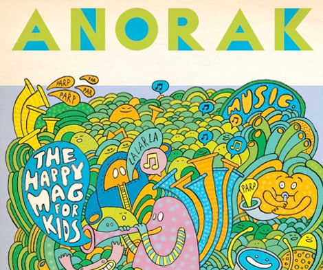
Fun! Prizes! Things! Anorak has to be one of the coolest kids magazines around. Aimed squarely at five to nine year-olds, Anorak is way more creative and engaging than the Highlights dentist fare I grew up with. In each issue they have original stories written and illustrated by contemporary authors, fashion and style for kids, and new children’s products. I’m definitely sold.
And some of the illustrators include Adrian Johnson, Steven Harrington, and Damien Correll among others.
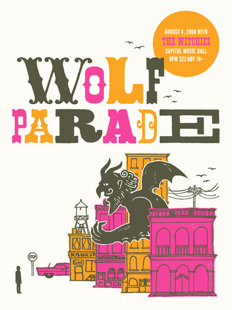
Toronto-based Doublenaut sent over some prints recently, including this Wolf Parade gem. I’m loving their type, texture, illustration, and color combinations. Bonus points for a great gargoyle as well!
Also, I believe that ‘R’ belongs in my personal collection.
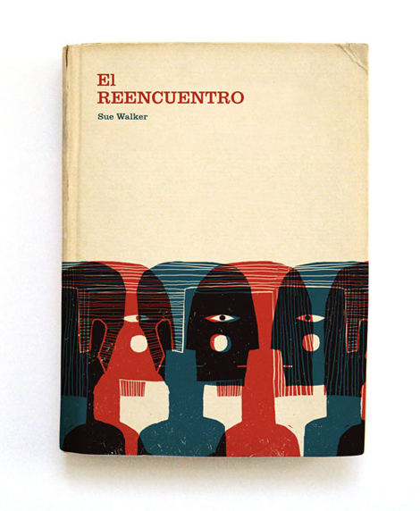
Love, love, love these cover illustrations by Cristóbal Schmal! So good. All of his work has this same great texture and quality to it. Makes me want to touch everything! His type is super snappy as well, and integrates nicely with the illustrations. Check his site out, he’s got lots interesting projects and experiments going on.
Via the never-let-you-down Ffffound.

Pretty, bummed, and sad? No way! San Francisco based designer and illustrator, Liam Devowski, is anything but that! His work is heavily influenced by bold ’70s type, and he successfully juxtaposes bright cheerful colors with lonesome emotional phrases. Liam also contributes to the pop art and design blog Viewers Like You, which features posts by Rad Mountain’s own Damien Correll.

