December 2017

You are currently browsing the monthly archive for December 2017.

Elda Broglio

Elda Broglio

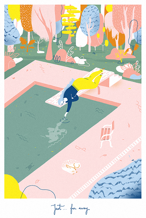
Elda Broglio is an illustrator and designer who focuses on motion graphics and editorial projects. She often employs fluid lines and playful patterns to craft lighthearted drawings that capture the comforts found in everyday actives. In her collection “The Rest”, she illuminates the quiet moments that occur between the chaos that comes with modern life. The pieces feature a tranquil cast of characters such as a commuter riding the train and a gardener enjoying the aromas of his plants.

Read the rest of this entry »

Run Studio Run

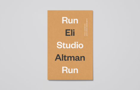
Run studio run book

Building and sustaining a design firm is a massive endeavor and until recently there has been a lack of material on the subject. In Run Studio Run, a new book published by Extracurricular Press, Eli Altman sheds light on the topic and shares valuable insights that help to shape his naming/branding agency A Hundred Monkeys. With stories and personal commentary, Eli digs into the nitty gritty of running a business and the challenges along the way. Joining him are a diverse cast of studio owners and freelancers including Aaron Draplin, Kate Bingaman-Burt and Brent Couchman that provide advice and tips throughout the book. Run Studio Run is still in fundraising mode, but should be released this coming Spring. To support production costs and secure a copy please visit the Kickstarter campaign. Prints, pins and notebooks designed by the team at Moniker are also available as special rewards for backers.


Read the rest of this entry »

Stéréo Buro

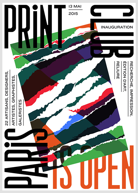
Stereo Buro

Stéréo Buro is a Parisian multidisciplinary studio founded by Diane Boivin, Christelle Ménage, and Silvia Dore. After working at prominent agencies throughout Europe, the trio joined forces to create a new studio and combine their unique and complementary skills. Today they craft compelling work for music festivals, workshops, and exhibitions throughout France. While designing promotional posters and brochures, they explore a wide variety of styles and often push the boundaries of unconventional type.

Read the rest of this entry »

Stefan Hürlemann

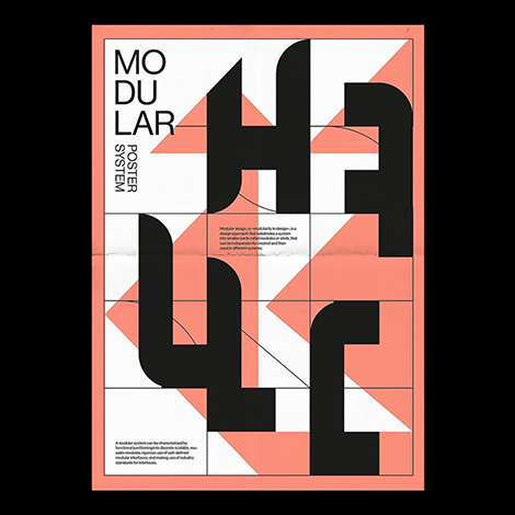
Stefan Hurlemann

Stefan Hürlemann uses personal side projects to help him pursue his love for type and experimentation. Since 2016, he has participated in the weekly challenge offered by blankposter.com, a site that encourages artists to design a poster based off of a randomly generated word. This exercise pushes him to use a variety of typefaces and explore different techniques and tools. These explorations have also inspired him to analyze unique themes and move his work in new directions.

Read the rest of this entry »

Studio Mut

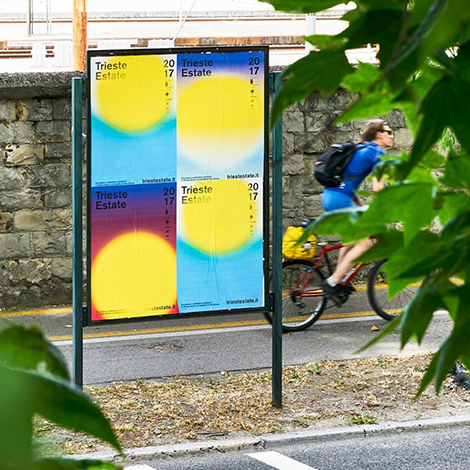
Studio Mut

Thomas Kronbichler and Martin Kerschbaumer are the creative minds behind Studio Mut. Working with clients in the art and culture industries, they craft vibrant posters for festivals and galleries. Employing simple forms and flawless type, they create great work that is bold and compelling.

Read the rest of this entry »

The Department

The Department

The Department is a San Francisco-based design studio with a focus on the restaurant and hospitality industries. I’m particularly fond of their work for Burma Superstar. The bistro’s branding features elegant pattern work and a variety of perfectly paired typefaces. Playing a starring role is the brand’s mascot, a Buddha that wears a warm and welcoming smile. Some of these elements are also present in the identity system of the restaurant’s sister location, a great brunch spot called B Star. Instead of the Buddha, the establishment’s logo is a bold blue “B” that harks back to the signage of 1950s American breakfast diners. The charming graphics have won the hearts of hungry San Franciscans and have helped the eateries stand out for over a decade.

Read the rest of this entry »

Aart-Jan Venema

Aart Jan Venema

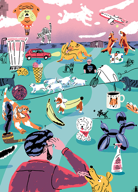
Aart-Jan Venema’s illustrations put a smile on my face. Brimming with loose brush strokes and bursting with color, his work is exuberant and refreshingly childlike. I’m especially fond of the piece above that he created for the Dutch Newspaper NRC. The drawing corresponds with an article that discusses captcha forms which are used to distinguish humans from bots. By creating a hilarious wonderland filled with dogs, ice cream cones, and bowling balls, he portrays the folly of picture captchas and how they can be difficult for users to complete.

Read the rest of this entry »

Page 1 of 198123...Last »