May 2017

You are currently browsing the monthly archive for May 2017.

Elliot Kruszynski

Elliot Kruszynski

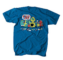
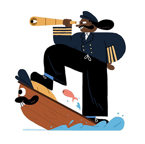
Elliot Kruszynski’s illustrations fill me with delight. Using simple shapes, he crafts lively scenes in which everyone, even inanimate objects, proudly sport large toothy grins and are consistently excited. Even when tough situations arise, his characters take them in stride and still find joy. This is often reflected in their amplified expressions that are hilariously relatable and almost emoji-like. Kruszynski’s skill for capturing life’s ups and downs has led to collaborations with a variety of clients including, Anorak Magazine, The Telegraph, and Vice.

Read the rest of this entry »

Opisso Studio

Opisso Studio

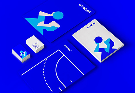
Opisso Studio crafts impressive identity and branding work for brands and institutions throughout Spain. Often using geometric forms and bright colors, they create memorable logos, custom typefaces, and striking illustrations. I especially love their logo for Asobal, a Spanish handball association. Using simple flat shapes, they crafted a charming handball player who looks focused and ready for battle.

In addition to their identity work, they often create graphics for some of Spain’s most respected museums. While working with The Centre de Cultura Contemporània de Barcelona, the studio employed a range of typographic styles to convey the spirit of each program. For the museum’s ongoing education series, which encourages experimentation and provides activities for families, Opisso created a robust typeface with playful sensibilities. The letterforms’ modularity expresses the program’s structured curriculum, while the striped patterns and neon colors portray its child-friendly components. In stark contrast, a more somber look was implemented for a retrospective focused on the concept of a “siege” by applying large domineering signage on red and black walls.

Read the rest of this entry »

From the Grain Edit Job Board

wrkshp job opening

UI/UX Designer at WRKSHP (Makers of the game Battle Camp and formerly known as PennyPop)

Are you a talented designer with a passion for entertainment and are looking for a way to break into the mobile games industry? We are currently seeking an UI/UX Designer to join our team of talented game professionals either remotely or in our Studio in San Francisco. This role will work closely with our designers and art directors on all of our game projects, including our hit game “Battle Camp”. Our ideal candidate will be extremely well versed with Illustrator, as that will be their primary (but not only) tool used on the job.

Apply for the UI/UX position Here.


See more job details after the jump

Read the rest of this entry »

Rico Greb

Rico Greb

Rico Greb is a German designer who often crafts album covers and posters for bands and music festivals. Employing flat shapes and inviting colors, he creates geometric illustrations filled with subtle nuances. A deep look into his compositions reveals minute details that expose hidden characters and telling symbolism. As faces, landscapes, and other images emerge, so does the full story of each piece. Greb’s affection for geometry can also be seen in his collage work, in which he uses mirroring techniques for a heightened effect. These dynamic arrangements are often vibrant and kaleidoscope-like.

Read the rest of this entry »

Savvy Studio

Savvy Studio

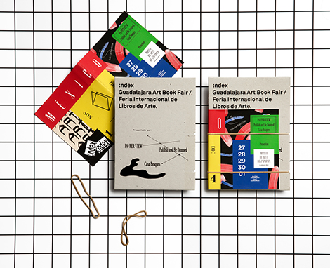
Savvy is a design, branding, and architectural studio based in New York and Mexico. While working with a global clientele, they craft sleek and timeless designs that highlight the unique characteristics of each product. This can easily be seen in their work for Index, an art book fair focused on independent publishers. For the event, Savvy crafted a brochure inspired by the range of styles and materials employed within contemporary publications. Featuring a variety of paper sizes and a vibrant flier, the piece encouraged curiosity and exploration. The finished pamphlet was an informative and striking piece of art.

Read the rest of this entry »

Pioneer Plaque Comes Back to Earth

Pioneer Plaque

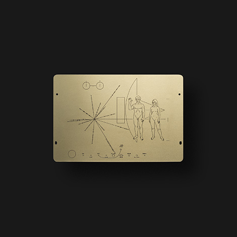
In 1972 and 1973, NASA’s Pioneer 10 and 11 probes were launched into space to explore the depths of the universe. Attached to their antenna supports is the Pioneer Plaque, a gold-anodized aluminum plate designed by Frank Drake, Carl Sagan, and Linda Salzman. The plate depicts mankind with the intent to explain who and where we are to any extraterrestrials that may find it.

Today, accomplished designer and space enthusiast, Duane King launched a Kickstarter campaign to issue exact replicas of the plaque. The reproductions will be made of the same material and hand-engraved by the original manufacturer. To reach a wider audience, laser-etched aluminum versions will also be available. As of now, only three plaques exist – two that are billions of kilometers away from Earth and one on display in the Smithsonian National Air and Space Museum. King wants his backers to experience the magical feeling of holding the unique emblem that may one day share our existence with other beings. To support his efforts, make sure to contribute to the campaign before it expires on June 16th.

Read the rest of this entry »

828

828

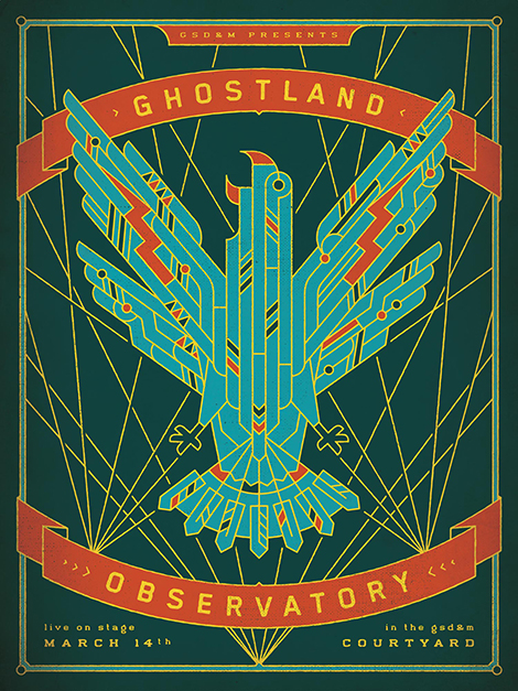
828 is a design collective that is proud to live and work in Austin. Collaborating with small businesses and large events like South by Southwest, the studio crafts exciting designs for institutions that make Austin a vibrant city. Inspired by the local culture, their illustrative work often features traditional southern imagery. This is evident in their poster for the Austin-based electro-rock band, Ghostland Observatory. As a valiant eagle rises towards a sky lit with laser beams, it flashes its colorful wings covered in Tex-Mex-inspired patterns. Cleverly representing the band’s Texan roots, funky music, and wild laser shows, the poster was awarded Gold in the 2016 Graphis Poster Annual.

Read the rest of this entry »

Jacob Escobedo

Jacob Escobedo

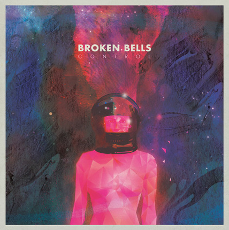
If you’ve recently walked into a record store or flipped through the TV channels, you’ve probably seen the art of Jacob Escobedo. In addition to being the VP of creative design at Cartoon Network and Adult Swim, he immerses himself in a number of side projects. He’s designed album covers for bands, such as The Shins and Broken Bells, and crafted editorial illustrations for The New Yorker, MIT Technology Review, and other prominent publications. Highly influenced by vintage sci-fi book covers and artists like David Pelham and Jean Giraud (AKA Mœbius), his work is filled with galactic scenery and otherworldly characters. These cosmic compositions radiate with pink, blue, and purple rays of light that beautifully glisten against the darkness of outer space. Similar colors are also present in his series of album covers for Adult Swim Singles, a collection of free songs by contemporary musicians. The artwork’s marbled and oozing colors look as though they are dripping before your eyes. This optical illusion is brought to life on the project’s website where the illustrations are transformed into interactive animations.

Read the rest of this entry »

Get 2 Months of Skillshare Premium for Free

Skillshare

Looking to expand your creative knowledge? Learn new techniques with Skillshare. The online community offers classes with top artists including prolific designer Paula Scher, logo legend Aaron Draplin, hand-letterer Jessica Hische, typography expert Ellen Lupton, illustrator and designer Jon Contino and more. Lessons cover a number of subjects including, branding, pattern making, and Photoshop fundamentals. In addition, courses are divided into short segments so you can learn at your own pace. For a limited time, Grain Edit readers can receive 2 months of Skillshare Premium for free. Don’t miss this opportunity to learn from some of the best in the industry.

Click here to receive 2 months of Skillshare Premium for free. 

Read the rest of this entry »

Raphael Schoen

Raphael Schoen

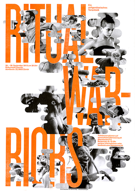
Raphael Schoen is a Swiss graphic designer and co-founder of Präsens Büro, a studio based in Lucerne. Often designing for creative events and organizations, he’s produced a wide collection of posters that employ abstract collages and bold typography. In his poster for the dance performance, Ritual Warriors, he created an intricate composition that injected warmth and energy into the otherwise black and white photography. The fluid shapes of the photos further enhance the performers’ movements and create the illusion that they are dancing around the type.

Read the rest of this entry »

Jee-ook Choi

Jee-ook Choi

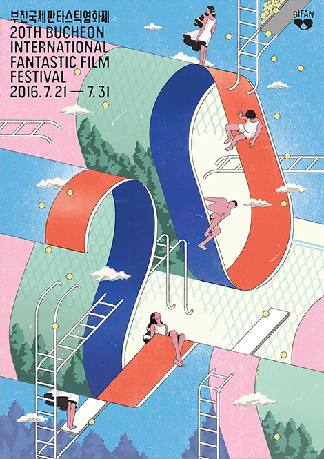
I can’t stop looking at Jee-ook Choi’s poster series for the 20th Bucheon International Fantastic Film Festival. With gravity-defying ladders and characters that sit and fall in multiple directions, the posters pay homage to MC Escher’s surreal and playful compositions. In addition to a vague sense of perspective, the series juxtaposes elements, such as day vs. night and water vs. land, to create an extra dose of mystery and intrigue.

Read the rest of this entry »

Squarespace Circle

Squarespace Circle

Introducing Circle — a community for creative professionals who build three or more websites on Squarespace. Currently free, members gain access to exclusive content, specialized customer care, advanced guides and product release notes. An open forum is also available to connect with others and gather valuable feedback. In addition, users receive six-month trial periods for new projects and 20% off the first year off a website or online store annual plan. Click here to learn more about the benefits of joining.

Squarespace logo

This post is brought to you by Squarespace – a website publishing platform that makes it easy to create beautiful websites, portfolios, blogs, and online stores without touching a line of code.

Interested in sponsoring Grain Edit? Visit our sponsorship page for more info.

Lucy Jones

Lucy Jones

Lucy Jones is an illustrator, designer, and printmaker based in the UK. She often designs posters for musicians and music festivals and takes on self-initiated projects such as designing book covers for stories in The New Yorker. Brimming with collaged photographs, loose brushstrokes, and handwritten scripts, her work is refreshingly uninhibited. By combining these elements with a small handful of colors and typefaces, Jones creates a signature style that is playful and unabashed.

Read the rest of this entry »

Nejc Prah

Nejc Prah

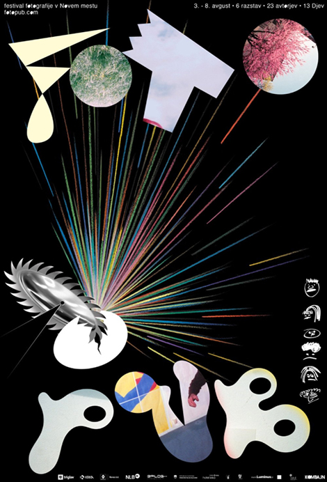
Nejc Prah is a Slovenian graphic designer based in New York City. An up-and-coming designer with an intriguing style, he’s earned accolades from the Type Directors Club and was named an ADC Young Gun for 2016. In addition to designing at Bloomberg Businessweek, Prah works on freelance projects and is a member of the artist collaborative, Ansambel.

I am especially drawn to his work for the Fotopub Photography Festival, an event in Novo Mesto, Slovenia that aims to educate, inspire, and connect photographers. For the festival’s identity system, Prah used a cracked egg to symbolize the birth of the new ideas and relationships that are formed at the event. This theme became a continuous thread throughout the festival’s promotional materials that illustrate the numerous ways an egg can be broken.

Read the rest of this entry »