Bluerock Design Co.
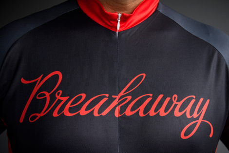
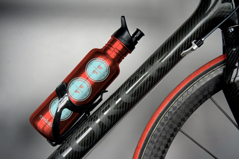
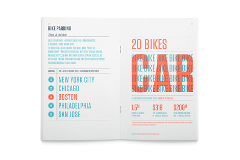
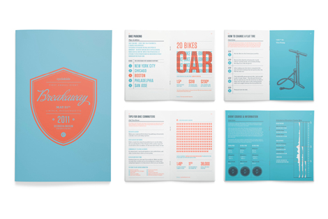
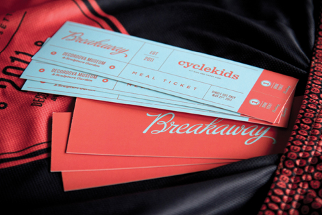
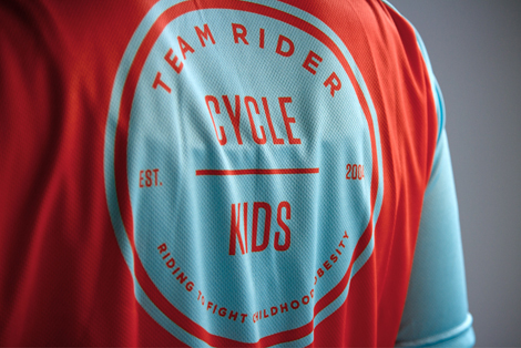
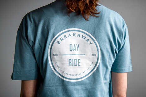
I like the scope and style of this branding project from Boston-based Bluerock Design Co. With the honorable aim of introducing kids to cycling and nutrition, the cleanliness, simplicity and boldness of this campaign are spot on. It feels like the overall aim of this project is inform and inspire, and the bright, crisp graphics really help in that cause. They’ve obviously had some fun in applying the concept to jerseys, bottles, shirts and tickets. A lot of times it feels like branding projects cover a familiar gamut of surfaces: letterheads, cards and websites. It’s nice to see this work on something a little more unique.
—–
Also worth viewing:
Herman Miller: Design For You
Matte Stephens Studio Visit
Marius Roosendaal
Not signed up for the Grain Edit RSS Feed yet? Give it a try. Its free and yummy.
Tagscontemporary, cycling, Design, Typography, USA
11.14.12 in Found design by Ethan
Share on Facebook


