Erik Marinovich
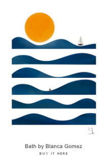
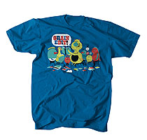
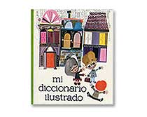
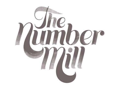
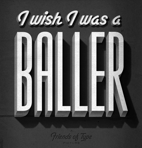
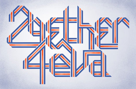
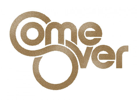
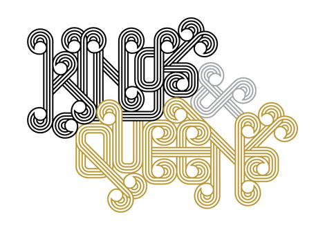
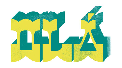
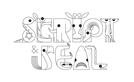
You need to take a gander at Erik Marinovich‘s work. It mirrors our current holiday climate quite well — bold and bright with a lot of busy hustle and bustle. Erik’s work defies any sort of specific style or set of rules (aside from the majority of it being typographic). The variety and amount of work contained within this portfolio is wonderful and exciting and void of plainness.
Much of the work shown below is showcased on Friends of Type, where Erik is a contributor.


Also worth viewing:
Herbert Kapitzki: Graphic Designer and Teacher
Typografische Monatsblätter
Vette Annonce type specimen sheet
Related Books:
In Alphabetical Order: Werkplaats Typografie
Not signed up for the Grain Edit RSS Feed yet? Give it a try. Its free and yummy.
Tagscontemporary, Typography, USA
12.22.10 in Found design, Typography by Ethan
Share on Facebook


