Invisible Creature interview
Invisible creature is the three-time Grammy-nominated Seattle based design duo of Don and Ryan Clark. Including their work while part of Asterik Studio and current work for Tooth & Nail Records, the two have created hundreds of CD packages and limited edition silk-screened posters. A small sample of their Client list includes: Foo Fighters, Chris Cornell, and Billboard magazine.
Their work is inspiring and fun to look at and they have no problem with experimentation. I’m amazed by their ability to consistently create quality work in a broad range of media.
In this interview, Don Clark shares with us some of the history of Invisible Creature and an exclusive look at the process behind “family portrait”, a piece in their recent gallery exhibition titled Haven.
Before we jump into the interview, I’ve put together a small sample of Invisible Creature’s design work over the past few years.
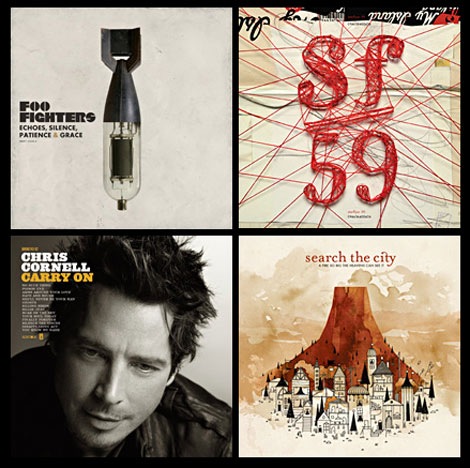
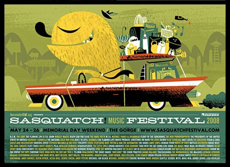
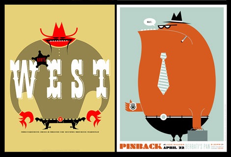
seen above:
Album covers for Foo Fighters, Starflyer 59, Chris Cornell and Search the City
Posters for Sasquatch Music Festival 2008, Kayne West and Pinback
——————————————————————–
Continuing with our designer interview series, grain edit is proud to present Don Clark.
Let’s start off with some background info on Invisible Creature.
How did you come up with the name “invisible creature†?
When we started the new firm in the summer of ’06, we really didn’t know what we were going to call the company. We started meeting at a local coffee shop in the mornings to go over all of the new company stuff, and obviously the name was a big priority. We ended up bringing a dictionary, thesaurus and a bible to the meetings – in hopes of finding words or phrases that connected with us. We had a long list of possibilities, but the one we liked the most was ‘Living Creature’. We decided that we didn’t really like the ‘Living’ part of it (for a few reasons) and opted for a new adjective: Invisible. The thought behind it was that we often feel like the ‘man behind the curtain’. For the most part, we are creating art for bands – giving a visual identity to THEIR art – and often times almost feeling like a 5th member. So, ‘Invisible Creature’ just stuck.
How did you first become interested in graphic design/illustration?
Good question. I actually can’t remember NOT wanting to be an artist. Growing up, my grandfather was an illustrator (he worked for NASA for many years) and he always had such a big impact on us (my brother and I). His illustrations had so much character, and seemed to reflect him and the era in which he lived. Because of him, “an artist” was always my response when asked the notorious question of “What do you want to be when you grow up?”. I don’t remember a time when I wasn’t drawing or designing in some way – or at least dreaming of it. My parents were also very gracious and supportive of our infatuation with art. We’ve been blessed to have made it our career.
What was your first design job?
Ha. I’m not sure if this counts, but my first actual ‘design’ job was for Old Republic Title in Sacramento (1993). In the morning, I would drive all around town and take photos of homes for sale. In the afternoon, I would place these photos in a default Quark X Press “For Sale” flyer template, change the bullet points and information, print up 50 copies on our laser printer, then drive back to each home and place the flyers at the real estate sign. It was amazingly creative. That lasted for about 6 months.
[pictobrowser 10159078@N03 72157605428337699]
photos of Invisible Creature’s studio
What’s a typical day like for you?
If it’s a day that I don’t need to be in the office extremely early, I like to wake up with my kids – maybe read my daughter a book or play Cars with my son. Then I grab coffee and a 10 minute breakfast/conversation with my beautiful wife – and head out the door. Once I get to the shop, I fire up the machine, put on some music (lately I can’t seem to stop listening to the new Portishead album – Third), quickly click through my favorite blogs, answer some email and get to work. The rest of the day involves juggling (too) many projects at once. Everything from traditional illustration to design to photo-illustration to branding. I’m constantly saying that I should just stick to one style or medium (and take on less work), but I honestly don’t think I’d be fulfilled doing anything different. It’s something that I constantly wrestle myself over and I don’t know if I’ll ever really figure out. At the end of what is usually a pretty busy day, I head home and enjoy my family. Typical days tend to be pretty great – for that I am thankful.
How do you and Ryan work together?
In addition to being my partner at IC, Ryan’s ‘day job’ is also as art director for Tooth & Nail Records. As work comes in through IC, I mainly tackle those projects. Ryan does most of the Tooth & Nail packages, and I would say that I work on 10-12 of those per year. However, we work together on everything. We sit 3 feet from each other and are constantly going over ideas for each project. How can this be better? What would you do differently? What do you think of these color choices? Does this just plain suck? And on and on. I feel like we are always pushing each other to create the best work we possibly can. We have a ton of fun here – it’s hard to call it a ‘job’ sometimes because it’s what we’ve dreamed of doing since we were kids.
Who/ what are some of your biggest influences?
It’s endless really. God, life, my family, my experiences, punk rock, film, modernism, old books, old furniture, old signs, estate sales, thrift stores, architecture, Seattle mornings, Sunday comics, Paul Rand, Peter Saville, Dirk Rudolph, Vaughan Oliver, Sagmeister, Storm Thorgerson, Jim Flora, Ward Kimball, Charley Harper, Chip Kidd, Alexander Girard, Alvin Lustig, Al Paulsen … I should stop.
What current designers do you admire?
I admire so many different artists. I think it’s really cool that the lines between styles and mediums are being blurred these days and we’re able to use the overarching term of ‘art’ that much more. Lou Romano, Amanda Visell, Tim Biskup, Craig McCracken, Jeff Kleinsmith, The Heads Of State, Jason Munn over at The Small Stakes, Aesthetic Apparatus, Nate Wragg, my brother (Ryan Clark), etc.- the list could go on and on.
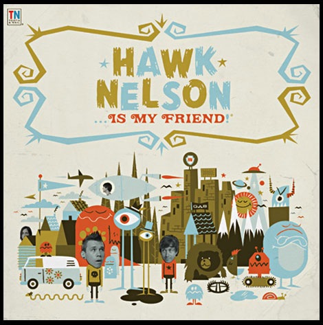
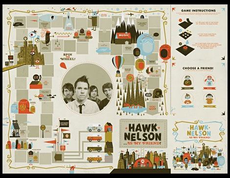
I really like the packaging/ design for the new Hawk Nelson Cd. What were some of the thoughts that fueled the direction of design for the album? What led to the creation of the board game?
The band came up with a really cool idea: they wanted the artwork to be an actual playable board game. They had sent some images of great vintage games, ranging from Beatles games to Candy Land. I actually found an old Jim Flora game that was a big inspiration for this as well. The cover was due a few months before the finished package, so I designed around 12 characters that I wanted to be in the game and created the cover or ‘box top’ for the game first. The goal of the game is to get to the Hawk Nelson concert first – but with monsters, animals and creatures trying to stop you and the band trying to help you by providing gas money and short cuts in their hot-air balloons. 4 people can play and the package includes game pieces that can be cut out and the CD face itself is the spin wheel, which actually works by putting your index finger in the middle of the CD and spinning it on the game. There are 2 editions for the album. The special edition comes with a CD and DVD (which are both different spin wheels) and actual perforated game pieces. All in all, I had a lot of fun with this and the band was happy – which is always a good recipe for a finished product. The band actually liked the art so much, they decided to use it all in the video for their first single “Friend Like That”
See the video Here.
With the rise of digital downloads and music sharing, what do you see for the future of the album cover as a design medium?
The album cover is not going anywhere. If people and companies are still going to create and sell music, it’s not going away. It gets frustrating to hear A&R people and management say things like “well, remember most people are seeing this as 3/4″ (55 x 55 pixels!) square on iTunes.” It’s funny, album art started with the 12″ LP, then it got smashed down to a 4.75″ square, now we have people making these kinds of comments? In general, people still want something to hold. And even if the general public stopped caring about packaging, are we really that naive to think that bands and artists are cool with that? No way. Every band I know will ALWAYS do some sort of packaging. Are budgets shrinking? Yes. Are a lot of folks just cool with an iPod full of music? Sadly, yes. Are people stealing music? Of course. There is definitely a big question mark in the sky and we’re going through some shakedowns in the industry … but album art is here to stay. It’s marketing. Marketing isn’t going anywhere, so why should the art?
If you could redesign one album cover, what would it be?
This is actually a hard one, since there were so many great album covers done in the mid-century. I hope this counts, but I guess the first thing that comes to mind is AC/DC’s cover for ‘Powerage’ in 1978. C’mon … we can all agree that cover could use a makeover. Wires for hands? Really?
If you had to recommend 2 books to another designer what would they be?
Design, Form & Chaos by Paul Rand and Made You Look by Stefan Sagmeister.
——————————————————————–
Project Spotlight:
I’ve asked Don if he could highlight a project for us. With the pictures he has provided you can see how the project progressed from the initial concept to the finished product.
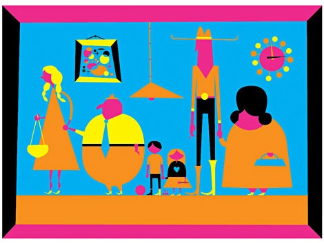
Last month, Ryan and I completed work on our first gallery exhibition,
titled ‘Haven’. We created 12 pieces that embodied our infatuation with the mid-century, domestic home life, architecture and collecting. The finished pieces ranged from 4′ x 3′ to 15″ x 15″. It was a lot of fun, especially with it being something we had never tackled before. For the most part, we had never done anything outside of client work over the last 8 years (sad, I know). It was very freeing to dig into a subject and medium that we were heavily invested in.
In regards to illustration, we don’t have a set process. Sometimes we’ll start out sketching the standard way: pencil and paper. Other times, we’ll just dive straight in on the computer. For these pieces, we just decided to begin in Illustrator. We knew that we were going to be adding quite a few traditional elements to each piece, so we weren’t too worried about the initial process. I chose my ‘Family Portrait’ to explain the particular process we had for ‘Haven’.
I started out with the foundation: shapes. When I began, I had a rough idea in my head of what I wanted to see. From there, it was just trial and error until I got the shapes exactly how I wanted. In regards to color, I didn’t even tackle that until I was completely finished (and happy) with each vector illustration.
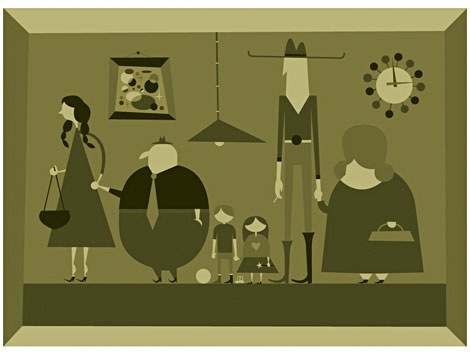
Next, I fiddled with 1,000 color palettes until I found something I liked. I decided on real drab and muted hues.
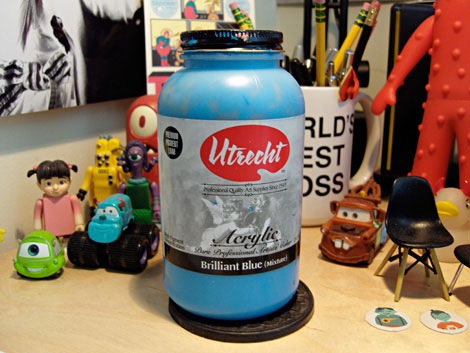
Once I had the final composition finished, I busted out the Utrecht
‘Brilliant Blue’ acrylic paint. Since all of the strokes end up being black after we scan them in, it didn’t really matter what color I used. Well, that and the fact that I didn’t have any black at the time.
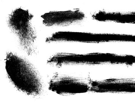
I then painted random strokes and dabs. Above is an example of what a
page looks like after I have scanned it in. I probably created 4-5 pages of random strokes – and used them all for the 6 pieces I created for ‘Haven’.
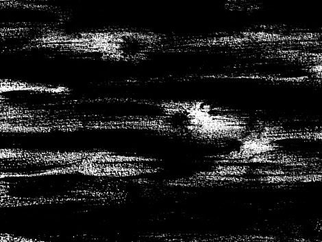
I then created a file for the background of my piece. It’s just a
combination of strokes layered up in Photoshop.
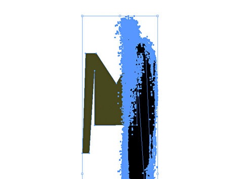
I then proceeded to knock brush strokes through EVERY single piece in my file. This probably took me an entire day.
Side note: The gouache technique of painting is ultimately what we are
trying to (roughly) replicate – but with an obvious vector spin. I plan on diving into gouache this year, as it’s a totally foreign medium to me. I am excited for numerous reasons, but I can’t wait to say goodbye to vectorized brush strokes!
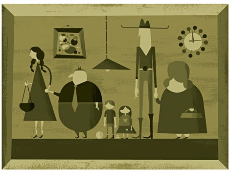
Once I was finished with placing all of my brush strokes, it was now time for the detailed line work.
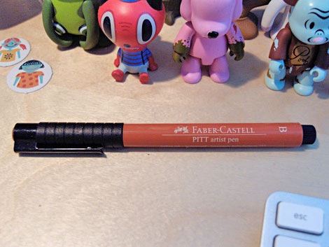
I used our trusty Faber-Castell ‘PITT’ pen. There is so much freedom with this pen, which allowed me to create very wide strokes as well as very thin. It has a broad range and worked perfectly for these pieces.
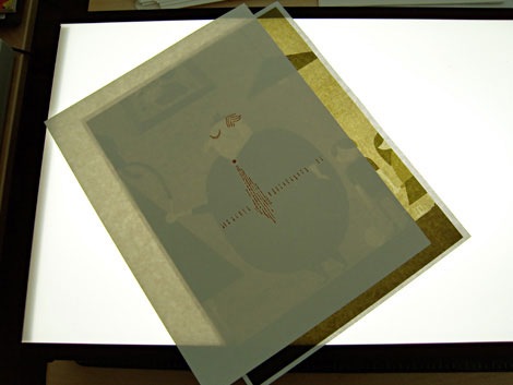
I then printed out sections of the art (this specific piece was around 4′ x 3′) and brought it over to our light table to begin adding the line work. You can NEVER duplicate these kind of lines on the computer, so we did it all by hand. It is a lot more time consuming, but it’s always worth it.
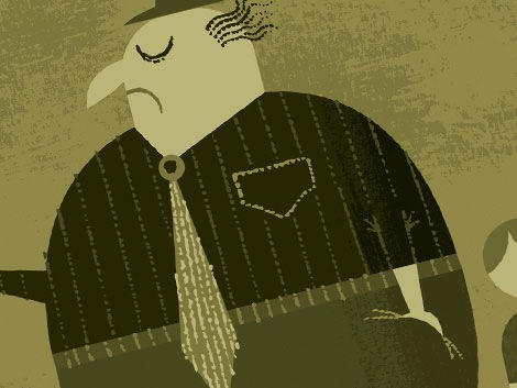
I then scanned in each page of lines, vectorized, and colored. This also took about a day.
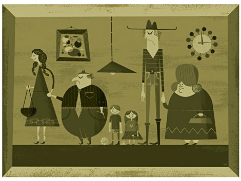
This, ladies and gentlemen, concludes my little tutorial. We have a finished portrait! We printed each piece on archival watercolor paper and I must say that the print quality is immaculate. We had many
people asking us if we actually painted each piece (yes!) and a handful more that were just curious as to what our process was. I hope this answers a few questions. These pieces were so fun to create.
——————————————————————–
The 30 second design challenge:
Through years of scientific training and data we have concluded that “the world’s best design ever†will be created in 30 seconds. It will be a design so intense that a young designer’s mind will instantly blow up when he/she sees it. We are on a quest for that design. Well, thats not the full truth. In the 30 second design challenge we give our interviewee a concept. They then have thirty seconds to sketch out a rough thumbnail.
Don’s been nice enough to join us for this session of the 30 second design challenge. In today’s challenge, we’ve come up with a fictitious 80s heavy metal band with a passion for kicking ass and flying kites.
Ok here we go, Don we would like you to design the lp cover for KITE KNIFE’s (as in flying kites) 1984 never released classic “Welcome to the blade wars”
Let the 30 seconds begin..now!
……..30 seconds later
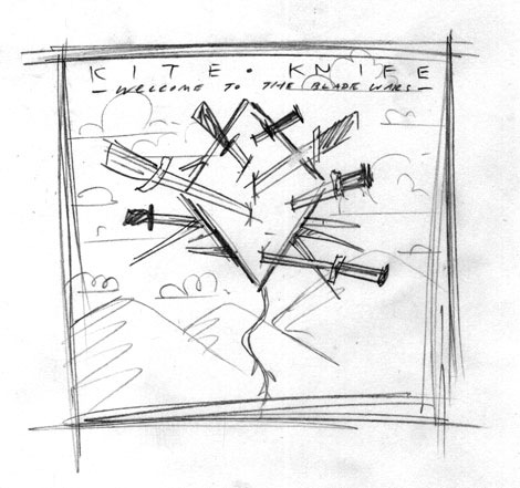
Yes! This rocks. I want to buy this album and stab a kite right now!
We would like to thank Don for taking the time to share with us. You can see the rest of Don’s work at the Invisible Creature website.
You can purchase Posters, Buttons and other good stuff by Don and Ryan at the Invisible Creature online store.
——————————————————————–
Enjoy reading this interview? Please leave a note in the comments and consider signing up for the grain edit RSS feed.
TagsART, contemporary, graphic-design, Illustration, Interviews, tutorials, USA


