Jason Munn interview
Our story with Jason Munn (The Small Stakes) begins in the summer of 2005. We had recently learned that his studio was located near our office so we decided for a little suprise visit. We arrived at his front door and rang his buzzer. When he opened the door we said something along the lines of..
“Hey man..we dig your stuff”. Ha, we had no idea how he would react to this unexpected visit from a couple of fans. Thankfully for us, he was super cool. He invited us in and gave us the tour of the studio. That was 2 years ago and we are still friends and we are still loving his work.
In addition to creating some swell posters, he loves diet coke, pizza and has a killer bench made by his grandfather that has his name engraved in it ( every designer needs one of these!).
Jason’s clients include Random House Publishing, ReadyMade magazine, Wired Magazine, Asthmatic Kitty Records, Death Cab for Cutie, Wilco, American Analog Set and ton of other well known bands.
Now onto the interview.
[pictobrowser 10159078@N03 72157602680652644]
Name
Jason Munn
Any relation to clarence “biggie” munn?
haha nope
Where are you from?
Neenah, Wisconsin
1 word for Neenah, Wisconsin?
Where?
How long have you been living in the bay area?
5 years
Favorite poster you’ve created?
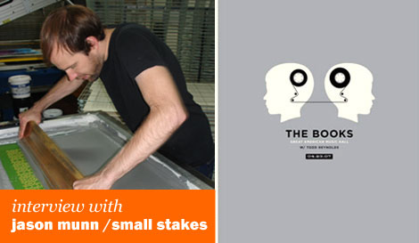
The 1st books poster
Where does the Small Stakes name come from?
A song by Spoon of the same name. The song is about taking chances and I saw starting my own business as taking my own chances.
What were some of your early influences?
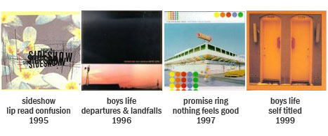
Album covers, especially from some of the mid-west bands like Boys Life, Promise Ring,and Giant’s Chair. Also Jeff Kleinsmith’s work on Sub Pop. Jeff’s cover for Sideshow’s lip read confusion really stuck in my mind and inspired me to be a designer. Besides album covers, I was really into skateboard graphics, the designs on the bottom of the decks etc.
What is a typical day like for you?
Start working at 9am, begin answering emails, walk down to 7-11 get a diet coke ( I don’t drink coffee), think about what needs to be done, work till 10pm , prepare a list for the next day and then wind down.
Did you goto an art/design school?
Well, I went to a university where I studied fine arts. I thought I needed a fine arts degree if I wanted to get into advertising/design. It wasn’t till later that I realized what I really need were classes in design.
So what did you after you got out of school?
I got 2 jobs. One was an internship for Fiskars ( the scissors company) doing packaging etc. and the other was a position at a small firm called distiller design. It was cool, when I left Fiskars they gave me this pair of engraved scissors.
How long did you work in Wisconsin till you moved to the “O” (Oakland)?
About a year and a half.
Did you have a job lined up before you moved here?
Nope, I just grabbed my portfolio and went. When I got here I was trying to get jobs at some of the local firms but, I got here at the wrong time (right in the middle of the dotcom bust) so no one was hiring.
So what did you do?
I worked various jobs. I worked at a t-shirt printing shop, cleaning screens, packing, wherever they needed help. Then I got an internship at Noise13. Around the same time a friend of mine started booking shows at a place called the ramp and they asked me to design posters for their shows.
What is the ramp?
It was a venue located in the basement of a church in Berkeley.
Who were some of the bands that played at the ramp that you designed posters for?
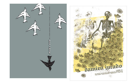
Brother danielson, Why?, Animal Collective, Damien Jurado, Rob Crowe, etc.
When did you start doing posters full time?
I had just moved into my own studio apartment (I was previously living with 4 other guys). I needed a way to come up with rent each month so, thats when I started to take my poster design work more seriously.
When did you start getting the bigger jobs?
I started to get know many of the bands that played at the ramp. If they were coming to town I would contact them directly and ask if I could design the poster for the show. I met Death Cab for Cutie’s management and They hired to me to do a poster and some merch designs for them and it received a fair amount of attention and that led to more work. Around this time there were some guys in Berkeley that put together a book called The art of modern rock. I submitted some pieces for that. The book did really well so, that led to more work as well.
Many of your earlier works were created using found imagery. Where were you finding your source material?
I was searching public libraries, Dover books, found image books etc.
Why were you using found imagery?
At first I wasn’t confident in my abilities to draw etc. Plus it was a huge part of the learning process for me. I was learning how images work together but, as I became more confident, I started to incorporate more illustration into my work.
Whats it been like to make that transition between working exclusively with found imagery to a mix of that and hand drawn elements?
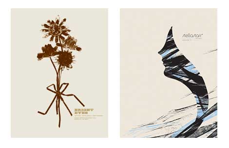
My posters take longer to create. Plus, it takes a while to come up with a strong central image. I’m also adding different types of found imagery. For example, in the Bright Eyes poster I used real flowers and scanned in black pieces of paper for the bow. For the Stellastarr poster I used a wedding veil for the hair.
————————————————————————————-
The 30 second design challenge (enter drum roll)
————————————————————————————
Through years of scientific training and data we have concluded that “the world’s best design ever” will be created in 30 seconds. It will be a design so intense that a young designer’s mind will instantly blow up when he/she sees it. We are on a quest for that design.
Ok, so maybe thats not the full truth. We came up with a fake band and album name and were giving you 30 seconds to design a poster for it. Are you down?
Ha, ok
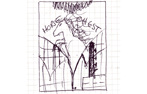
The band’s name is “Horse chest” and the name of the ep is “Sweet Mane“. Its a folk rock band and the lead singer plays piccolo. Let the 30 seconds begin now….
(30 seconds later)Alright, let’s see it.
hahahaha this is great!
Yea the horse would be a tattoo on the guys chest and his chest hair would make up the mane. Ha, plus he’s got a piccolo in his pocket.
I love it! I would totally buy this poster. Somebody has to make this album.
So we are at the end of this interview. Thanks for taking the time to talk with us. Before we go, do you have any weird stories you want to share?
I found an image of my old house on Flickr and someone wrote “being a designer doesn’t mean you’ll be rich”
ha thats classic!
————————————————————————————-
You can view Jason Munn’s complete portfolio online at: thesmallstakes.com
Stop by and buy a poster!
Tagscontemporary, Designers, graphic-design, Interviews, posters


