Recently Received Books

The Moderns via @grainedit

The Moderns by Steven Heller and Greg D’Onofrio

Looking for some new inspiration or something to add to your winter reading list? Here’s a few of the titles that we’ve received within the last month or so. Included are awesome titles from Abrams, Blast Books, The Monacelli Press, Thames & Hudson, Wee Society and Princeton Architectural Press.


Read the rest of this entry »

Johnson/Kingston

Johnson Kingston

Ivan Weiss and Michael Kryenbül of the design studio Johnson/Kingston aim to create inventive work that challenges the norm. To keep their designs fresh and unique, they often craft bespoke typefaces and unconventional layouts for posters and websites. They then pair these elements with intricate textures and distorted imagery that signifies the mood of the event they are designing for. I’m especially fond of their work for the 2016 B-Sides Festival. The event’s poster features jagged graphics and an ornate typeface that characterizes the music festival’s edgy, yet playful atmosphere.

Read the rest of this entry »

Chiii Design

Chiii Design

Chiii Design collaborates with organizations focused on art and culture. Based in Macau, the studio crafts work for creative events throughout the region. Last year, they designed the branding system for the Y Show, an exhibition that presents the portfolios of local and international art graduates. The identity features purple and pink letterforms strung across an elastic strand that represents the vibrancy of the young artists in attendance.

Read the rest of this entry »

Fol Studio

Fol Studio

Fol Studio is a multidisciplinary design firm that strives to be a “brand development partner” for their clients. Their strong branding skills are especially evident in their poster work for exhibitions and film festivals throughout Turkey. I’m particularly fond of their work for the art space Arter. For a retrospective on the controversial artwork of Jake and Dinos Chapman, the studio crafted eye-catching posters that feature mutated letterforms and bright splashes of color. These elements characterize the brands of both the gallery and the artists by featuring the bright hues of Arter’s identity system and signifying the audacity of the Chapman’s portfolio.

Read the rest of this entry »

Kate Prior

Kate Prior

Kate Prior is a London-based artist currently working as an in-house illustrator for Urban Outfitters. Her quirky aesthetic fits perfectly with the brand and speaks to its hip and outgoing customers. Her humorous drawings have also caught the attention of Google. Last year, the tech giant commissioned her to create a set of stickers for its messaging app Allo. For the project, she crafted the Cool Beans, a gang of bean-shaped characters that hilariously reflect the wide range of emotions one often shares with friends.

Read the rest of this entry »

Tishk Barzanji

Tishk Barzanji

Tishk Barzanji crafts surreal illustrations inspired by modernism and London’s architecture. Brimming with massive windows and shadowy figures, his pieces explore themes of deconstruction and man’s interaction with space. These concepts are also present in his animated work, which demonstrates how objects would move through his mysterious landscapes.

Read the rest of this entry »

Jon McNaught

Jon McNaught

Jon McNaught is an illustrator and comic book artist who captures the small comforts of everyday life. He often draws characters enjoying quiet activities like reading books or making coffee. An avid printmaker, he enjoys crafting linocuts and screen prints comprised of humble shapes and limited color schemes. These simple elements add an extra dose of harmony to his wholesome and serene compositions.

Read the rest of this entry »

Cécile + Roger

Cecile and Roger

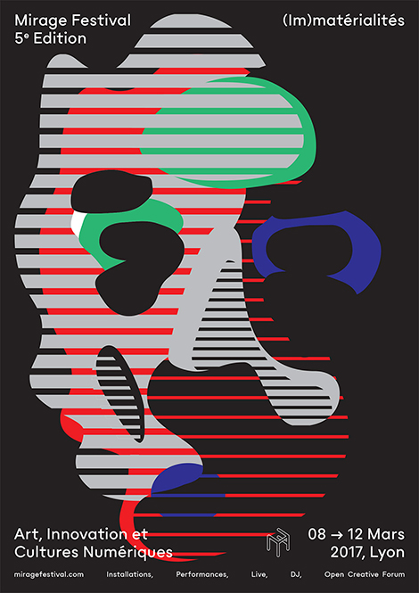
The Geneva-based studio, Cécile + Roger, crafts exceptional work for the Mirage Festival in Lyon, an annual celebration of art and digital culture. Over the past five years, they created promotional materials that capture the innovative spirit of the featured installations and performances.

This year, the festival’s theme was “(Im)materialities”, the idea of transforming a perceived truth. To express this concept, the studio developed an identity system consisting of round splotches, line patterns, and bright hues. The elements hark back to the event’s vibrant laser beams and often unite to form abstract faces. This materialization represents the phenomenon of pareidolia – the imagined perception of pattern or meaning where it does not actually exist – a mirage.

Read the rest of this entry »

Sébastien Plassard

Sebastien Plassard

Filled with muted colors and old-fashioned technology, Sébastien Plassard’s illustrations have a vintage flair. The nostalgic imagery often turns surreal and dreamlike as he depicts melting automobiles and horse-car-robot amalgamations. His alluring pieces have added a dash of whimsicality to popular publications such as The New York Times and Télérama.

Read the rest of this entry »

A’Design Award Winners: Packaging

Saana Hellsten
Basik Packaging by Saana Hellsten

Present your packaging skills to the international design community by submitting a project to the A’Design Award & Competition. From wine bottles to tubes of mascara, the contest reviews packages of all kinds. The jury panel judges each design based on criteria such as form, innovation, material choice, functionality, and more. Winners will receive an A’Design Prize, which includes invitations to the award ceremony in Como Italy, PR support, guaranteed publications of their work, and other services. If packaging isn’t your bag, the event offers other categories such as Visual CommunicationUI and UXPhotography and more. To participate, register and submit your work here.


Read the rest of this entry »