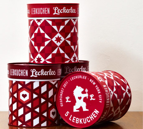
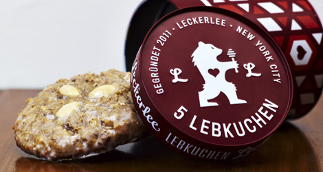
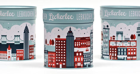
Strohl for Lekerlee
I have been an avid consumer of this German treat for years, but I can guarantee you that it was never the packaging that drew me in. SF Based Strohl took Lekerlee to the next level by creating packaging that is sleek and modern, a sharp contrast to the traditional gothic type and overly-illustrated german villages that usually adorn the cookies’ container.
—–
Also worth viewing:
EnormousChampion Interview
Q + A with Jason Munn
Invisible Creature Poster Pick
Not signed up for the Grain Edit RSS Feed yet? Give it a try. Its free and yummy.
02.15.13 in Found design by Dave
Share on Facebook


