The Typewriter: A Graphic History of the Beloved Machine

type writer book

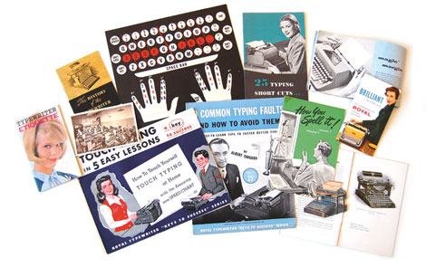
The Typewriter: A Graphic History of the Beloved Machine is the latest project from UPPERCASE magazine founder and editor Janine Vangool. This richly illustrated book will feature never-before published typewriter memorabilia, intriguing historical documents and entertaining anecdotes. To help raise the $25,000 needed for printing costs, freight and transaction fees Janine is currently holding a kickstarter-style funding campaign. If you would like to contribute either monetarily or by donating ephemera to be used in the book, please check out the UPPERCASE website for more info.

(more…)

Typozon

typozon

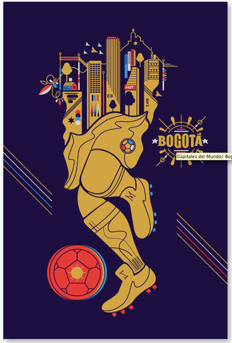
Nice selection of work from Bogota, Colombia based design studio Typozon.

(more…)

Sergio Membrillas

Sergio Membrillas

We’ve seen some amazing talent emerging from Spain recently and Sergio Membrilas is no exception. Sergio is a freelance illustrator from Valencia that possesses a keen eye for color, a wonderful sense of composition and a large writing utensil (see his profile picture). His portfolio is filled with editorial and advertising pieces that showcase his incredible skills in hand-lettering and character illustration. To keep up with all of his latest, follow this link.

(more…)

Element One

element one

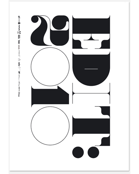
Element One is a Polish design studio specializing in identity and publication design. Their work is crisp and to the point.

I’m a big fan of their editorial work; the use of scale along with type and image is fascinating. Nothing feels untouched. They can make things loud and bold but delicate at the same time.

(more…)

House Archive Boxes

house archive boxes

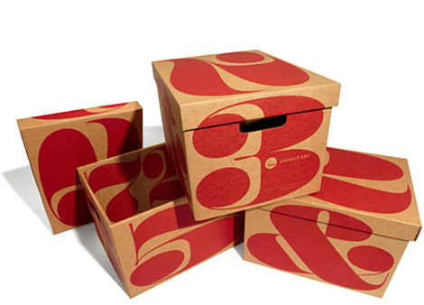
Looking for a stylish way to store your favorite things? Check out these corrugated storage boxes from House Industries. The first edition of the Archive Box features three different versions: a pattern based on House’s Neutraface Slab typeface, huge high-contrast numbers from Photo-Lettering’s Benguiat Montage alphabet and a typographic brace motif.

See them all here.

(more…)

Sophie Alda

Sophie Alda
A friend turned me onto London based illustrator Sophie Alda’s work, and I immediately fell in love. The content of her work is so strange and exciting, especially when she juxtaposes architectural buildings with unusual figures. Her use of muted tints and shades of color are a nice touch, as well as the various abstract forms she creates. Definitely be on the lookout for this gal!

(more…)

Bandito Design Co.

bandito design co

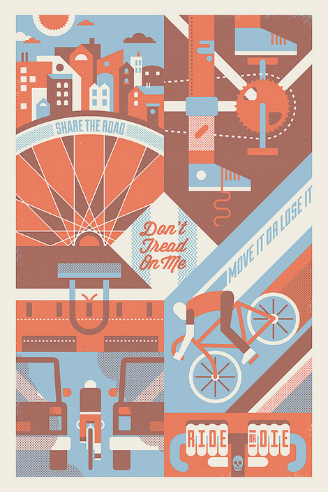
Bandito Design Co. is the home of designer/illustrator extraordinaire Ryan Brinkerhoff. Ryan has his hands firmly entrenched in the exciting gig-poster, screenprinting, music-meets-design scene. He also possesses some fancy hand lettering skills. Skim through his work: it’s hard not to like. I really love his color palettes, and the mileage he can get from using such a small number of colors.

(more…)

Non-Format update

non format

Non-Format, has recently updated their portfolio with really exciting new work. Their artful interpretation of typography is really interesting, it shows an extreme range of thinking beyond traditional forms. Working for the biggest international clients, Non-Format has made a name for themselves as being on the forefront of modern design. Keep up with their latest work by visiting their website, and to get the full Non-Format experience, check out all of their past work in their archive!

(more…)

João Filgueiras Lima: Edifício Morro Vermelho

edifício morro vermelho

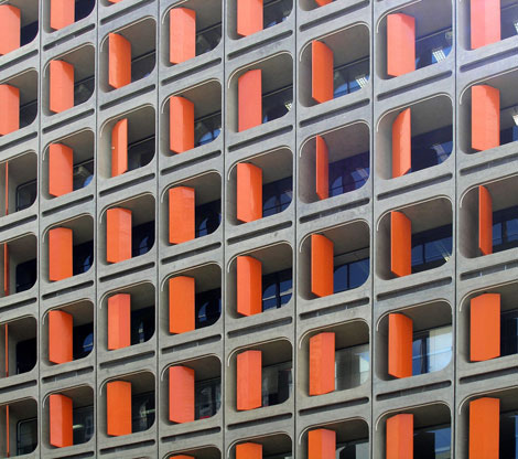
For fans of brutalist architecture, feast your eyes on this beautiful slice of Brasilian modernism conceived by architect João Filgueiras Lima. The Edifício Morro Vermelho complex, aka “Red Hill” housing. features a series of swiveling bright orange fiberglass panels that are not only pleasing to the eyes but also act as a functional shading device.

(more…)

Ze Cardoso

ze cardoso

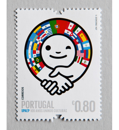
Ze Cardoso is a designer, illustrator and artist hailing from Oporto, Portugal. Recently graduated, Ze has a number of interesting self-initiated projects on his site. I really like the colors and personality in this stamp project, a collaborative effort for CTT, Portugal’s national postal service. They’re bold and playful, and would make sending letters much more enjoyable.

(more…)