Raymond Biesinger

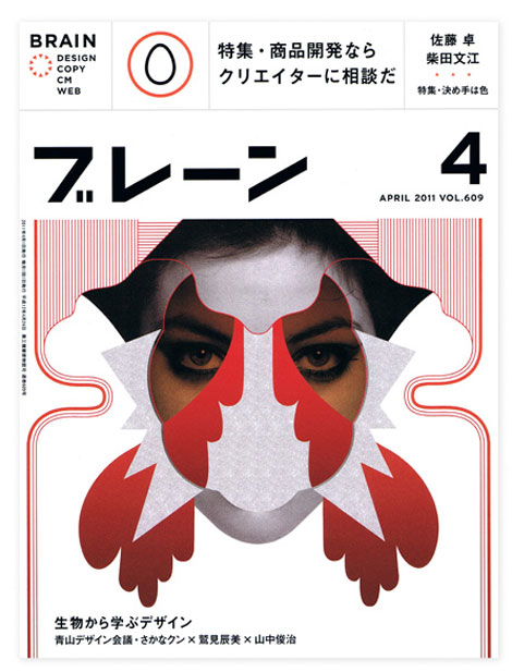
Raymond Biesinger, who was one of the first editorial illustrators that I learned about when I got out of college, has some lovely new work on his freshly updated website. One of my personal favorites, Raymond seems to take the most simple of concepts to an entirely new level by creating intricate, complex worlds by using minimal color palettes and impressive line work. You can see Raymond’s influence on many current editorial illustrators, which makes him an important part of the industry’s foundation. He also has several great side projects, including his band, The Famines, & a book which comes out in November called Black & White Illustrations.

(more…)

Geometry Daily

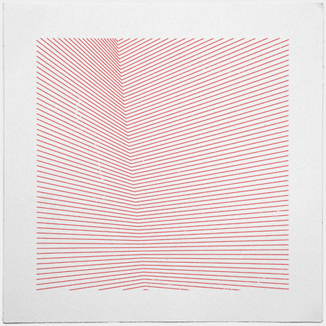
Very cool minimal geometric composition/illustration project from Tilman, a Nuremberg, Germany-based designer. Overall, the collection here is strong and I love how spare these compositions are while still being playful.

(more…)

Daniel Frost

The increasingly amazing & expressive art from Daniel Frost has kept me a fan since the first time I stumbled upon his site a few months ago. While dabbling in the minimalist space, he creates complex stories using simple methods and shapes. My favorite work is from his latest series, called Frostville—a lovely show depicting the fictional world of Daniel Frost.

(more…)

Mogollon

mogollon

Impressive portfolio from the Brooklyn-based design collective Mogollon. Drawing from a vast and eclectic range of influences they create work that is a fusion of art, design and craft.

(more…)

Anna Kövecses

Anna Kövecses

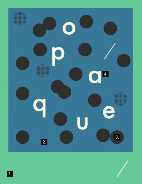
Cool daily poster project from Anna Kövecses. Aside from being a wonderful creative exercise, the intent is to highlight successful color palettes and provide inspiration.

(more…)

Wee Society

wee society

Introducing Wee Society, a new kids brand created by the folks behind the design firm Office.

The first line of products introduces the Wee Alphas – a quirky crew of 26 illustrated animals with a letter of the alphabet hidden in each one. The Wee Alphas appear in a series of art prints – including a limited edition 13-color screen print and a personalized print that you can customize with your child’s name and a silly (or slightly more serious) statement. See them all here.

(more…)

Typographische Monatsblätter Archive

Typographische Monatsblätter

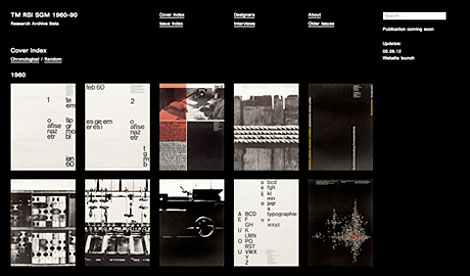
Louise Paradis, along with the guidance and support from friends and staff at the ECAL/University of Art and Design Lausanne, has launched an amazing website dedicated to the Swiss magazine Typographische Monatsblätter. Focusing on the years 1960-1990, the online archive features covers, typeface identification as well as interviews with many of the magazine’s contributors. Enjoy!

(more…)

Why Design

why design

At Herman Miller design is the language they use to ask questions and seek answers to the problems their customers face. The design process is a journey into the unknown—or as George Nelson once quipped, “I have never met a designer who was retained to keep things the same as they were.” Before we decide what we do and how we do it, we like to begin by asking the question “Why?” In Why Design, a new film series, Herman Miller explores the world through the eyes of their designers, and shares something of why we value their point of view.

(more…)

Scrawl Magazine

scrawl magazine

Scrawl is a new digital magazine about comics & illustration created solely for the iPad. Scrawl was created as an independent platform for artists, which enables freedom and the opportunity to create and share their work with others. The pilot issue, which is now available as a free download, won both the best in the comics category and the first prize at the “Magnify your world” contest held by Mag+.

(more…)

Anagrama

Anagrama

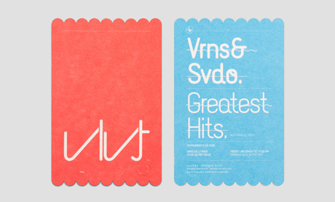
Anagrama is Mexico-based design studio/agency doing a lot of very slick branding projects. I love how full and considered these campaigns are—from the initial mark to the collateral, their thoughtfulness and attention to detail is obvious. They do a great job photographing and presenting their work, as well.

(more…)