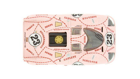
Go Faster: The Graphic Design of Racing Cars

This video provides a very interesting look at the design of racing cars in 70s. The graphics on these care are incredible — very minimal and nothing at all like the logo-plastered cars of NASCAR.
From the Gestalten.tv website:
“You’d never guess it, but these big toys for big boys were at the height of their design during the 1970s – by sheer chance. Mechanics and team members – not designers or marketing strategists – adorned racecars with all of those flashy stripes, logos, numbers and colors prevalent at any Formula 1 race today. After compiling more than 100 examples of sleek cars from this glory age, Go Faster-author Sven Völker takes us for a joy ride at the Porsche Museum in Stuttgart for a whip-fast lesson in competitive war paint, visual anarchy and piggish car designs.”
Via Quipsologies

TagsDesign
03.05.10 in Found design by Ethan
Share on Facebook


