Chris DeLorenzo Interview
I’ve been following the work of Christopher DeLorenzo for sometime now and i’ve always been impressed with his ability to skillfully navigate between illustration, type and design with the slightest of ease. Building on simple forms, he crafts character-driven work that is equally informed by his love for film and passion for literature. A native of Massachusetts, Chris briefly ventured into NY for a stint at Saatchi & Saatchi X. He has since returned, to take on the lead design / art director role at the clothing brand Johnny Cupcakes. We’ve featured Chris’s work on the site in the past, but in today’s interview he grants us a closer look into his work and process.
When and how did you become interested in illustration and design?
I guess the seed was planted when I was really young. As a kid, art and craft were always around me. My grandfather was a carpenter and constant painter and creative person and my grandmother was basically the town artist. They helped light the spark and eventually fueled as I got older. In college I found out about graphic design, but I felt too limited so I took all of the illustration and printmaking classes I could. During an art history class I first saw Milton Glaser and Seymour Chwast and it was love at first sight and my mind was blown. Basically I’ve been striving to model my career after them ever since.
As a designer, what types of projects are you most passionate about? what attracts you to that type of work?
There are a lot of working designers that like to think of themselves as artists as well and I am definitely in the class. We can all design a logo or lay something out with a bit of personal distance if we have to, but our favorite projects are the ones where the client just wants us to give it our voice, our hand and our personality. When I get an email from a new client who wants me for my art and design thinking and voice rather than my title as “graphic designer” I get very excited and it’s always one more coin in the jar labeled “I think I can do this for a living”. I really like open ended briefs, something where I get one of two words and an emotion to work off of. I love editorial illustrations but sometimes the topics don’t really lend themselves to my drawing style and I sometimes feel they are forced. But nothing beats seeing your work on the printed page. I will never grow tired of that. I hope it never grows tired of me.
Could you walk us through one of your projects? Please include the tools you worked with to achieve the final look.
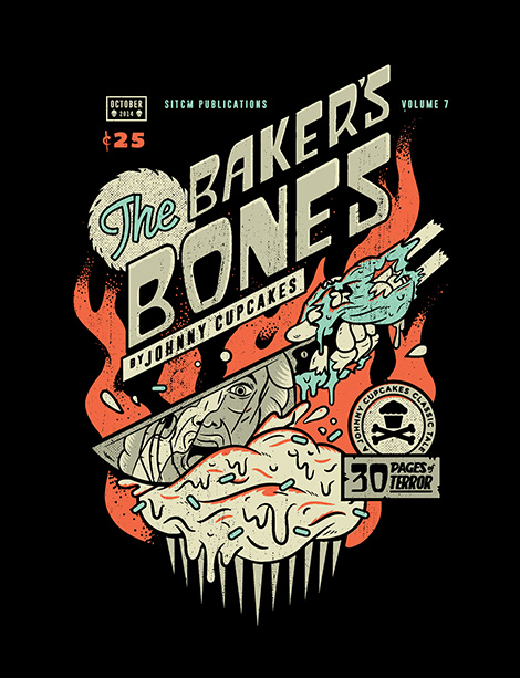
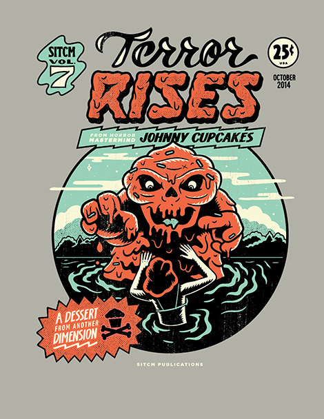
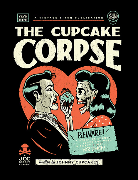
Last year, Johnny Cupcakes, the company I design for, released a Halloween collection of t-shirts called “Midnight Delights” The idea was a spoof on vintage pulp horror novellas. Three t-shirts packaged in a book-like box. There’s such a rich history with that genre that we really wanted to capture it as best we could. I hand drew all the covers first, sketches and pencil work, then I used my wacom tablet to recreate everything digitally and do the type. Of course, they were looking too flat on the screen so I had to add some texture to them, you’ll see different stippling and line strokes on them that I used with Retro Supply brushes. And then to top it all off I added some distressed textures to give it that worn old book feel. Since our printers screen print everything it’s really nice to have the Retro Supply textures in vector that way I can keep it all in one place and not have to move art into a different application and separate the colors.
In what ways did the initial concepts differ from the finished product?
Not a whole lot changed actually. I just came up with a lot of different titles for the books first and since we had three shirts it made it a lot easier to pick three good ones and not have to dwindle them down to one, that way we got to capture a whole range of stories – some romantic, some summer camp swamp monsters, and the disgruntled undead. Since the client was ourselves it was really just about making us laugh and creating a fun and uniquely Johnny Cupcakes experience for the customer.
How has your work evolved over the years?
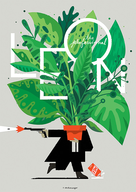
Well if you take a look at my tumblr site and start from the beginning you definitely see a certain stylistic change. I think that’s the one thing that some people might be thrown off with, because my execution might differ from the last image but my thinking and personality has always come through no matter what. I have a design brain with an illustration hand so I’m always trying to tackle a problem with the best visual way. Again, trying to be my own one man PushPin studios.
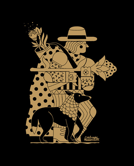
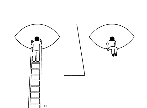
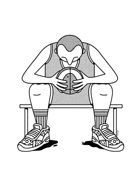
More recently my work has been very illustration heavy as I’ve grown up a little bit I’ve become more confident in how I see the world and not how others make me see. This has resulted in more simple line drawings using a lot of patterns and geometry. I’m more inspired these days in seeing the poetry in objects and things and the idea that everything can be a portal into something else.
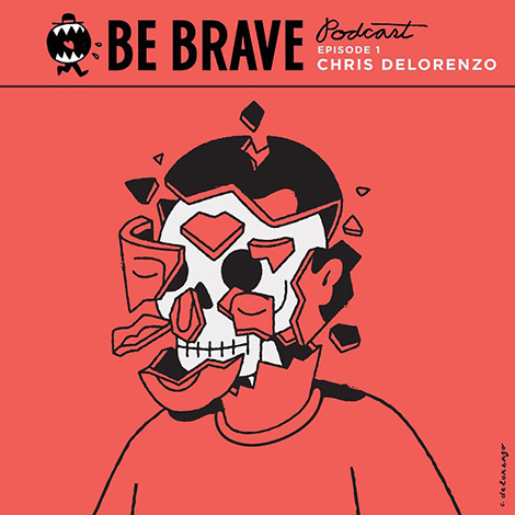
In addition to your work for Johnny Cupcakes, you also you produce the Be Brave Podcast which features candid interviews with young creative people. What led you to launch the show and in what ways have side projects contributed to your own growth and development as an artist?
Although Johnny Cupcakes has a huge presence and influence, I have barely gotten any work based on my position and portfolio with them. The work I get these days is all based on the side projects and personal work I’ve made. The Be Brave Podcast started out as a way for my friend David Tanklefsky and I to practice our craft, it was a way to have a client and a problem without having an actual client. David writes and interviews and I create portraits based on people and their stories. We realized we know a lot of cool people who we want to expose to the world and dig deeper into their creative drive and method.
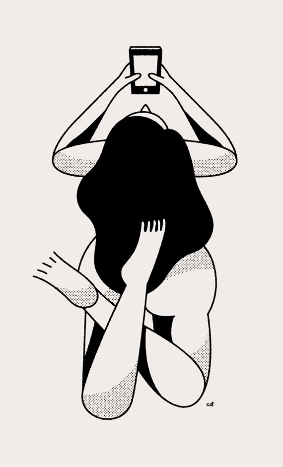
Another project that has been getting lots of attention and work for me are my ‘Nudes with Phones’ series. Those started as just a fun little experiment and quickly evolved. Each drawing I put online is like a fishing lure, some of them bite and some just keep swimming by, that’s why you have to keep making, and if they aren’t biting…go to a different pond.
It sounds like side projects continue to be a strong and effective tool tool for personal growth, developing a new client base and gaining insight into your audience. Do you have any recommendations for designers that feel stuck in the corporate grind and are looking to develop passion projects outside of their day job?
Just do it. Every designer at a corporate jobs probably thinks of at least one or two side projects a day that they don’t know could be side projects yet. They probably grab a beer with their friends and they all say “we should totally do….” or “Wouldn’t it be cool if….” or “I really wish someone would…”. Next time you find yourself daydreaming about a project or saying those words, stop and write them down and start making it happen. Making things is the easiest thing in the world, it’s the abstract stuff we get caught up in. I don’t care that you’re tired when you get home from your job, nobody cares and they are tired of your unhappiness so you should probably do that thing you’ve been talking about. I fall into the same trap all the time, sometimes you gotta pull the plug on that netflix subscription and start it back up after you’re done with your project.
We would like to thank Chris for taking time to share with us. You can see more of his work here. Posters, prints and goodies are available from his online shop.
——

This interview is brought to you by RetroSupply Co. the #1 online marketplace for retro inspired effects for Photoshop and Illustrator. Including fonts, Photoshop brushes, Photoshop actions, Illustrator brushes and much more.
Save 50%
For a limited time use the code GRAINEDIT50 and save 50% off all purchases. Offer expires December 31st, 2015.
——
Also worth viewing…
Josh Brill Interview
Brad Woodard Interview
Ty Wilkins Interview


