September 2016

You are currently browsing the monthly archive for September 2016.

Ray Oranges

Ray Oranges

Ray Oranges is a Florence-based designer whose work has caught the eye of Wired, Monocle, and Creative Review. Focusing on the shapes of his subjects rather than their details, he abstracts architecture and landscapes to create artful and geometric pieces. His extreme minimalism, mixed with his calculated use of negative space and long shadows, gives his portfolio a surreal and dreamlike quality. To keep up with his work and architectural inspiration, make sure to follow him on Instagram.

Read the rest of this entry »

Dan Woodger

Dan Woodger

Dan Woodger is a London based illustrator who uses pastel color palettes and black outlines to create eccentric scenes that are bound to make you chuckle. His portfolio of highly expressive characters has helped him land editorial and advertising collaborations with The New York Times, Heineken, and Google. I am especially impressed with his work for the messaging app LINE, in which he crafted 1000 unique emojis in 10 weeks. To keep up with his work and read his personal insights on each of his projects, make sure to follow his blog and Instagram.

Read the rest of this entry »

Joseph Navarro

Joseph Navarro

Joseph Navarro is a Costa Rican graphic designer with a talent for typeface design and lettering. His 3D typographic compositions are often lit from unique angles, creating highlights that guide the viewer’s eyes throughout each design. In addition to typography, he also has a knack for crafting sophisticated branding systems and vibrant geometric illustrations.

Read the rest of this entry »

Sponsor // A Fresh Face in The Stock Imagery World

Foto Sushi

Foto Sushi, a new player in the stock photo industry, is breathing life into the mundane world of people imagery. The brainchild of seasoned art directors and designers, Foto Sushi was created to help alleviate some of the pain that goes into finding good people images. Designers can choose from about a dozen expressions per model, and each model is shot under consistent lighting schemes so they can be easily grouped together. Each extra-large, high resolution image has been beautifully retouched to save designers time and models are shot in focus to make them easy to clip out. Lastly, Images are never cropped, so designers wont’ be inconvenienced with rebuilding body parts. Licensing agreements are Royalty-free making Foto Sushi hassle-free.

See all the images at Foto Sushi.

Read the rest of this entry »

Giacomo Gambineri

Giacomo Gambineri

Giacomo Gambineri is an Italian illustrator and graphic designer. Using thick outlines and story panels, he illustrates articles and reader’s Tweets for The New York Times and New Scientist. His quirky depictions of social issues and popular culture help bring humor to today’s hot topics. To keep up with his work, make sure to follow him on Instagram.

Read the rest of this entry »

Michael Spitz

Michael Spitz

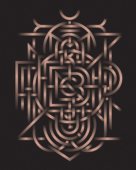
Michael Spitz is a freelance graphic designer based in New York City. From logos to illustrations, he tackles a wide breadth of projects and styles. Having a passion for typeface design, his portfolio is chock-full of innovative lettering and monograms. One exploration that is particularly impressive is a metallic bronze monogram that encases the entire alphabet and blooms from A at its center to Z at its rim. His inventive typographic designs are featured in the books New Graphic Design – The 100 Best Contemporary Graphic Designers and Typism 1 and 2.

Read the rest of this entry »

Jun Cen

Jun Cen

When it comes to storytelling, Chinese illustrator and animator, Jun Cen, prefers to veer away from the obvious. His conceptual illustrations portray stories in clever and inventive ways. A wonderful example of this is his work for Plansponsor magazine. In the illustration, a diver is seen searching for obscure pearls in order to highlight the complexities of finding an ideal healthcare plan.

Cen’s innovation is also evident within his cunning use of patterns to represent ice, stone, and fur. Rather than drawing these textures by hand, he employs marbled and blotchy patterns that mimic the lighting and colors of these natural surfaces. To see more of his work and to catch a glimpse of his process, check out his blog and Vimeo.

Read the rest of this entry »

burkhardthauke

burkhardthauke

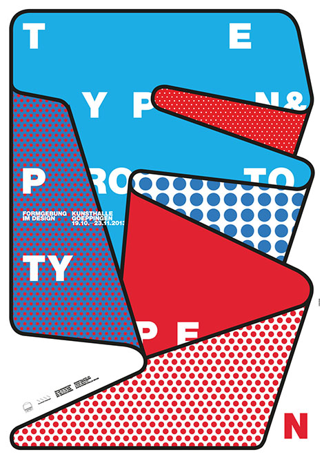
burkhardthauke is a design studio that isn’t afraid of experimentation. Founded by Ralph Burkhardt and Daniel Hauke, the German studio fuses complex layering and inventive lettering to create typographic posters that vibrate with motion. To craft such innovative compositions, the duo deconstructs words, stretches and expands letterforms with colorful gradients, and uses a number of other techniques to distort type. With work so intriguing, it is no surprise that they win numerous awards from type clubs and design organizations every year. Make sure to take a look at their portfolio and follow them on Instagram to check out their most recent work.

Read the rest of this entry »

Okay

Okay

The work of Carl Bender’s design studio, Okay, holds far more merit than its name implies. Having a strong sense of narrative, he creates distinct and memorable brands by integrating his client’s stories into his designs. I’m especially fond of his work for Bender’s Whiskey Co. Inspired by the company’s location on San Francisco’s Treasure Island, the whiskey’s quirky illustrative packaging pays homage to the island’s nautical history and the swashbuckling sailors who have spent time there.

Read the rest of this entry »

Page 1 of 198123...Last »