August 2016

You are currently browsing the monthly archive for August 2016.

Marie Assénat

Marie Assenat

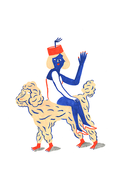
Brooklyn-based French illustrator, Marie Assénat, creates paintings and drawings that have a charming and naive essence. Although her characters are often humorous, her work has a sophisticated flair that has led to collaborations with Le Chocolat Des Français and the French Open. Whether it’s a GIF of a dancing poodle or a painting of a roller skating kitty, her drawings are bound to put a smile on your face.

Read the rest of this entry »

Erman Yilmaz

Erman Yilmaz

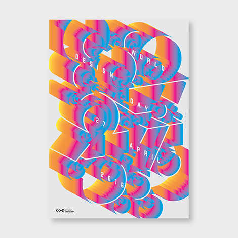
Erman Yilmaz’s passion for street art highly influences his digital work. Like graffiti, his typographic arrangements intertwine with illustrations in an elaborate and colorful fashion. As the elements converge, he inserts hidden details that add extra significance to the message of each poster. To see more of his work, check out his street art and Instagram.

Read the rest of this entry »

Josh Cochran

Josh Cochran

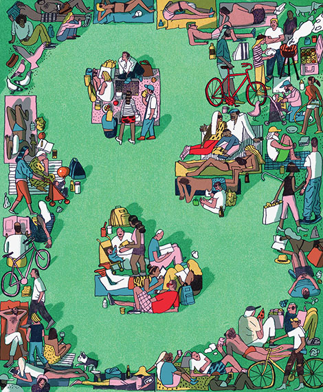
Josh Cochran’s portfolio is a colorful wonderland that is rich with detail and life. Working with muted tones and hand drawn lines, he creates charming monsters and imaginative environments that one could stare at for hours. His whimsical characters have found their way into conceptual illustrations for The New Yorker and large murals for the U.S. Open and Warby Parker. To keep up with his work, make sure to follow him on Instagram.

Read the rest of this entry »

Violaine & Jérémy

Violaine & Jeremy

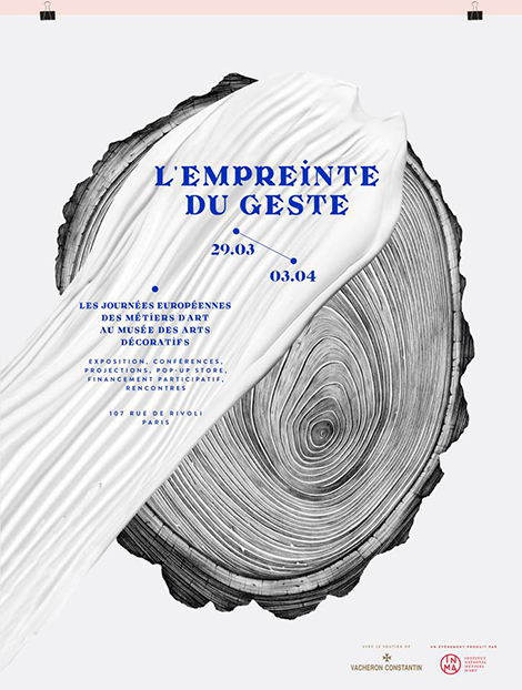
Violaine & Jérémy is a French illustration and graphic arts studio founded by Violaine Orsoni and Jérémy Schneider. Unafraid of mixing digital and traditional techniques, the studio often combines custom designed typefaces with impressive pencil drawings. Their projects with Parisian institutions such as the Musée des Arts Décoratifs exude the studio’s talent for creating identity systems that are chic and elegantly edgy.

Read the rest of this entry »

Raúl Soria

Raul Soria

The illustrations of Spanish artist, Raúl Soria, are filled with vivacious colors, whimsical patterns, and pleasant surprises. Although his work is already lively and often surreal, his use of animated GIFs gives his portfolio an extra dose of charm. Don’t be surprised if one of his characters suddenly gives you a friendly wink or curiously raises an eyebrow.

Read the rest of this entry »

Design Facts

Design Facts

Did you know that it took Adrian Frutiger three years to design the twenty-one sans-serif fonts that make up the Univers family? Or did you know that in 2010, Milton Glaser was the first designer to receive the National Medal of Arts? On Design Facts,designer and art director, Shane Bzdok, shares facts about the history of graphic design, the people who have shaped the craft, and the impact design has made on our culture. To read these fun facts and submit some of your own, make sure to visit the site today and follow its Twitter page.

——————–

Also worth viewing:

Sebastian Weiss
Lo Siento
Variety Show Studio

Follow us on RSSInstagramPinterestWanelo

——————–

Maite Franchi

Maite Franchi

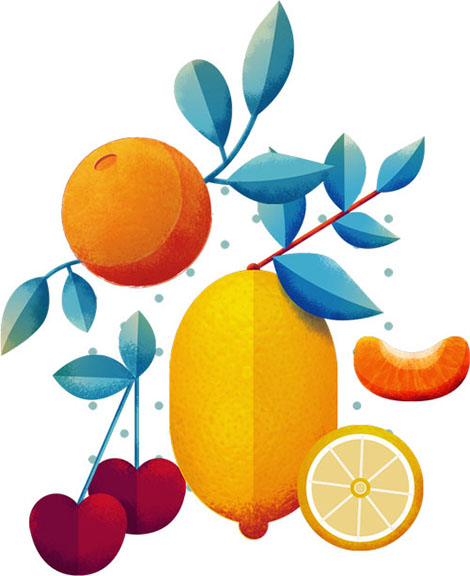
Maite Franchi is a graphic designer and illustrator based in Lyon, France. As seen within her collaborations with Sony, The Huffington Post, and Vanity Fair she crafts editorial illustrations with a bold emphasis on texture and refined color palettes. Often illustrating for articles about cooking and travel, her portfolio is jam-packed with appetizing food illustrations that beautifully pop behind geometric patterns. If pixels were edible, her work would look good enough to eat.

Read the rest of this entry »

Sponsor // Yana Typeface

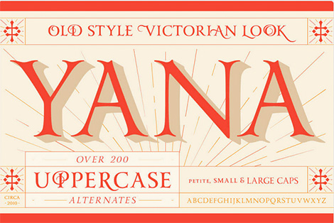
Yana by Laura Worthington


Classy, calligraphic, and confident. Yana’s classical proportions convey worldly sophistication and experience. Yet unlike more staid classical faces, Yana’s concave terminals and elegantly flared serifs suggest romance, mystery, and a touch of Victorian extravagance.

Designed as a versatile family for everything from text use to headlines and titling, you’ll find yourself using Yana in project after project. Yana is available in regular, bold, and italic variants, and includes two sets of swash capitals — each available in standard sizes and small caps, but also in mid-sized petite caps, ideal for adding beautiful, properly scaled flourishes to the middle or end of wordmarks.

Yana is available through a limited-time promo deal here.


Read the rest of this entry »

Karolis Strautniekas

Karolis Strautniekas

Looking through the portfolio of Lithuanian illustrator, Karolis Strautniekas, feels like stepping onto the set of a film noir movie. Brimming with dark silhouettes, cool tones, and grainy textures, his illustrations tell stories that are seductively mysterious. His work can be found gracing the pages of The New York Times, Forbes, and on his blog where he posts side projects and works in progress.

Read the rest of this entry »

Twice

Twice

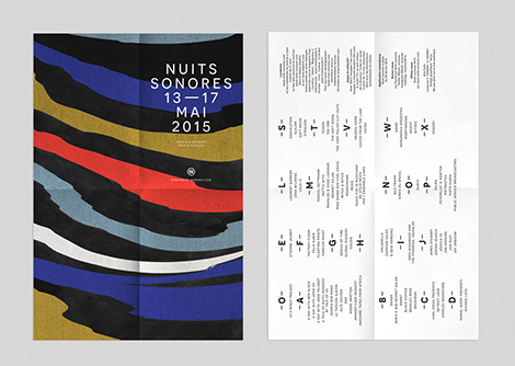
Twice is a Paris-based design studio founded by Fanny le Bras and Clémentine Berry. The duo combines organic textures and abstract shapes to design chic album covers, posters, and lookbooks. Their use of bright colors and bold photography make their designs just as unique and lively as the music and events they often accompany.

Read the rest of this entry »

David Biskup

David Biskup

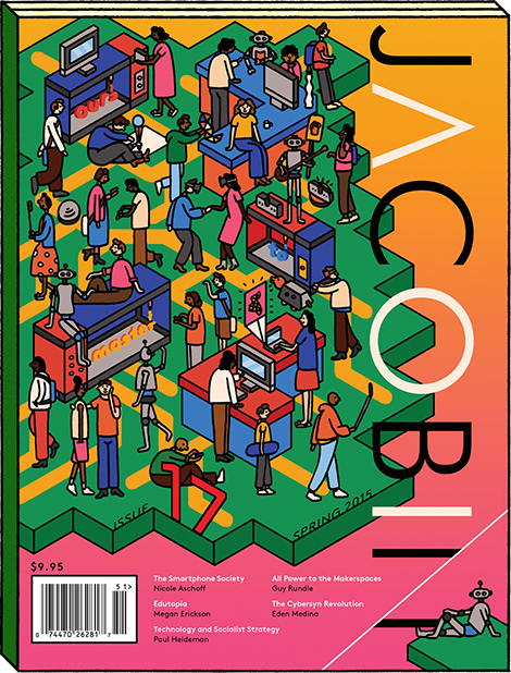
David Biskup is a London based artist whose illustrations have graced the pages of prominent publications such as The New York Times and The Guardian. His signature style combines bright colors, playful characters, and a touch of dark and risqué humor. In addition to his freelance work, he also publishes visual novellas inspired by his personal life and man’s relationship with creativity.

Read the rest of this entry »

Jordan Metcalf

Jordan Metcalf

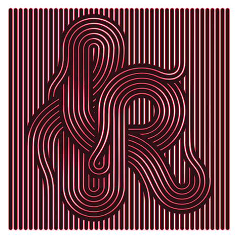
Jordan Metcalf is a Cape Town-based designer, illustrator, and artist who concentrates on type-focused design and lettering. Not afraid to experiment and willing to tackle any letterform, he has collaborated with a variety of clients, including Nike, Adobe, and Harper Collins. His inventive compositions are witty, alluring, and often include a balance of elegant ornamentation and accentuating textures. Although he mostly works digitally, he has also employed tactile mediums such as laser cut perspex and etched wood.

Read the rest of this entry »