Mark Brooks
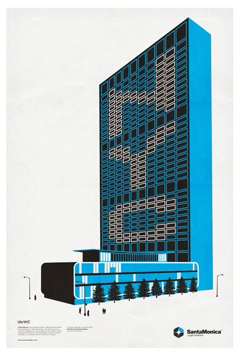
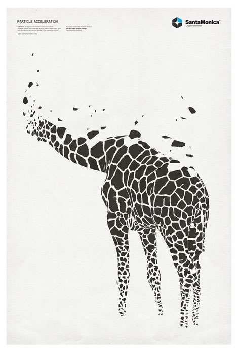
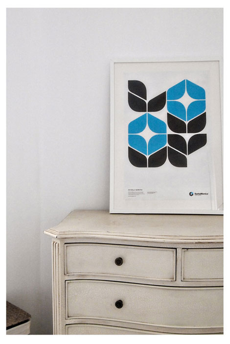
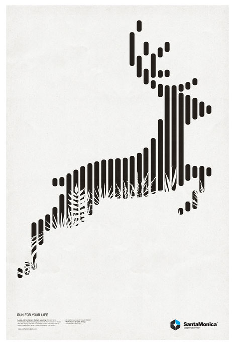
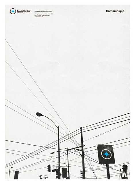
I’m really digging the deceptively minimal work of Mark Brooks. The illustrations are sparse and the images full of contrast, and I feel that the concept quality is top notch. For example, whatever is happening with the exploding — or shattering — giraffe below is amazing.
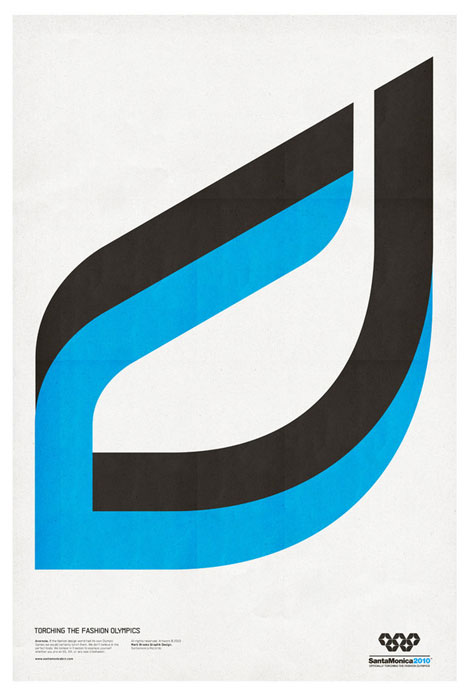
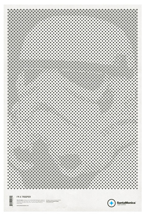
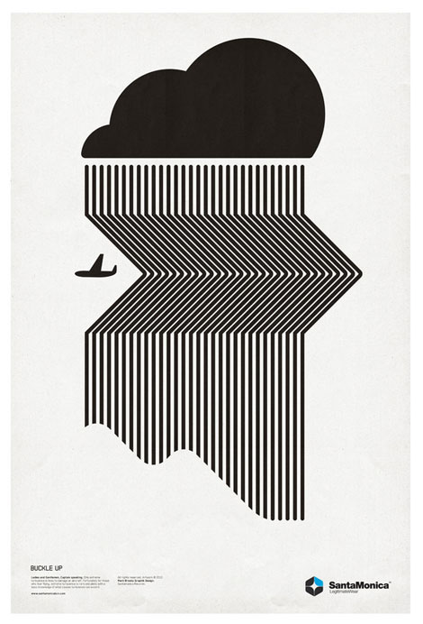
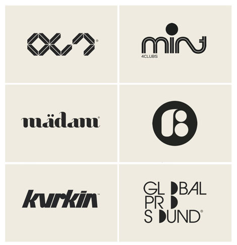
Mark’s portfolio is bold; I love that many of the pieces require a second look. In addition to the variety of pieces designed for Santamonica, the LA based apparel company, Mark also has a comprehensive logo portfolio. Like his print work, they are bold, crisp and smart (and largely typographical).
Check out his Behance portfolio as well.
(via iso50)
For your viewing pleasure:
ISO50 Interview
Jonathan Zawada
Dan Cassaro / Young Jerks
Not signed up for the Grain Edit RSS Feed yet? Give it a try. Its free and yummy.
Tagscontemporary, Designers
02.23.11 in Found design by Ethan
Share on Facebook


