Sasha Barr Interview
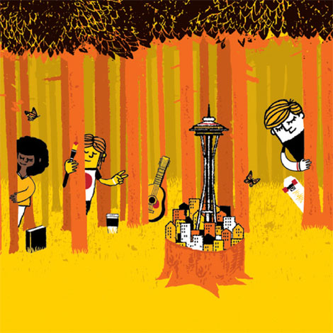
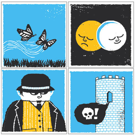
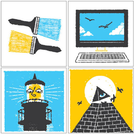
The latest installment to the Grain Edit interview series takes us to Seattle, birthplace of grunge music and home to illustrator and designer, Sasha Barr. I was first introduced to Sasha’s work a few years ago when I stumbled upon his website, positively titled “This is the New Year.” His work often employs rough textures, intricately drawn patterns featuring elements from nature and little creatures, and cool color palettes.
In this interview, Sasha discusses how he made the trek from Tennessee to Seattle, his influences and creative process, how he landed an awesome gig working at Sub Pop Records, and also shares incredible views of his awesome home.
Let’s dive on in!
What’s the story behind “This is the New Year?”
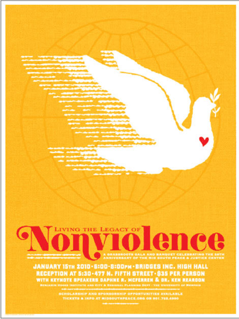
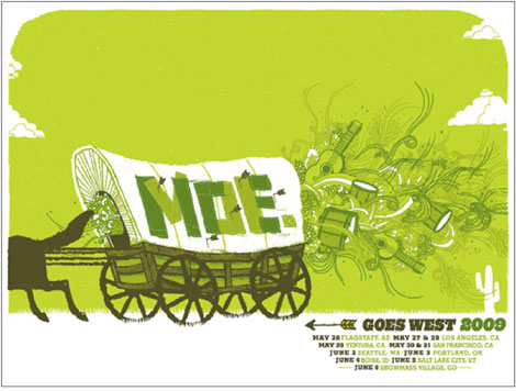
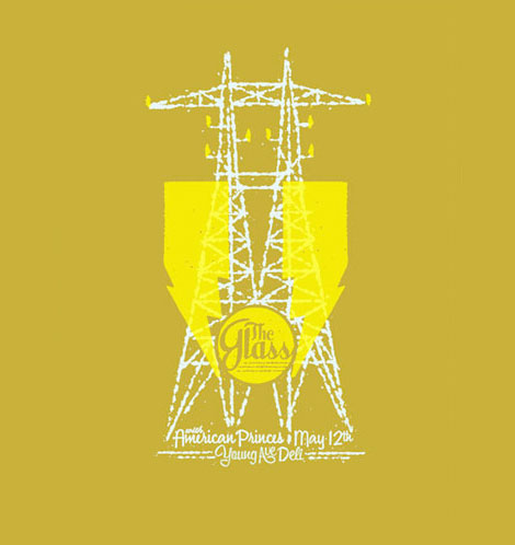
In 2001, a friend and I started making posters under the name Nocturnal Showprint, but after a while I took a break from screen-printing to learn more about photography. In 2004, some Memphis bands and good friends (Snowglobe, The Glass, The Coach and Four, etc.) convinced me to start making posters again. I started putting a website together and I needed a name. It was the beginning of a new year, and I wanted something that represented a new beginning; it was also an easy answer. I’ve always been terrible at naming things. I renamed my cat 3 times before settling on “Fatty,” if that gives you any insight to my naming abilities.
How do you like Seattle compared to Tennessee? What are some of your favorite things about Seattle?
This is a big question! I moved to Seattle for no good reason, really. I wasn’t escaping the South, per se, just changing up the environment. There are plenty of things I miss about Tennessee, but I’m finding myself really happy with Seattle. Seattle has so much going on and so many opportunities; it’s a great place for creative types. I was lucky enough to come in to some great jobs, as well as a great relationship, all of which wouldn’t have happened had I not moved here!
The water, mountains, and parks (Discovery Park especially) are amazing. It’s really easy to take a walk through the neighborhood and end up on some beach or in a giant park. Every time I see the snow covered Olympics, Mt Rainier, or the Puget Sound, I feel incredibly thankful for being near such beautiful nature while living in an urban/suburban environment. I’ve been a skateboarder for some years, and Seattle has a ton of skate parks, something that was super hard to come by in Memphis. Oh, and the buses are handy. Top Pot donuts are another fantastic thing about Seattle…and no mosquitoes.
How long have you been in your space?
We moved in last May, so a year. We plan to stay for a while!
What do you like most about it?
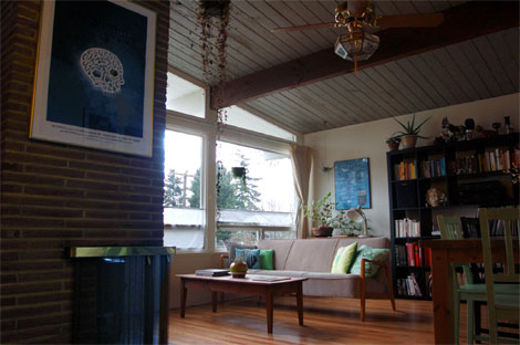
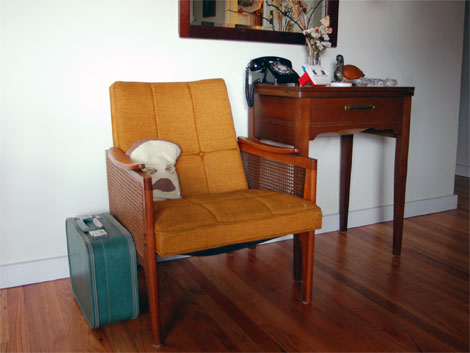
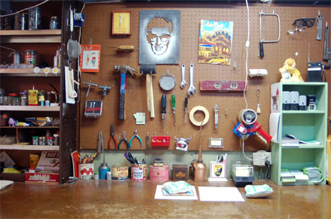
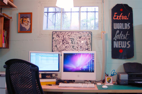
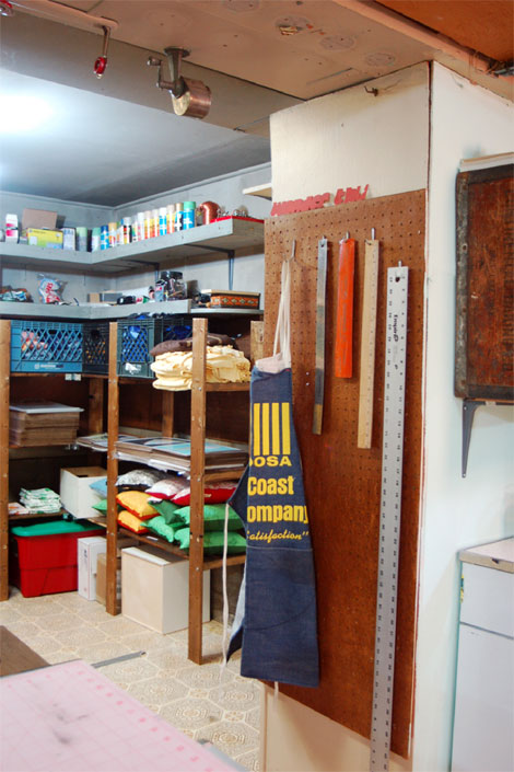
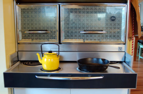
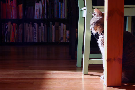
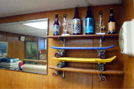
It’s a crazy 50’s house, with all sorts of retro style and accents. We’re the first people to ever rent it, and the owners had lived in the house since 1961. They left behind all kinds of old fixtures, jars, cans, matches, boxes, curtains, bolts…we could of open an antique store with all the cool stuff they left for us. [We have] vaulted ceilings, big picture windows, a Frigidaire Flair stove, a full finished basement complete with bar and woodshop, plus a really incredible view of the Olympics from the backyard. Words really don’t do the house justice. There’s enough room upstairs to have a life, while the basement provides ample space for the working. I’m a big fan of being able to work at home. It’s nice to take a break from working to clean up a bit, dig a hole in the yard, make some chai, or take a nap with the cat.
What are some of your favorite objects in your studio?
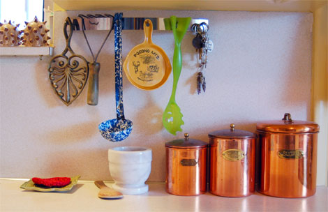
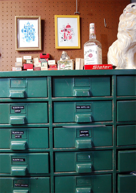
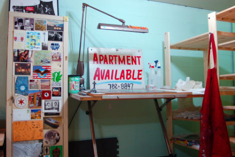
All of the random old stuff that came with the house are fantastic additions to the space. The old wooden Wonder Bread box I screwed in to the wall for a bookcase/ shelf is pretty nifty. There’s also a bunch of old spray paint cans that have neat labels. Oh! My favorite thing could be the Jim Beam bottle that Meagan found hidden behind one of the big tool boxes, Grandpa’s secret stash!
When did you first become interested in illustration/design?
My parents were both art students in school, and are still creative people, so art and creativity have always been a big part of my life. My mother was a printmaking student in school who now spins, knits, and weaves fabrics, and my father is a screen-printing ceramicist. I did a fair amount of drawing, painting, and collage in high school, and learned how to screen-print as a teenager. After moving from Middle Tennessee to Memphis for college, I started getting in to street art stuff, teaching myself Photoshop basics to make 11 x 17 flyers to paste up around the city. I don’t have many pictures to show for it, but I tried my best to cover Memphis with flyers of Buddy Holly (for no good reason). I surfed around on the internet and just found stuff that inspired me, essentially trying to figure out the processes. My first design project was for a local band called Pezz; just some photos in a basic CD jewel case. Somewhere in there, I found Gigposters.com and instantly wanted to try and screen-print posters. I was friends with the guys in the band Lucero, who were kind enough to let me do a poster for them. [It is] pretty obvious I was way in to the Eduardo Recife at the time. It’s really just evolved since then […] lots of books, peers, and the internet.
Did you attend a traditional art school? If so, what was your experience like?
I went to the University of Memphis as a printmaking student, with a lot of photography and ceramics classes. I think I had a hard time focusing on school work, so I was always doing different things. It was a weird situation to be in, freelancing regularly but also having a bunch of creative work due for school. I concentrated more on the freelance work and perhaps my class work suffered. Throwing on the wheel was a really good way to not think about anything and just make shapes. With the photo classes, I was in the darkroom all hours of the day and night. I’d stay late and just develop prints till I was too tired to stand. The printmaking department was pretty small and I was one of the only undergraduate students at the time. Attendance was pretty relaxed so I usually went in by myself late at night to print class work and posters. I learned how to use Adobe Illustrator because it was easy to set things up for screen-printing and my skill level with it has grown over time. I don’t know, when I think about it, my school experience was kind of weird but I’m happy with the way it all worked out. It’s been a slow process, and I still have much to learn.
Who or what are your influences?
I learn a great deal from my co-workers Jeff Kleinsmith and Dusty Summers, so they’re obviously big influences on me. I’ve always been a huge fan of Chris Ware’s storytelling and structures, despite the fact that his stories always bum me out. Having been a skateboarder for many years, skate art has played a big role as inspiration: Andy Jenkins, Evan Hecox, Michael Sieben, Donald Pendleton, Andy Mueller, Michael Leon, so on and so on. There’s without a doubt a huge list of poster artists that have always inspired me: Jay Ryan, Jesse Ledoux, Sonnenzimmer, Tim Gough, Raymond Biesinger, Invisible Creature, Aesthetic Apparatus, Diana Sudyka, Mat Daly, Aaron Horkey, Spike Press, Methane, Dirk Fowler, Jason Munn, Tyler Stout… Then there’s just a random list of folks who’s stuff I dig: Jim Datz, Travis Millard, Brian Gaberman, Atiba Jefferson, Lab Partners, Geoff McFetridge, Josh Cochran, ISO50, Paul Rand, the folks at Pixar, Vasco Mourao, Adrian Johnson & 50’s cartoons, Mike Perry, Saul Bass, Ray Fenwick, Frank Chimero, Tom Gauld, Nate Powell; it just goes on and on and on. I just like looking at nice stuff, trying to figure out how it’s done, and letting it influence what I’m doing.
On another side of things, I found the recent series on PBS Craft in America quite inspiring. Coming from a family of craft artists, I enjoy the history and humility behind it all. My girlfriend, Meagan, and her family are also big influences for me. She’s a fiber artist and I really love her sense of humor and musings on the world around her. Her family also consists of craft artists, growers, cooks; much like mine. Meagan and I also share Wonder Thunder, so it’s only natural that we influence each other.
Music is of course a huge influence, but to compile that list completely would be a bigger task than I could even begin to imagine. Lately I’ve listening to the upcoming releases from Sub Pop’s Wolf Parade & Foals, The Band, All the Saints, The National’s High Violet, Mr. Gnome, Big Star, Dead Meadow’s Three Kings, Maserati’s Passages and …And Justice for All. Radiolab and This American Life have kind of taken over the music lately, though. I prefer to listen to the stories and talking when doing the more production stuff: screen-printing, fabric cutting, order packing, and the like. [That’s] always inspiring.
For those that may not know, Wonder Thunder is a line of handmade goods that you & Meagan collaborate on. Can you tell us more about it? How did it start? You guys were featured in Better Homes and Gardens last year. How did that turn out and what other cool goods are you planning on making this year?
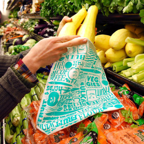
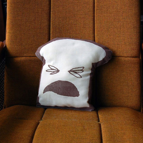
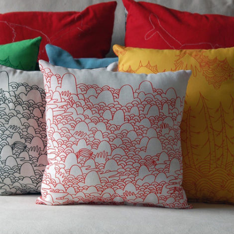
Wonder Thunder started out as an Etsy store Meagan ran when she was living in Portland, but had been on hiatus for a while. Our first winter in Seattle proved to be cold, grey, and wet everyday all day so we really needed something distract us. I’d always really liked the name and it seemed like a fun way to pass the time so we just started making things. We started out making little pockets for iPods and it grew from there. Our process usually begins when sitting around, doodling on an envelope, and coming up with funny ideas like a watermelon dressed up as a cowboy. We seem to work off each other’s ideas pretty well.
Wonder Thunder’s holiday season was truly out of control. We’re really glad we had such a fantastic response from Better Homes and Gardens; it was incredible, but truly tiring.
The vegetable bags have been a big hit for us, so we want to keep the future of Wonder Thunder in that sort of vein. We like doing the kitchen towels as well, we recently redesigned them with all over patterns and one new graphic of wide ruled notebook paper.
We both feel pretty guilty about waste and plastic trash, so we’ve recently been concentrating on switching all our products to organic and more sustainable materials. Hopefully 2010 will provide us with some time to concentrate on new designs as well.
If you had the chance, would you incorporate some ceramic work?
I saw Tad Carpenter’s plates not too long ago found myself intrigued by dinnerware, but I haven’t looked in to it much further. We would have to have something like that made for us, we just don’t have the facilities or equipment! Someday perhaps!
How did you land the awesome gig working with Sub Pop & Suicide Squeeze? They put out some of my favorite bands! What are some of your favorite things about it? Do you find it easy to generate artwork for bands?
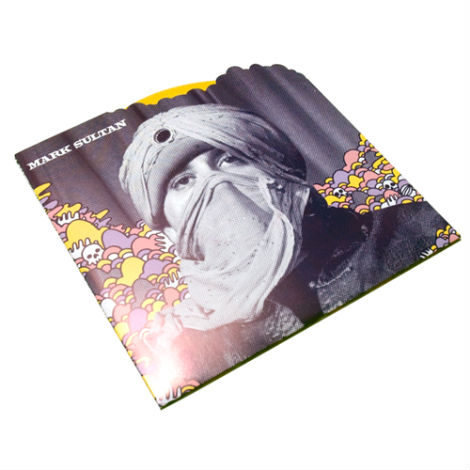
I really lucked out with both labels. With Sub Pop it was just a chain of timely events. The art department at Sub Pop just needed someone to fill in for a little while, but then their 20th anniversary came around, things got really busy, so they asked me to stay! I’m fortunate to have such talented dudes as co-workers. I feel like I’ve learned a ton from Jeff and Dusty. The whole environment at Sub Pop is great, everyone’s really in to what they’re doing, and it’s all centered on music I love. I don’t think generating art for the bands is typically easy, but it really varies with each project. Sub Pop is very open to whatever the bands’ vision might be, and sometimes we just help them see it to fruition. It’s always a unique challenge, which I appreciate. The Mark Sultan 7″ is the only project I’ve had complete creative control over, and I was really pleased with how it turned out. I’ve also had the opportunity to work on some interesting projects such as their Nike shoe and Manik skateboards. It’s been a great experience so far, and I’m honored to be with them.
With Suicide Squeeze, I help out with everyday sort of stuff, ads, one-sheets, posters, the occasional layout, etc. The fellow who runs it, David Dickenson, has been doing it for a while now and he’s great to work with. I dig what they release, and feel privileged to help them out.
What is your creative process?
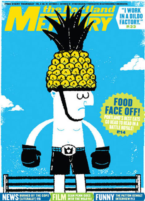
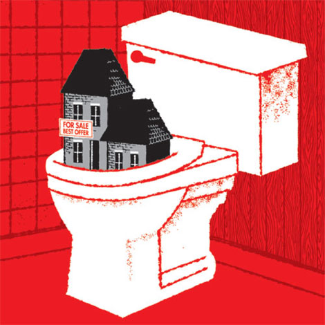
I’ve never been an avid sketcher, I usually just think as I look through inspirational material. Sometimes I’ll just start from scratch, other times I’ll start by collaging stuff. If it’s for a band I try to do something inspired by song lyrics, their image, or their sound. Sometimes I’ll have a line from a song and idea in my head for a while before I get the opportunity to put it to work. My old Death Cab for Cutie posters are a good example of that. I usually just start from there. For some projects I’ll have 10 versions of the project(in various states of disrepair) before I end up finding something that works. Most editorial work I’ve worked on had a fair amount of direction coming in to it, which I like. I feel like my stuff, my “look,” is a little all over the place, so every project is different. Lately I’ve been trying to throw in more line work stuff, it all just depends on who or what I’m inspired by at the time. That’s a big influence on my creative process.
Sasha was kind enough to show us this process in detail with the creation of this Band of Horses poster.
So, this poster is pretty straightforward, not anything super fancy but it gives you an idea of how I typically work. I don’t typically sketch out ideas very often; I just go through my materials and get to work! I didn’t have a concrete idea going in to this poster, but I’ve always really loved the song “Ode to the LRC,” which references a Learning Resource Center and reading stories in the opening stanza. All in all I think it took bout 3 – 4 hours of messing around before I finished something I’m happy with.
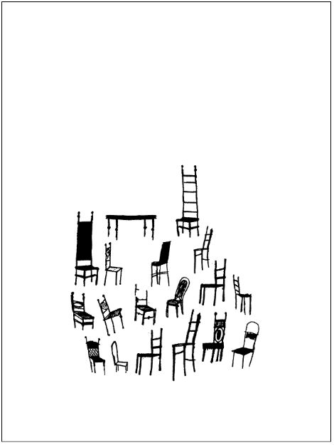
I saw an image in an old design annual of some chairs, so my spark sort of started with that. I started with these, thinking I could make something cool with them. I work almost exclusively in Illustrator, so I always turn everything in to vectors.
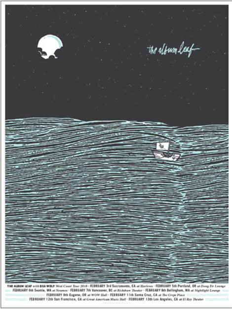
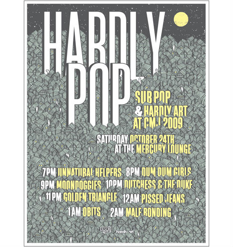
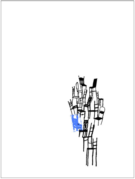
Here I’ve started to pile up the chairs, not really knowing where it’s going, but it seems like a good idea. My last couple of posters have been particularly busy with line work (Album Leaf & Sub Pop CMJ Showcase), so this time around I wanted to keep it open and simple (and quick).
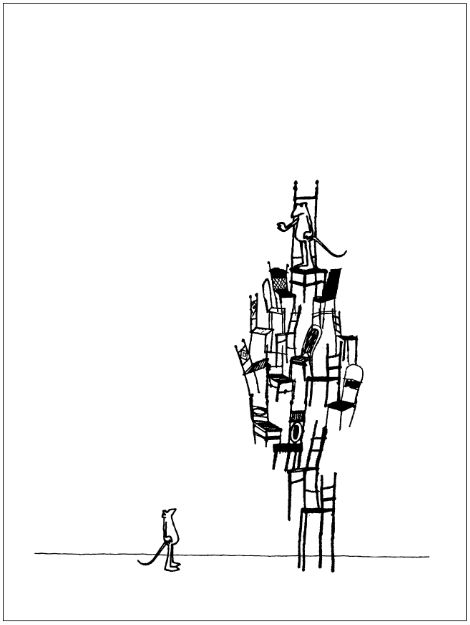
I put in a little sketch of a this mouse guy here (the one on the bottom, also now in vectors), multiplied/ rearranged him, and put the second one on the top of the chair pile. I also added the straight line at the bottom to create some ground. I think this is cool image, but it’s not really doing it for me at this point.
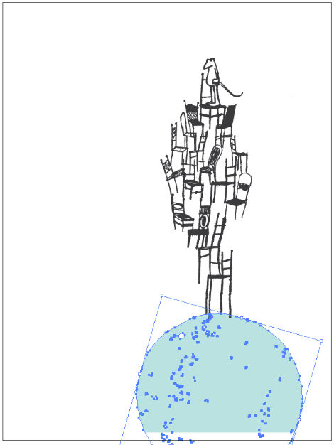
I have a bank of all kinds of vectors I pull from when working on projects; here I’ve added a circle shape to the bottom of the chair pile, while removing the lower mouse character. At this point I’m creating a better idea of what’s happening with the poster, I’m imagining the stacked chairs & mouse on top of a large head, almost as if it’s coming out of the head.
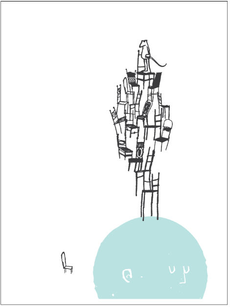
Here’s a good example of how I typically create images and characters. It’s actually pretty rare that I’ll draw something and scan it in, more often than not I’ll build things in illustrator from other vectors. The facial features I’ve added here were made using the line work from the chair on the left and the Pathfinder tools.
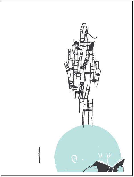
Now this is where my image actually starts to make some sense to me. I’ve added in this book, so my big blue head is reading a story to go along with the lyrics/ Band of Horses theme. In my mind the character is reading a story, and the chair stack/ mouse are what he’s imagining as he’s reading. You can see I built the book and hands from the line on the left.
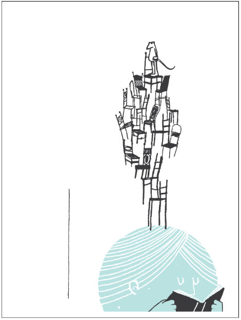
Here I’m adding some tiny detail to the blue head, just creating some hair using the line on the left and the envelope distort tool.
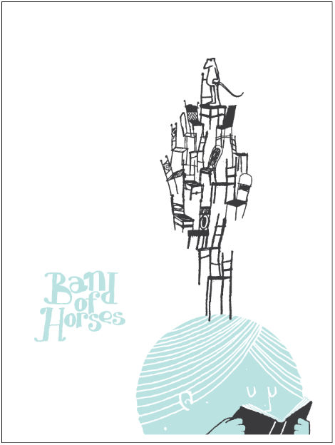
My first attempt at adding type, my initial thought was to do something hand drawn/ childlike, but I’m not so into it after seeing it.
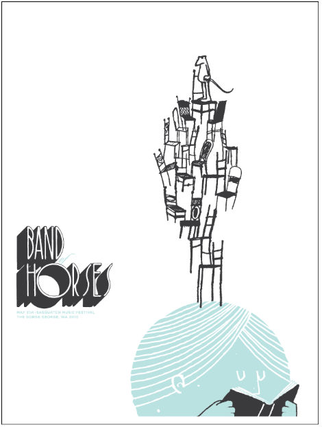
My second attempt at type is a little more successful to me, I’ve scanned this retro 3d type from a font book, and I like the way it looks with the image. I’ve added the secondary text and “OF” in a script font, but I’m not feeling the script or the Gotham (I’m guilty of using it too much).
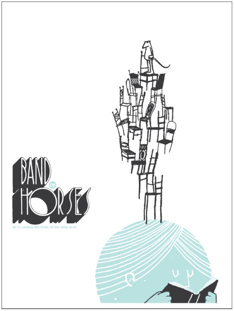
My third attempt at the type is a little more satisfying, the “OF” is now in a small blue circle, and I’ve changed the secondary type to Franklin Gothic Extra Condensed. Because I don’t want to spend too much time messing around with little details on this piece, I call it a day for the type. But, I’m not super happy with the image just on white.
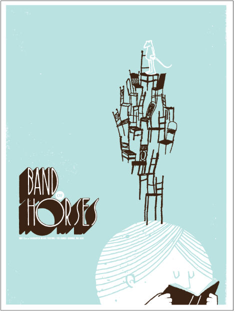
The final poster. I inverted the colors a bit, changed the grey to dark brown, and added some texture. I’m guilty of using blue and brown a little too much, but I think I’m ok with it. I think the poster is pretty cool, and it’s time to move on!
What is a typical day like for you?
The weekday mornings start around 7:30/8:00, which starts with feeding the cats, making coffee, putting on The Album Leaf, and cooking some sort of hot cereal. Some weekdays I catch the bus downtown to Sub Pop. Other days, I work on Wonder Thunder stuff and/or freelance. If it’s dry outside, I try to go to local skate park in the morning for an hour or so when there’s less people around, then going back home and getting to work. If it’s raining I’ll go to the indoor skatepark in my neighborhood, Innerspace in the early afternoon. Before moving to Seattle I used to work until all hours of the night, but now I feel like it’s good to have down time. While I’m certainly envious of people like Frank Chimero, Tyler Stout, and Mike Perry who all seem to ooze the creative spark, I’ve come to realize I’m more project driven than I am the type of person who always has the urge to make things. When evening-time or the weekend rolls around, I’m ready to do something else other than art stuff. Lately I’ve been craving spending time in the yard. We also try to wander around the neighborhoods, where we’ll meet friendly cats and add them to our Google cat map.
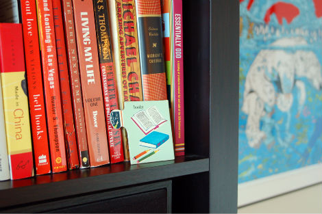
What are some of your favorite books?
Anything by Chris Ware. Nate Powell’s Walkie Talkie comics and collections (Swallow Me Whole, Tiny Giants, Sound of Your Name). Cormac McCarthy’s Blood Meridian, The Road, and Child of God. Denis Johnson’s Jesus’s Son. Malcom Gladwell’s The Tipping Point & Blink. Alan Weisman’s The World Without Us. I also enjoyed the Lord of the Rings Trilogy, Vonnegut, Bukowski, and Irvine Welsh quite a bit growing up. I just finished This Wheel’s on Fire by Levon Helm, now I’m currently going back through Cometbus issues and reading some of the 33 1/3 books.
What are you currently working on?
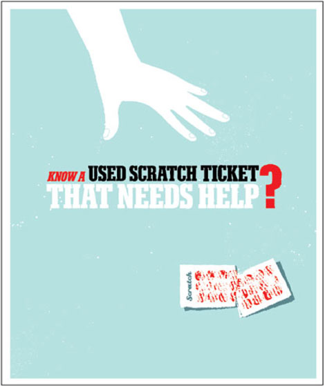
At Sub Pop I recently finished up the artwork for the newest Male Bonding CD/LP release, and am currently helping out with the next Foals full length. The art for that one came to us pretty much done, so I’m mainly setting things up for Sub Pop’s needs. I recently wrapped up some illustrations for the Washington Lottery, which they’ll use for various types of advertising. I just finished some new art prints, posters, and a couple illustrations for Seattle Magazine. Right now I’m putting together a new graphic for Half Acre Beer Company, a 7-inch jacket for Austin band Oh No Oh My, and a poster for the Richmond, BC Dragon Boat Festival. We also just got a new cat, which Meagan and I are working on trying to name.
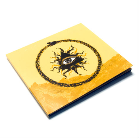
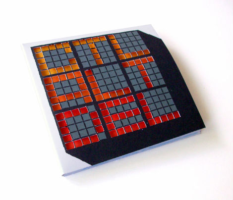
Design challenge: Create an album cover for the fictional band “CTRL ALT DEL.”
So I wanted to make something akin to an old computer manual, at least that’s what I had in mind. I made a little digipack and did the cuts with an Xacto knife. My cutting skills could use some work, but you get the picture!
A million thanks to Sasha for his hard work and enthusiasm through the interview process. If you like what you see, check out his website and pick up some prints from his store. I also highly suggest having a gander and Wonder Thunder, a collection of handmade housewares created in collaboration with Meagan Claire Hall.
Like what you see? You might also dig:
Neither Fish Nor Fowl: Interview with Jim Datz
Little Friends of Printmaking Interview
Enjoy reading this interview? Please leave a note in the comments and consider signing up for our tasty free grain edit RSS feed.
Tagscontemporary, Features, graphic-design, Illustration, Interviews, Sasha Barr, USA
05.04.10 in Features by Grace Danico
Share on Facebook


