Modern design and the stamp – Iain Follett’s stamp collection
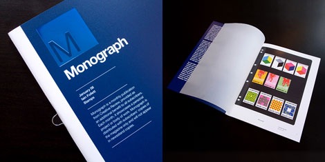
After discovering Iain Follett’s stamp collection was featured in Creative Review’s January 2008 issue of Monograph, I decided to contact him and see if he would be interested in sharing some of his favorite stamps on grain edit. He agreed and has graciously provided us with some choice stamps and his comments.
Continuing with our designer’s bookshelf series, grain edit is proud to present Iain Follett.
I started collecting stamps in my childhood without realising I was doing it. I used to collect everything from stickers to comics to the the freebies in cereal packets and stash them in old shoeboxes. I have always hoarded ephemera and pieces of print, whatever the format, and this still continues today. Although my tastes have refined to design books, posters, comics, stamps and anything I like the look of.?
However, my gran is the reason I started collecting stamps, and why I say I didn’t realise I was doing it. I loved stickers growing up, but she felt there was more value in stamps, how right she was. Every Wednesday she would bring the latest british first day cover set over to my mums house without fail, along with that a collection of used stamps from around the world passed on to her by her friends and relatives. I diligently mounted these stamps into albums and stockpiled the first day covers.
As I grew up I grew out of collecting stamps, but still the stamps kept coming. Years passed (school, college, university, a career in graphic design) and I found myself flicking through a copy of Drip Dry Shirts: The Evolution of the Graphic Designer, where I came across pictures of the Dutch Postal Service stamps designed by Wim Crouwel. Instantly I was taken back 20yrs to my youth. A key stamp I had always remembered, liked and now really admire. I think this sums up the power of the stamp and good stamp design, an image so small and simple, yet so memorable.?
This reignited my interest in stamps, they often say you revisit things you enjoyed in your youth, but do it with more wisdom and passion when your older. I collect stamps purely for there aesthetic value now, anything that takes my eye. Hours are spent on Ebay trawling through collectors shops and private collections and visiting the odd stamp shop. Its a great feeling to find a gorgeously designed stamp, especially one with great print production. A fifth colour, metallic inks or some embossing. I feel stamp design is a somewhat overlooked, making the best use of such a small space whilst relaying an important message, or cultural/historic fact, is an artform.
In no particular order, pretty much all of the stamps below here have been bought from Ebay, or have been in my collection since I was a child.
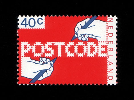
The Dutch postal service has worked with many progressive designers since the 1920s, including Gert Dumbar in the late 20th Century. Working with Raalte, Dumbar designed these postcode stamps in 1978 to encourage the Dutch to include postcodes in addresses. This is one of the earliest stamps I can recall from my childhood, it’s always stuck in my mind.
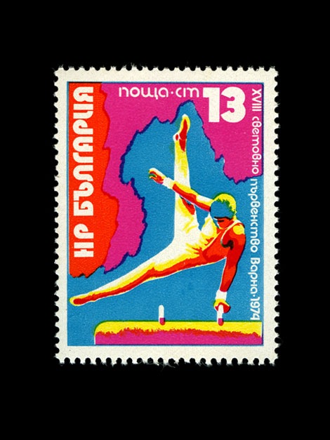
I like this because of the colour and sense of movement, and I have a fondness for sports stamps, particularly stamps of the Olympic Games.
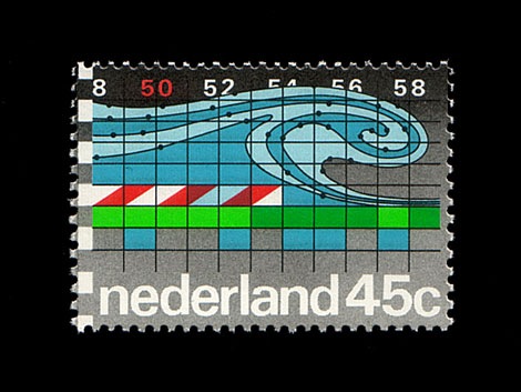
50th anniversary of the Delft Hydraulic Laboratory. Diagram of a water current. Designed by Anne Stienstra, Amsterdam. Great colours, I dig the wave.
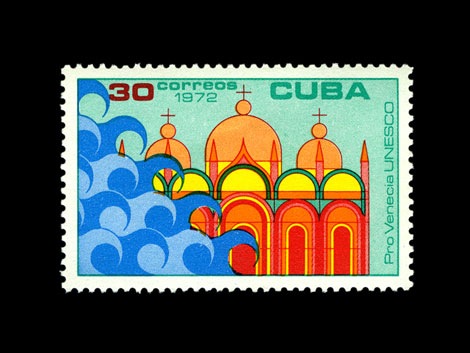
UNESCO Save Venice series. I like the impending danger in this stamp.
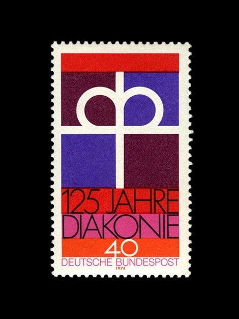
Protestant Church. Just like the clean lines, the type and the colours, a really well balanced stamp.
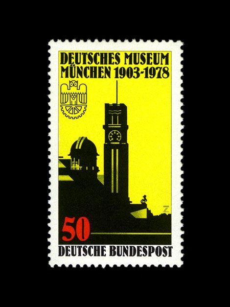
Natural Sciences Museum . Love the colour, love silhouettes, it kind of reminds me of Sin City comics (which I also collect and adore). Most of all I like the stylized bird, it looks like an Owl?
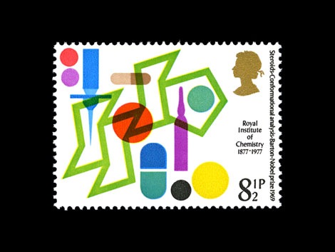
Chemistry, Design: Jerczy Karo. Great shapes and overprinting.
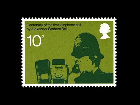
Celebrating the Centenary of the Telephone, Design Philip Sharland. I wonder who he’s on the phone to, he looks serious and very, very British.
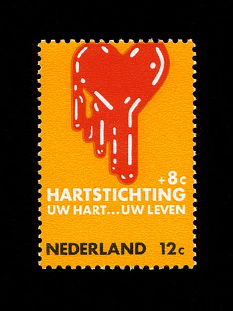
I can’t say why, but I was immediately attracted to these dripping heart stamps.
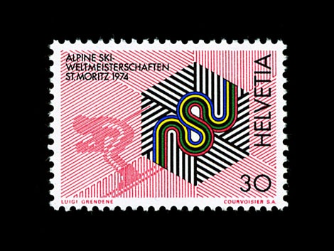
Only found this last week. Great shapes and colour.
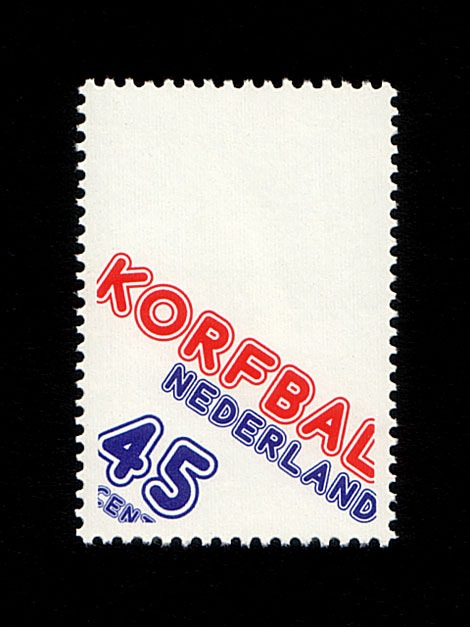
Korfbal. A great sounding word. Lovely type and positioning.
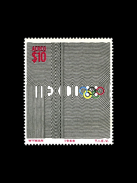
A classic design, nuff said.
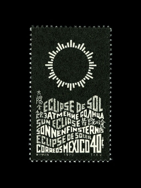
A really cool eclipse diagram and type.
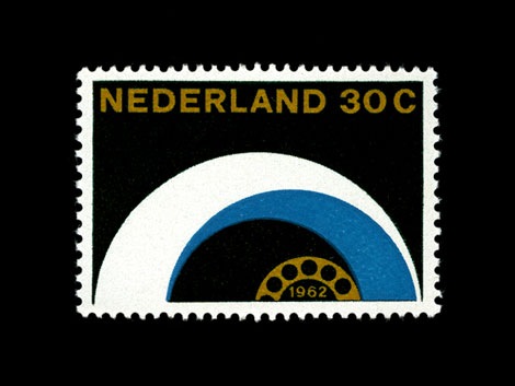
Another popular stamp theme ‘telecommunications’, this is a nice example from the Netherlands. Design by Otto Treumann.
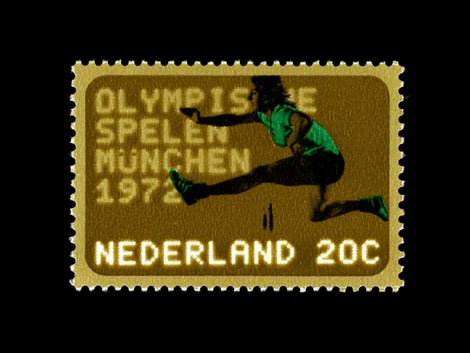
My scan doesn’t do the colour justice and the type almost glows out of the brown.
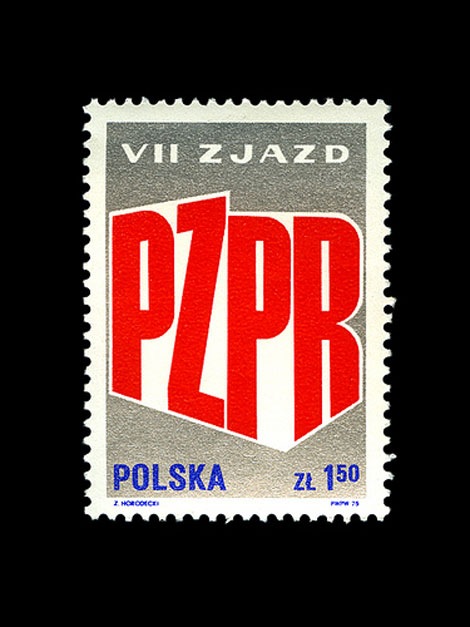
Another stamp I can still remember from way back when I was growing up. Nice Metallic Ink
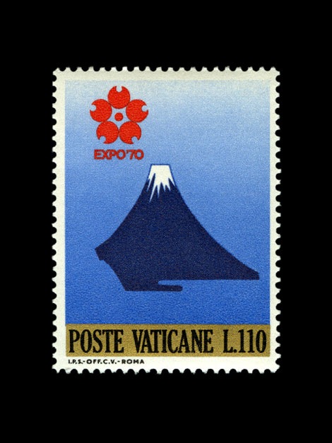
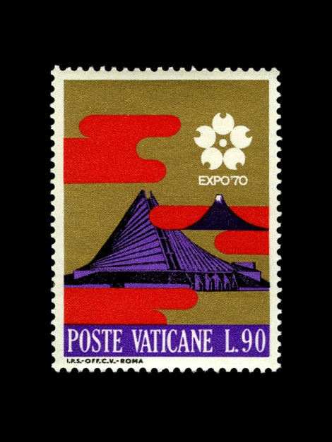
These stamps are printed with a metallic gold and the printing and colour is great, clean and vibrant.
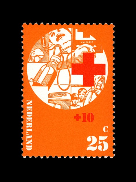
Red Cross set for the Dutch PTT.
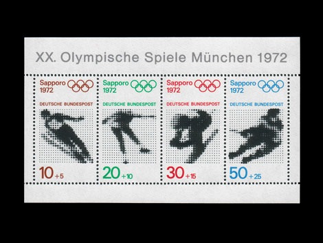
A beautiful set, one of the nicest I have found, great halftone images and typography.
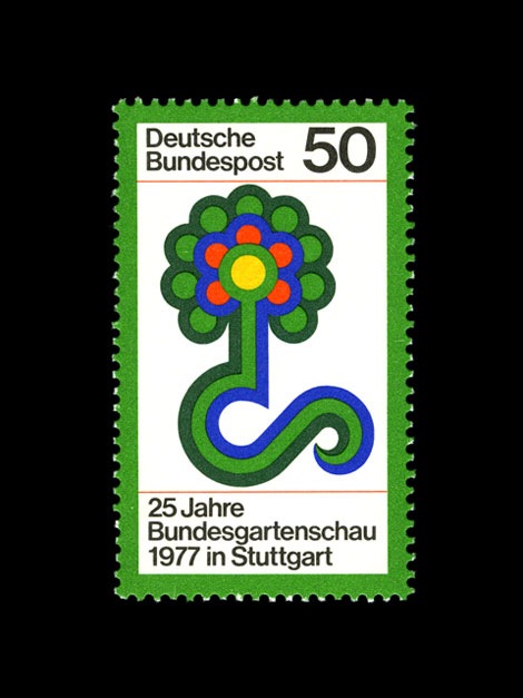
A beautiful graphic illustration of a flower.
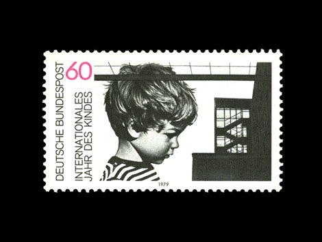
Shame this child looks so sad, because the stamp is so good.
You can see Iain’s full online collection at:
www.flickr.com/photos/adapt-or-die
——————————————————————–
Background info:
After graduating with a degree in Graphic Design at Nottingham Trent University Iain worked for 8 years as a Graphic Designer and Art Director at Un.titled. He left Un.titled in January 2008 to set up Six, a new, independent creative consultancy, providing design and art direction for brand, print and screen.
Iain is also the founder of creative brand Adapt or Die under which his personal work is showcased. Through Adapt or Die he collaborated alongside Darren Firth (WIWP/Six) to co-design the TWO FACED book and exhibitions at Agnes B’s librairie galerie in Hong Kong, and at COSH in London in 2007. By the way check out Darren’s new project ‘Now Showing‘ opening this month at COSH in London.
We’d like to thank Iain for sharing his collection with us.
Please check Iain’s work out at:
Web – http://www.madebysix.com
Blog – http://madebysix.wordpress.com
——————————————————————–
For those of you who can’t get enough of well designed stamps, join us in our Modern design stamp group.
Enjoy reading this post? Sign up for the grain edit RSS feed and we’ll keep you up to date with all the latest grain edit content.
05.20.08 in Uncategorized by Dave
Share on Facebook


