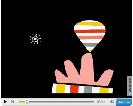
Zoudov – animated film

zoudov - french animated film short

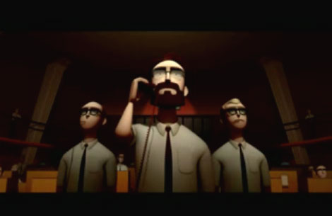
Many thanks to Laurent for sending me this animated short. After watching it, I couldn’t believe that it’s a student film. It looks like something straight out of PIXAR. Laurent mentioned that films, cartoons and design from the 1960s were the inspiration for the project. Excellent animation and great use of James Bond soundtracks to set the atmosphere.

View Zoudov on Youtube or check it out on the official Zoudov website.

Have a great weekend everyone!
Speaking of which, after getting a tip from my friend Wes I decided to rent “King of Kong”. Thats on the playlist for the weekend. Anyone else seen this?

Penguin books – Book cover design

Penguin book cover design
1960s penguin book covers

Things magazine..wheew sweet mother! They have put together a kick butt gallery of penguin book covers. Includes beautiful covers overseen by Jan Tschichold as well as the late typographer Hans Schmoller. My favorite years are between 1961-1972 when Italian art director Germano Facetti was in charge of design. Facetti enlisted Polish graphic designer Romek Marber to redesign the look of the Penguin series and the rest is history.

Side note: Watched Jules Dassin’s Brute force last night. Great Flick. I also recommend Riffifi which was directed by Dassin as well.

(via Ace jet 170)

Eames presents Saul Bass solar energy film

modern graphic designer saul bass solar energy film

Eames demetrios, grandson of Charles and Ray Eames presents a rare glimpse of the Solar Film produced by graphic designer Saul Bass. The film was commissioned in 1980 by Robert Redford. If you listen at the end of the film you can hear Saul Bass speak for a few seconds. He mentions something about pumping hot water to the house.

I’m not sure if the illustrations/ animations in the film were created by Saul Bass or Art Goodman. The film credits Goodman, but it is unclear if he was just involved in the animation process or if he created the illustrations as well.

Cool film and as one person mentions in the later half “If you stop and think about it, the Sun doesn’t send you a bill each month”. So true my friend.

Can’t get enough of Saul?
check these out:
Henri’s Walk to Paris – children’s book illustrated by Saul Bass
San Francisco International Film Festival poster
Saul Bass’s Case study house

Mid Century modern stamp and label group

bulgarian_stamps-design.jpg

Grain Edit is proud to introduce the Mid Century Modern Sticker, Label and Stamp club.

This group features Stickers, Labels and Stamps from the mid 1950s to the mid 1970s.

This would include: vintage matchbox labels, buvards / blotters, luggage Labels, airline labels and stickers, first day covers and stamps.

We are particularly interested in Eastern European match box labels ( czech republic, hungary, yugoslavia, russia etc.) Airline labels + stickers from Swiss Air, Boac, Braniff, Air France, Air India, SAS, CSA , Sabena and Varig and French Buvards ( especially ones by Herve Morvan, Raymond Savignac and Lefor Openo).

Special thanks go out to David McFarline for submitting the stamps shown above.

Otl Aicher design on Flickr

otl-aicher-olympics-2.jpg
1972 Olympics rowing regulations booklet

Tons of great work in the Otl Aicher design group on Flickr. Includes posters, brochures, books, stamps, packaging, corporate reports, even a wooden version of Waldi the 1972 Munich Olympics mascot. Projects include the 1972 Olympics identity, Lufthansa and work from his days at HFG Ulm.

Clean, minimal, modern.. I love it. I could look at this stuff all day.
Many thanks to Adam for passing this link along.

Side note – got some cornbread today. Man I love this stuff. Is it even bread? Its like muffin cake.

Citroen brochures

citroen-brochure-1.jpg

Jose B has put together a nice collection of Citroen brochures at his website citrobe.org. I’m not a huge fan of the actual car, but I do love these brochures.
citroen-brochure-2.jpg
citroen-brochure-4.jpg

Paul Rand animated video

paul_rand_video.gif

“A work of art is realized when form and content are indistinguishable. When form predominates, meaning is blunted; but when content predominates, interest flags. But the genius comes in when both of these things fuse.” – Paul Rand

Wise words from a design genius. The Paul Rand video above is filled with nice little quotes like this. The video also brings to life some of his well known logos and illustrations. Who wouldn’t want to see Sparkle and Spin animated? nuff said

100 years of Bruno Munari

bruno_munari-alphabet.jpg
Today is Bruno Munari’s birthday. If he was still alive, he would of been 100 years old. What better way to celebrate then to browse through the Bruno Munari image archive put together by the Collezione Bruno Munari. The collection includes information on most of his projects created during his highly prolific career as a designer.

317 Dutch posters – Heck yea!

dutch_posters.jpg
Its funny, I actually counted all the posters just so I could have a number for the headline. I most likely miscounted, but oh well on to the post. Nago has put together an amazing Dutch poster gallery for you to see. Includes works from Total Design (Wim Crouwel), Otto Treumann, Pieter Brattinga, Otto Treumann, Willem Sanberg, Ben Bos, Jan van Keulen and others. The website is based in the Netherlands so if you can’t read Dutch just click on the pretty pictures.

Hello, I’m a banana

rita_chao banana.jpg
I think I found the inspiration for the yellow jumpsuits in Wes Anderson’s classic bottle rocket film. Its right here in Tofu magazine’s online gallery of 1960’s Asian record covers. The gallery features records from Singapore, Hong Kong and Macau between 1964-1969. There are some killer examples of Asian pop psych and beat, although mostly covers of American songs from that time period. Be sure to check the audio clips, because who wouldn’t want to hear Rita Chao’s “Yummy Yummy Yummy“?

Page 2 of 3123