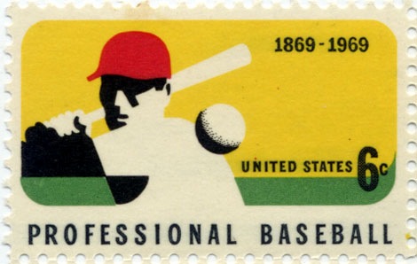
1960s vintage postage stamp – 100 years of baseball

vintage us postage stamp 1969

stamp commemorating 100 years of Professional Baseball c 1969 – printed on a Giori press.

One of my favorite stamps from the US. It all works for me, the use of negative space, the colors, and the 6 cent price tag. Makes me miss the days of buying big league chew at the candy store and watching TWIB.

Also worth checking:

vintage modern stamps from Israel

modern sticker, label and stamp club

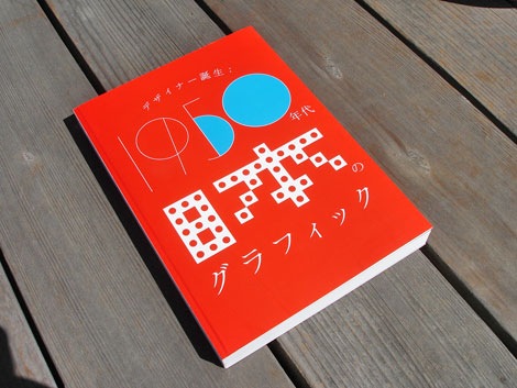
Japanese graphic design in the 1950s exhibition

1950s japanese graphic design exhibition

1950s Japan: The blossoming of the graphic designer exhibition book

1950s japanese graphic design exhibition

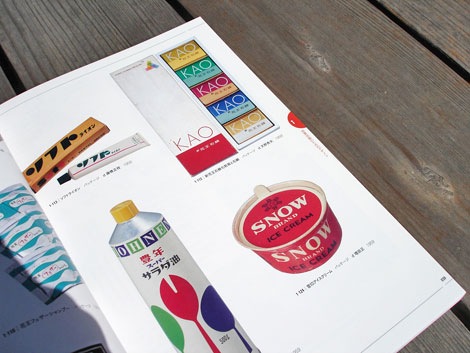
Packaging –  Honen salad oil – design by Kenji Ito 1959, Snow ice cream -design by Tadashi Masuda 1959, KAO soap – design by Hideo Amano 1958

(more…)

Airline memorabilia – vintage playing cards

british airways playing cards

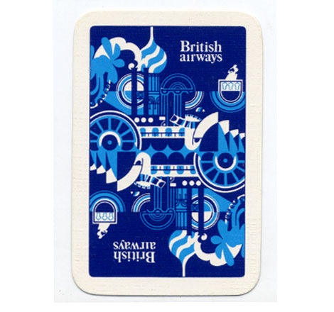
British Airways standard playing cards – 1970

Woah, British airways on acid! Anyone know who designed this deck of cards?

Aldo Novarese – Recta Sans Serif Typeface for Nebiolo

Aldo Novarese recta san serif typeface

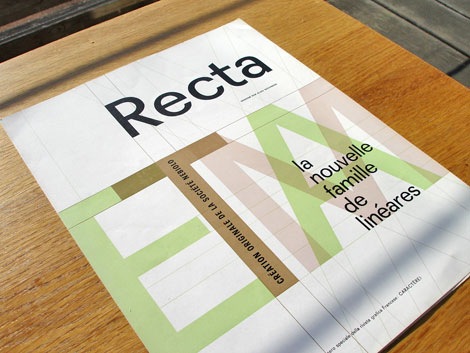
Aldo Novarese – Recta Type Specimen sheet circa late 1950s/ early 1960s.

Beautiful san serif typeface by Aldo Novarese. He designed Recta in 1958 while serving as the art director at the Nebiolo type foundry (Societe Nebiolo Torino) in Turin, Italy. Novarese is well known for designing the modern typeface Microgramma, which later became Eurostile.

In the pictures below, you can see a few examples of the 21 fonts that were included in the Recta font family.

(more…)

Vintage luggage label from Norway

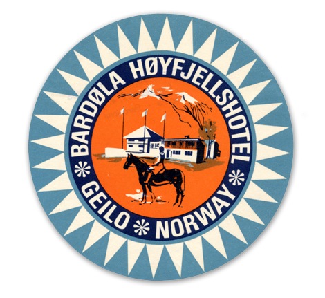
Vintage luggage label from Norway

Label from Bardola Hoyfjellshotel in Geilo, Norway – c1960s?

I think I’m obsessed with modern Scandinavian design from the 1950s- 1960s. First it was furniture and kids books, then Ceramics and now luggage labels! Where does it end? What’s in that Nordic water?

also worth checking:
Swiss Modern luggage label
Modern luggage label from Portugal

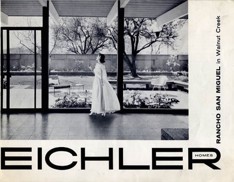
1950s Eichler modern homes brochure

Eichler Homes brochure
Brochure for the Rancho San Miguel (Walnut Creek,CA) Eichler development c1950s

In honor of the upcoming Birth of Cool: Mid-Century Modern design in California exhibition, I thought it would be nice to post this Eichler brochure. I found the brochure several years ago at an estate sale in Lafayette, California. I love the photo. Most likely the photographer is Ernest (Ernie) Braun.

Richard Erdoes – Childrens book illustration

[pictobrowser 10159078@N03 72157604770297324]
Richard Erdoes – Policemen around the world c1967

Richard Erdoes was an author and illustrator. He was born in Vienna, Austria in 1912 and later immigrated to the United States. The book above is one of a 3 part “around the world” series. The other two books were Musicians of the world and Peddlers and Vendors of the world. Both of which, were produced around the same time in the late 1960s.

It looks like Erdoes’ used a combination of Pen/ Ink and gouache to achieve the finished look found in the images above. This reminds me of the work of Miroslav Sasek who I believe used gouache as well.

Many thanks to grain edit reader Thorsten Schmidt for sending the following Richard Erdoes link in:
Richard Erdoes magazine illustration

You can pick up a copy of Policemen around the world at Amazon.

—–

Also available for your viewing pleasure: Ryohei Yanagihara

Enjoy this post?  Sign up for our tasty free grain edit RSS feed.

—–

Dutch Typography – Lettergieterij Amsterdam typefaces

[pictobrowser 10159078@N03 72157604685532108]
Vette Annonce type specimen sheet late – Netherlands 1950s/ early 60s

Happy Wednesday! It’s been a while since I’ve posted any type specimens, so I figured it was time to post this gem from Lettergieterij ‘Amsterdam’ (Amsterdam Type Foundry) which was founded by Nicolaas Tetterode. The specimen is a tri-fold that opens to reveal an 11 X 17 sheet. I’d love to know more about Tetterode, ATF, and this typeface. Can any of the typographers out there fill in the blanks? Has Vette Annonce been digitized? I believe “Vette Annonce” translates to “fat advertisement”. With that in mind, is “Vette Annonce” even the name of the typeface?

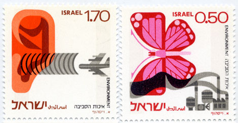
70s modern stamps from Israel

Rare 70s modern stamps from Israel
Israeli environment stamps – 1975 designed by Eliezer Weishoff

Beautiful stamps addressing both noise and industrial pollution.
Be sure to check out this modern stamp from Israel as well.

Syd Mead concept illustrations for US Steel

[pictobrowser 10159078@N03 72157604562347640]
Concepts – Promotional book for US Steel c1961

Industrial designer / illustrator Syd Mead is well known for his vehicle designs and backgrounds for classic science fiction films like Blade Runner and Aliens during the 1980s. Long before these projects, he produced a series of conceptual illustrations and paintings for US Steel. The futuristic automobiles, diagrams and environments were published in several promotional books during the early 1960s.

These books are intense to look at. The full page spreads are over 2 feet wide and heavily detailed. Keep in mind when viewing the images above, that this work is very early on in his career, as he had recently finished his studies at Art Center in Pasadena.