Mike Cina Interview
Today we’re excited to announce a new series of process related interviews with our favorite artists and designers. In the first installment we head to to Minneapolis, MN, the home of Michael Cina who is an award-winning creative director and skilled artist. Bridging the gap between music, photography, art and design, he creates work that is innovative and often unconventional in its approach. Here Mike discusses the role of intuition in design, his workflow for a recent Ghostly International project, his passions outside of the studio and much more. Enjoy!
You run a small studio. What do you enjoy about being on your own, as opposed to the design firm environment?
When I started to look for jobs after college, I was curious what it was like working for a firm. I interviewed almost every agency in the Minneapolis area and made up my mind that I would eventually do my own thing. Early on, I recognized that my interests and ideas were different from the norm. I enjoy a wide variety of work, especially drawing logos, making typefaces, fine art and projects that require a different approach.
To make that happen, I had to have the ability to choose what I wanted to work on and who I wanted to work with. Being able to work on many different types of projects stretches my thoughts and abilities. I am very thankful to work with the people and clients that I have. Most people want to put you in a box, so when you don’t fit that mold, they don’t know how to use you.
One of the other things that I enjoy most is having an open schedule. I can manage and work on projects around as I see fit. Somedays I focus on one project for most of the day and make some great progress. Normally I juggle and work on 5 or 6 projects a day.
How important is technology to your creative process? Are there particular tools that play a significant role in helping you bring your ideas to reality?
The internet has defined my career. I was able to cut my teeth making design for the web early in 1996. It afforded me the freedom to have clients from all over the world. I also started a “remote” design studio in the early 2000’s with someone from another part of the United States.
When I went to college, my professors taught us how to create design without using a computer. During college I bought my own computer and taught myself how to use these applications/tools. It fit like a glove for me and I knew this was what I was supposed to do, even though my college professors told me that I was not well-suited for design.
Adobe Illustrator is my favorite application hands down. I start almost every design I do in there, from websites, to books, to typefaces… I use it every day. It is more of a ‘blank canvas’ for how I work and what I work on. Simple things like Dropbox have made my life so much easier. I work from two locations so it is infinitely easier to do that now.
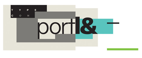
Identity work for TypeCon: Portl&
How has your process evolved since you first started designing?
My process changes depending on what kind of jobs I am working on. I am constantly looking at how I work and how I can improve my workflow. When I was younger, I used to have a formulaic process where I would put all my projects through that structure. Now I have many ways in which I work and approach a problem. I use my past experience and gut to tell me how to approach a situation. Each project requires a different solution, so why should I apply one approach to them all?
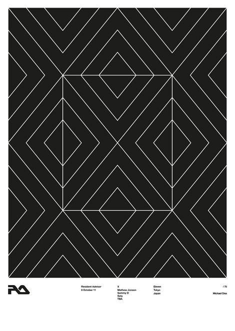
Resident Advisor ten year tour poster
Could you walk us through a project? I would love to see how you approached your recent work for Ghostly International’s SMM Compilation.
The SMM series is a music compilation that is curated by Ghostly’s studio manager, Jeff Owens. He is normally the mediator between myself and the bands, so it is a funny twist that he is the client. As he was working on picking the tracks, he would send me songs and ideas for the album title. We had a lot of emails and conversations about topics such as over consumption, politics, food, and alternate ways of living. The name of the LP fit the tone of the tone of the music but also the concept perfectly.
I did many partial days of researching consumption and opium. As I searched, I kept finding more information. I was struck most from the photos of people who were starving to death while smoking opium. After looking at all the images and putting the puzzle pieces together, I felt that there were some great connections to be made. It felt like I had to create a narrative to tell this story, one image couldn’t pull the weight.
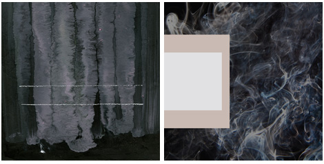
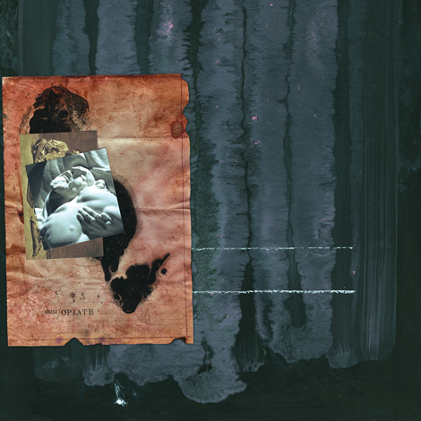
The composition for the cover was stuck in my head for months. I knew I wanted to combine 3 or so images on the cover and obscure them to some degree so you had to look deeper. The first image I started with was the paper. I artificially aged an old piece of paper, printed it out, did the lettering over it and burned it some. The black represented heroin tar. From there I searched for some old pictures of opium addicts. I collected a folder full of them and picked the ones that I felt best fit. Then I wanted a picture that represented death and life. This was the hardest to think of and it stumped me for days. I remembered a photo I took a long time ago from a statue when I was visiting Notre Dame. It struck me because it was a person holding up and caring for someone that is dying or dead. Life in the face of death if you will. The painting in the background is one of my paintings. I had done some paintings specifically for the background of this cover, but this one just fit perfect.
Early Concepts for the front cover
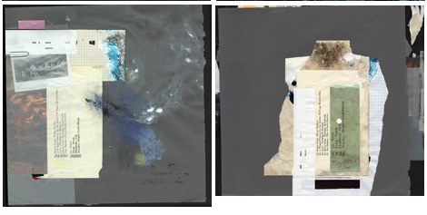
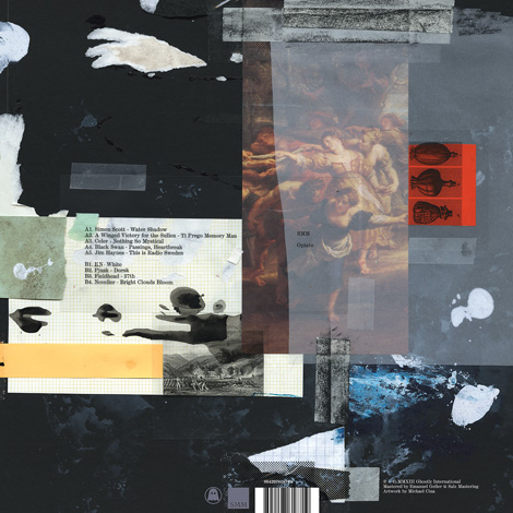
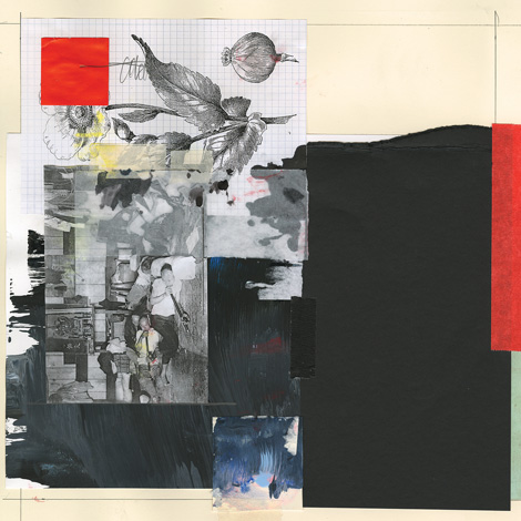
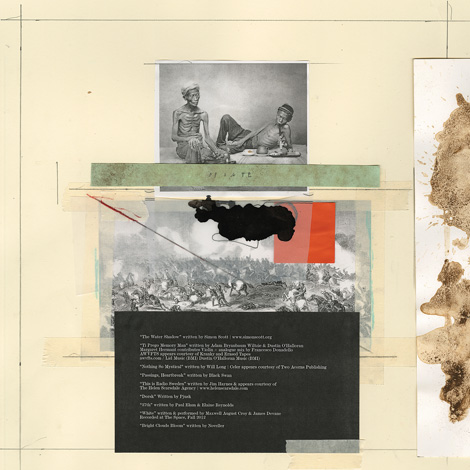
The rest of the package I had no idea what I was going to do though. I was stumped on this also for a while. I had a long time to think about it, too much time actually. When I get stumped, I just start making work. So I got a lot of paper and started weathering it with random techniques and started assembling a stack of images that I felt was applicable to the narrative. One day I was inspired and started making all of these collage pieces. The black board on the back of the cover is from a presentation I did in 1994!
Early concepts for the back cover
To create this cover I used Illustrator to sketch some initial ideas for the cover, draw some type, and then to layout the final package. Most of the package was done with collage, then scanned in and color corrected with Photoshop. I had to add and edit some text in Photoshop for some last minute changes. Now that is fun!
Final front cover
Final Back Cover
Inside Panel A
Inside Panel B
I appreciate your ability to work in a broad range of styles and mediums. I often find that you push the limits of what design can be. Are there any materials or techniques you’d like to explore further?
I am a huge fan of all things design. When I look at my work in the context of design history, I feel like I don’t fit in the mold. I don’t have a specific style or niche and I use anything to communicate. Learning new ways to think and work expands my visual vocabulary, so I can say something in a unique way for a project. I want to go a lot further with new ideas and mediums.
I have wanted to experiment with 3D printing since I first heard of it. I had some ideas at one time but forgot them all. Maybe I will do something next year with this. Over the last two weeks I have been messing with filming an idea for a video. I would like to do some larger paintings and do an installation.
There is one project that I have been working on for six months with a friend and it is a new “look” that I have not shown anyone yet and I have not seen work like this ever, so I am keeping it close to my chest. I want to unveil it in either a gallery, a fashion magazine or a big client commission. The project has visual ties to the fashion and art world. It is very exciting to me. We have one gallery already interested but I want to think very big with this idea.
I have been fortunate enough to work with some clients that are open to letting me “take risks” with their brand. So many people want what they have seen before, it’s comfortable. Why I love design so much is that I have the opportunity to push myself in these different directions to see what happens. I would like to continue to work with larger budgets/projects with companies that want to say and do something unique.
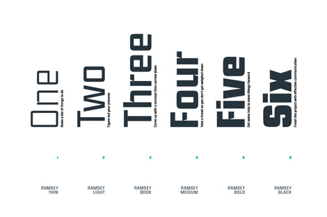
Ramsey font
How much of your work is based in observation vs fantasy? Does “chance” play a role?
Observation is very important to me. I don’t see myself having much to do with fantasy, but I do have a fascination for the unseen. When I see something that interests me, I try to understand why I like that particular thing. Is it the color, form, shape, composition, texture, etc? Design uses different languages to speak (semiotics is one of them), so it is essential to me that I understand how to say things visually. A lot of my process is figuring out how to speak visually through a solution.
Chance also plays a big role in my work. I have always learned best through “accidents.” Early in my career, I noticed that “mistakes” (early in the creative process) can be a huge asset. So I have tried to incorporate making mistakes into how I work. Eventually, you learn how to make calculated errors. After the initial creative process there is less room for making these kind of mistakes.
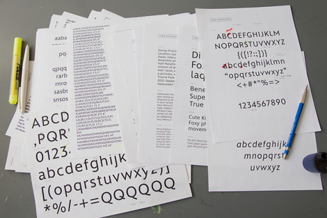
Early development on Matterhorn typeface
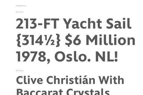
Matterhorn typeface
Analytical tools are now ubiquitous and because of this designers are often asked to back up their work with data and research. With this in mind, how much of your work is based on intuition and what role should intuition play in design today?
Facts and details are crucial to any project. I try and find out as much as I can about a project and I often will write up an overview of the essential ‘themes.’ From there it is all intuition. After all of these years designing, you develop what I refer to as your gut (intuition). Western cultures, as a whole, are extremely analytical and Eastern cultures value intuition. I feel that there is a middle ground where if you understand something well enough, you can then use your informed intuition to help guide the process and be open to change. I change things up all the time.
I am interested in critical thinking and economics. I am reading a couple of books right now on these subjects so I can understand these topics more. One of the books states that intuition is is a form of your subconscious processing information. I see design a lot like being a jazz musician. You have to learn about the basic fundamentals, notes, chords, technique, memorization, etc. Once you learn all of these things you don’t have to process that information anymore, it is natural to you. Then you can begin to do things like improvise and make quick decisions based on what you are hearing your other bandmates playing. I think it creates more room for emotion to enter the process. I approach art and design in a similar way. Especially art.
What are your passions and interests outside of design and why?
I have a lot of passions and interests and I love to learn about new things.
Records. I am a music addict and I collect vinyl. It has turned into a bad habit that I am trying to regulate.
Design books. I have been collecting them since the early 90’s.
Family. I have been blessed with two children and an amazing wife.
Non Fiction. I love audiobooks. I can listen to them anywhere and sometimes when I am working on mindless things.
Education. I am passionate about helping others through mentorships and sharing my experience and knowledge. I have been considering teaching lately.
Faith. I try to become closer to God and positive to the world around me.
Cooking and Food. I have always loved cooking. One of my dreams is to open a restaurant but I know the reality is different than the dream. I don’t eat processed food anymore so I have to cook almost every meal I eat. It is a lot of work!
Art. Art has always played a role in my life in one way or another. I have been messing around with no direction lately. Next month, I will be showing three new works on metal in a small group show.
——
We would like to thank Mike for taking time to share with us. You can see more of his work at michaelcinaassociates.com.
This interview is part of the #designinprocess series brought to you by Adobe. Read all of the interviews here and follow along on Twitter and Pinterest at #designinprocess and #newcreatives.
——
Also worth viewing…
Mike Cina Mix
Type Picks
Old & New
Not signed up for the Grain Edit RSS Feed yet? Give it a try. Its free and yummy.


