September 2017

You are currently browsing the monthly archive for September 2017.

Icinori

Icinori

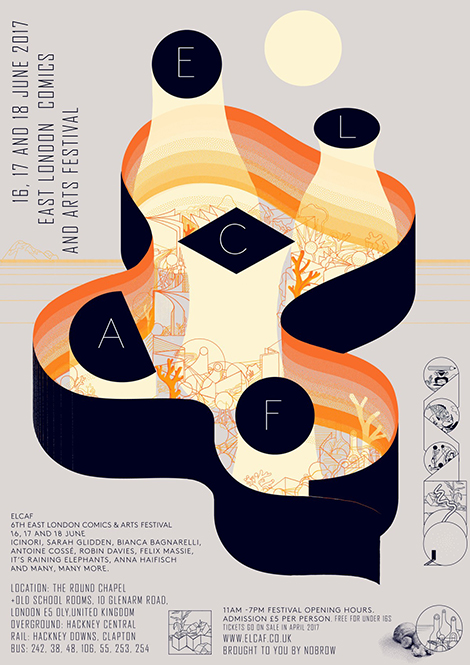
Icinori is the moniker of the design and illustration team Raphael Urwiller and Mayumi Otero. Since 2007, the duo has collaborated on drawings for advertisements and editorial pieces. In addition to their commercial work, they focus on Icinori Publishing, a non-profit that has produced over 30 books and a large collection of prints. Utilizing limited color palettes, speckled shading, and fluid line work, their books illustrate original stories and traditional folktales. To get your hands on their gorgeous products, make sure to check out their shop.

Read the rest of this entry »

Shrimp Chung

Shrimp Chung

Shrimp Chung is a graphic designer by day and DJ by night. She combines her two passions by crafting promotional materials for Seoul’s vibrant music scene. I’m particularly fond of her work for the fourth annual AMFAIR Showcase, a celebration of Korean electronica. To advertise the event online, she created an animated poster that features unique letterforms made of record sleeves. The poster’s smaller text is also quite striking. She replaced the letter O with large circles that resemble the vinyl albums spun by DJs. To see the poster in action, along with her other animated designs, make sure to visit her site.

Read the rest of this entry »

Francesca Sanna

Francesca Sanna

Francesca Sanna is an illustrator and author who illuminates serious issues in a welcoming and endearing way. Through her book and side projects, she tackles subjects such as immigration, education, politics, and body image. Her drawings have a strong sense of narrative and feature lovable characters that confront their battles with strength and positivity. Her recent masterpiece is her book The Journey. With simple sentences and enthralling illustrations, she tells the story of a young family who flees their country to live in a safer area. The book’s fantastic imagery and clever use of color beautifully teaches children about the emotions and struggles that refugees often encounter.

Read the rest of this entry »

A’ Design Awards & Competition – Call for Submissions

A'Design Awards
Chris Cran Exhibition Catalogue by Stefan Canuel, RGD

Do you have a design, photograph, or rendering that you are really proud of? Submit it to the A’Design Award & Competition! The renowned event is held in Como, Italy and accepts applications for both conceptual and realized projects. Organized into 100 categories, the competition judges all areas of design including PrintVisual CommunicationPackaging, and Photography. Entries will be reviewed by a respected panel of designers, academics, and members of the media from countries around the world. In addition to the A’Design trophy, winners will receive marketing assistance, certification support, and other services to help advance their careers. Whether you are a student or a professional, don’t miss this chance to share your work with the international design community. Register now before the upcoming deadline.

Read the rest of this entry »

Recently Received

Release the Hounds

We’ve recently added a ton of great books to our shelves including titles from Princeton Architectural Press, Rizzoli, Laurence King Publishing, Thames & Hudson, and more! See them all after the jump. Enjoy!

Read the rest of this entry »

Fanette Mellier

Fenette Mellier

Brimming with bright hues and bold forms, the work of French designer, Fanette Mellier, is hard to ignore. I’m especially drawn to the identity system she crafted for Frac Aquitaine, an art museum in Bordeaux. At its center is a logo made from a reflected “A”. This emblem resembles the arrows of a compass and guides the viewer’s eye throughout the documents. It is also used to mark gutter folds in brochures, separate paragraphs, and is often superimposed over photos.

Read the rest of this entry »

Good Apples

Good Apples

Good Apples crafts brand identities and digital experiences for a wide breadth of clients. Especially impressive is their collaboration with OZO Coffee Company in which they developed the visual identity and packaging. After modernizing the brand’s logos, typefaces, and color palettes, the studio created over 50 pictograms to represent the different qualities of the roasts. These symbols are gorgeously displayed on merchandise, apparel, and packaging. I’m particularly fond of the animal icons that signify the regions from which the coffee originated.

Read the rest of this entry »

Luke Lucas

Luke Lucas

Luke Lucas is a talented typographer whose lettering has graced the covers of magazines, the walls of office buildings, and everything in between. From old style serifs to 3D scripts, he’s tackled numerous styles and often utilizes fun textures to give a unique personality to each piece. I am especially impressed with the details within his compositions. His dynamic shading and line work add a gorgeous layer of depth to his letterforms.

Read the rest of this entry »

Studio Makgill

Studio Makgill

Studio Makgill crafts beautiful work that is deeply inspired by their clients’ passions. While crafting the identity for the brewery Wiper and True, Makgill noticed the company’s fascination with nature and the biological process of fermentation. This motivated them to create a packaging system that depicts examples of how humans have used nature to their own advantage. The bottles feature illustrations of elephants performing at circuses, hot air balloons floating in the wind, and much more.

Read the rest of this entry »

Page 1 of 198123...Last »