August 2017

You are currently browsing the monthly archive for August 2017.

Siobhán Gallagher

Siobhan Gallagher

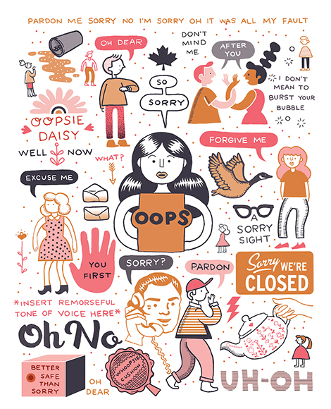
Siobhán Gallagher’s wit and charm shines through her personal illustrations and self-published zines. Her hilariously relatable comics and writings depict the struggles of awkward social interactions, big city living, and modern tragedies such as accidentally liking a crush’s old Instagram photo. This knack for successfully translating contemporary strife has led Gallagher to create editorial illustrations for prominent publications such as MIT Technology Review and Bust. Her collaborative efforts with illustrator John F. Malta are also quite impressive. Together they’ve edited an anthology of apocalyptic art, titled Till Doomsday, and published two editions of their zine, We Out Here. To get your hands on Gallagher’s work, check out her new book, In A Daze Work: A Pick-Your-Path Journey Through the Daily Grind, which was released this July.

Read the rest of this entry »

Top A’ Design Award Winners

Daeki Shim, Hyojun Shim

Between the first show Poster by Daeki Shim, Hyojun Shim

The 2018 A’Design Award & Competition is now open for submissions. The prestigious event features over 100 categories and will be judged by a panel of esteemed designers, scholars, and members of the press. In addition to receiving the A’Design trophy, winners will obtain career development services, invitations to exclusive design clubs, and other great prizes. The contest accepts applications for realized and conceptual projects from students and professionals. Register now to participate.

For today’s post we’ve highlighted a small sampling of past winners, including favorites from the Packaging and Print categories.


Read the rest of this entry »

Masquespacio

Masquespacio

Masquespacio is an award-winning creative consultancy that focuses on graphic and interior design. Their skill for integrating the two art forms is especially evident in their collaboration with the furniture company Missana. To celebrate Missana’s 20th anniversary, the studio revamped the brand with contemporary colors, materials, and textures. These elements were incorporated into the website, catalog, and a new line of furniture called The Novelties Collection. To display the new assortment of products, they designed vibrant exhibition spaces like the one seen above. Finally, Masquespacio crafted The Toadstool Collection, their own line of furniture that features mushroom-like seats, a table, and a sofa bench. The pieces were highly inspired by the Memphis movement of the 1980s and the architecture of Michael Graves.

Read the rest of this entry »

A Practice for Everyday Life

A Practice for Everyday Life

A Practice for Everyday Life is a London-based studio founded by Kirsty Carter and Emma Thomas. Since 2003, they’ve crafted sleek and sophisticated designs for a variety of clients including schools, exhibitions, and fashion brands. I’m especially smitten with their work for Drawing Futures, a conference focused on speculative drawing and its connection to architecture. While branding the event, the studio created Lining Gothic, a custom typeface with squared-off angles. The typeface’s unique attributes accentuate the strong structural nature of the wordmark and its resemblance to an architectural drawing.

Read the rest of this entry »

Werklig

Werklig

Werklig strives to design with purpose and create brands that are “built on truth, not fake stories”. One of my favorite brands they developed is Suomen Jäätelö, a Finnish ice cream company. Especially impressive is the packaging: an unconventionally shaped tub that is covered in a striking pattern. The marbled nature of the graphic is inspired by the perfect elasticity and thickness of the ice cream. It connotes the smooth frostiness of the product and also gives the brand a modern and playful personality.

Another great packaging project is their bottles for Galipette, a French apple cider. The roundness of the bottles and labels are inspired by the company’s name, which translates to “somersault”. Wanting to allude to the rural history of cider and attract an urban audience, Werklig utilized both traditional and contemporary typefaces to craft labels that are “distinctly French and elegant but with a modern twist”.

Read the rest of this entry »

Bohuy Kim

Bohuy Kim

Bohuy Kim is a Korean graphic designer who runs the studio Odd Hyphen. A strong believer in creative experimentation, he regularly pursues self-initiated projects such as the poster series Visual Impact. In this collection, he plays with unique typography, 3D illustration, and distortion techniques to explore subjects such as concealment, text, and the vicissitudes of patterns. Many of these elements are also present in his promotional posters for the Goopang art group where he employs abstract compositions and neon color schemes with striking effect.

Read the rest of this entry »

Perky Bros

Perky Bros

Perky Bros crafted a quirky identity system for Forgotten Boardwalk Brewing. Inspired by beachside folklore, the beer’s packaging illustrates legends of pickpocketing magicians, the invention of the funnel cake, and more. Hidden within the imagery are humorous details and cryptic messages that are a joy to discover as you sip the contents of each can. Sitting front and center is the brand’s mascot; a mystifying three-eyed cat that serves as an ode to the notorious feral felines that lived under New Jersey’s piers.

Read the rest of this entry »

Raffinerie

Raffinerie

Raffinerie is an award-winning design studio based in Zürich. A favorite project of mine is their collaboration with the Solothurner Film Festival. Building from an established visual language, the studio developed a flexible identity system that they adapt each year. For this year’s event, they created a comprehensive campaign that included posters, invitations, and a program booklet. The promotional pieces highlight the festival’s energetic atmosphere and simultaneously promote its diverse collection of motion pictures. Prominently featured in the materials is a rectangular “O” which represents the screens the movies are projected on. This “O” is manipulated and morphed into a series of dynamic speech bubbles that interact with the film stills featured throughout the system.

Read the rest of this entry »

Anna Hurley

Anna Hurley

I am smitten with Anna Hurley’s illustrations. Utilizing simple forms and limited color palettes, she crafts playful scenes full of charming characters. I’m especially fond of her illustration “Celestial Hair”. Here, she depicts a woman with a flowing mane that contains a bustling coral reef and a starlit sky. This enchanting piece encompasses the wit and whimsicality often found in her work.

Read the rest of this entry »

Erik Kirtley

Erik Kirtley

Erik Kirtley is a Stockholm-based designer with a passion for typography and illustration. He beautifully displays his skills through a poster series titled Random Acts in which he documents everyday activities. With subjects such as “brushing teeth” to the more abstract, each poster has its own unique style, but still retains its connection to the larger theme.

Read the rest of this entry »

Page 1 of 198123...Last »