


Werklig
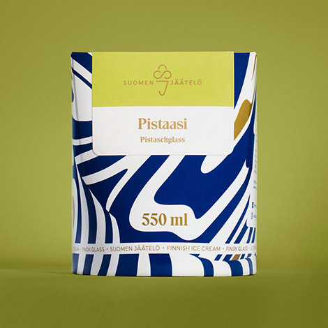
Werklig strives to design with purpose and create brands that are “built on truth, not fake stories”. One of my favorite brands they developed is Suomen Jäätelö, a Finnish ice cream company. Especially impressive is the packaging: an unconventionally shaped tub that is covered in a striking pattern. The marbled nature of the graphic is inspired by the perfect elasticity and thickness of the ice cream. It connotes the smooth frostiness of the product and also gives the brand a modern and playful personality.
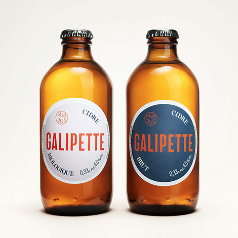
Another great packaging project is their bottles for Galipette, a French apple cider. The roundness of the bottles and labels are inspired by the company’s name, which translates to “somersault”. Wanting to allude to the rural history of cider and attract an urban audience, Werklig utilized both traditional and contemporary typefaces to craft labels that are “distinctly French and elegant but with a modern twist”.
——————–
Also worth viewing:
Savvy Studio
Upland Sour Ales
Super Super
Follow us on RSS, Instagram, Pinterest, Wanelo,
——————–
