Sponsor // The Secret Of Parallax Scrolling Revealed by Webydo’s Code-Free Design Platform
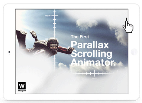
Now available in Beta mode – Webydo’s Parallax Scrolling Animator feature
Few things can make a website stand out from the masses like creating a Parallax Scrolling website into. But what is Parallax? Parallax allows background, middle ground, and foreground elements on a web page to move at a separate rate from one another, which when done properly, creates a 3D effect as the end user scrolls down the page. Long a tool of animators, it took the web design world by storm when it first gained mass attention with in 2011 Nike’s Better World website, and since then has become the go to trending design structure in the arsenal of web designers who need an extra bit of flair to make their sites shine.
Still, despite its evolution from 2D cartoon images and into the mainstream world of web design, Parallax scrolling is something that needs to be used in the proper context in order to really be effective. When utilized as a storytelling device, to engage users interactively, or as a method to enhance the presentation of a product, Parallax Scrolling is a powerful option to create a site and share your brand story.
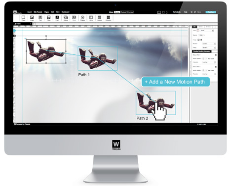
Of course, employing it can be a bit tricky due to the level of code involved and hours on manually writing it to produce such a site. This is why the folks at Webydo, the industry’s leading code-free design platform, are now the only ones to have incorporated Parallax Scrolling into its platform as yet another professional feature at the disposal of the designers creating their clients website on the robust platform.
With that in mind, let’s look at some great examples of Parallax sites, and what makes their design so unique.
1. New York Times Tunnel Creek story
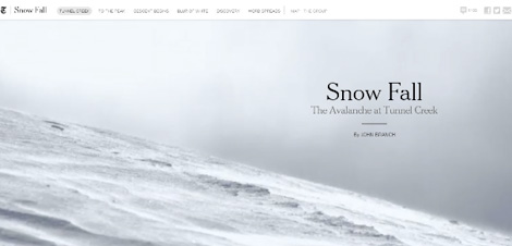
There’s something to be said for saving the best for last, but this is the internet, where attention spans rival those of goldfish, and so I believe in putting your best foot forward. So let me say that this is the most beautiful example of Parallax scrolling that I have yet to come across. In telling the story of an avalanche in Tunnel Creek, a section of the Cascade Mountains in Washington.
Rather than a traditional long form retelling of the harrowing tale with just pictures and block quotes to break up the text, the Times takes you on a journey through the mountains themselves with GIFs, videos, and motion maps, resulting in a one-of-a-kind experience as the read makes his way through the story.
This is, quite simply, the most effective and charismatic use of Parallax-enhanced storytelling I have ever seen.
This is one of my favorite uses of Parallax scrolling, because not only does it make for a perfect example of storytelling, but it also uses the scrolling itself as a method of animation (see how the girl floats down through the picture frame near the top).
On top of that, it’s the perfect medium for Parallax scrolling, because it’s a site that’s done purely as a piece of art for personal friends and family of the couple, thus nullifying one of the biggest drawbacks of using the technique – loss of SEO value due to the absence of click-through pages and meta tags. Jess and Russ don’t care if they’re not coming up on the first page of Google, because they have a perfect memento of their relationship to share with their loved ones.
3. Puma Mobium
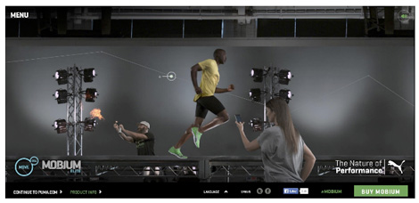
This Puma site is one of the more well-known examples of Parallax scrolling, and for good reason. With photography of a runner making his way through a testing facility, the user can stop along the way to learn more about the product, or to simply marvel at the creativity of the design. Bonus points here for being one of the few examples of horizontal Parallax scrolling, though that guy with the lighter and the aerosol can should probably be a little more careful.
4. Sony
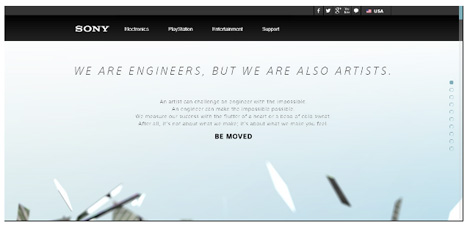
Finally, in the interest of ending on a high note, I leave you with one of the most amazing and unique Parallax scrolling sites out there. Sony’s site promises artistry in addition to engineering, and you’d be hard pressed to argue that this isn’t a perfect example of both. The user is treated to a veritable journey through Sony’s products, design process, and creativity as you move down the page. But frankly, words just can’t do this one justice; you really need to just go and experience it for yourself.
Wrap Up
As you can see, Parallax Scrolling can do more than just add dimension and depth to your site. When used properly, it becomes a vital way to share your client’s story that allows you to truly branch out in awe-inspiring ways, engaging your users in the process and giving them a web experience that they’ll want to come back to again and again.
Along with the rest of their innovative techniques,Webydo’s addition of the Parallax animator into its platform means that its users are now better equipped than ever to create the most beautiful and innovative sites on the web. And with a development team that is never satisfied, you can bet that even more features are coming down the pipeline soon.
Webydo’s parallax scrolling animator is still in closed beta, but you can request an invite here.
——————–
This article is presented by Webydo’s community of professional designers.
Interested in sponsoring grain edit? Visit our sponsorship page for more info.
——————–
Also worth viewing:
Respublika Font
Infographics
Verb Font
Not signed up for the Grain Edit RSS Feed yet? Give it a try. Its free and yummy.
——————–


