Ty Mattson Interview
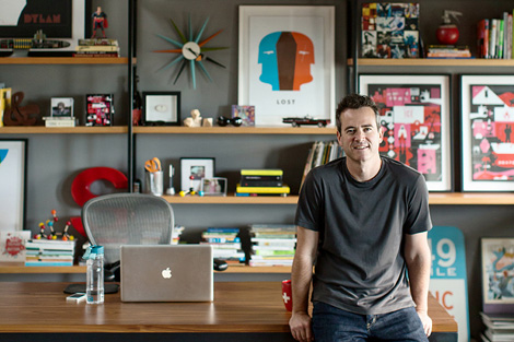
Browsing through the portfolio of Mattson Creative, an award-winning design studio based in Southern California, can prove to be a daunting task. It’s easy to be overwhelmed by the quantity and consistent quality of work. I’ve long admired their expressive illustrative style and am especially smitten with their self-initiated projects for popular TV shows including Dexter, Lost and more recently Breaking Bad. We’ve profiled the studio in the past, but in today’s interview we talk with Ty Mattson, the studio’s founder and creative director.
Tell us a little bit about your background. Where are you from originally?
Originally I’m from your neck of the woods. I was born in Walnut Creek and lived in the Bay Area until I was about 12, then I moved to Southern California.
I was interested in design before I knew what “design” was. I remember getting a birthday invitation in pre-school that was a rebus – a mix of icons and letters to create a message – and I thought it was amazing. I carried it with me in my pocket for weeks. I’ve made art for as long as I can remember – crayons, magic markers, pencils. Lots of Superman. I still have drawings of every character from Star Wars that I made when I was a kid.
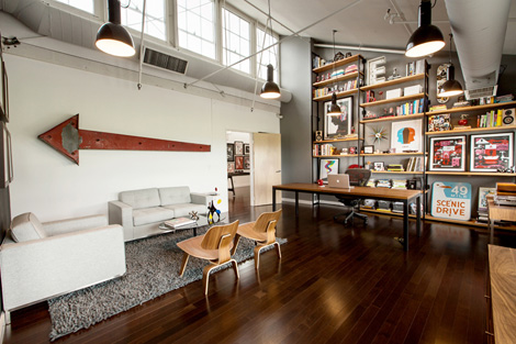
Ty Mattson’s studio
What was your first design gig?
My first design gig…well there were little things like programs for High School plays an things…or employee t-shirts at Disneyland…when I was in college at the University of Michigan I illustrated covers for the Ann Arbor Observer and I designed the logo for the University Arboretum. These projects started out as school assignments, then they became real projects. After school I came back to California and started working for a design firm.
Could you walk us through one of your projects? Please describe your workflow, including the tools, from pen and paper to software and devices.
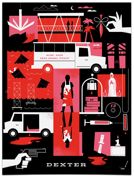
So we do a wide range of things at Mattson, and each type of project requires somewhat of a unique approach. We do a lot of entertainment branding and consumer product packaging, so we create a lot of style guides and branded programs for Nickelodeon, Dreamworks, Discovery Channel and others…so those projects usually have very specific goals and requirements where our creativity is very focused and specific because typically the core brand visual language already exists – so our job is extend it or expand it to various applications like packaging or products, etc. We also do a lot of corporate branding where we are creating and establishing a visual language from scratch. We may come up with a name…create mood boards…then develop logo concepts, followed by whatever else the client needs – stationery, business cards, websites, trade show or environmental expressions. Then we also do illustration – where we might create a book or a series of posters. I have had a lot of fun with these types of projects over the last few years particularly when I get to reinterpret a brand that is part of popular culture. I’ve designed poster series that have been inspired by “Lost”, “Dexter” and “Breaking Bad” that have been embraced by the fans of those particular programs.
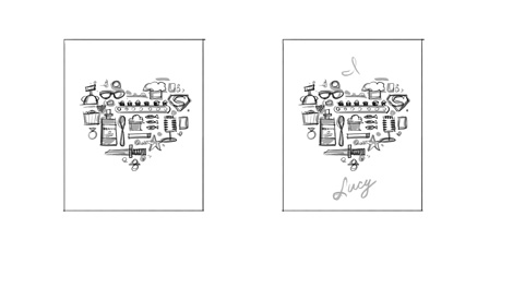
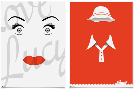
CBS called and asked me to do a series of prints inspired by their classic shows. They were looking to decorate their new office with some unique pieces of custom art. I was incredibly excited to collaborate with them on this project…especially given the cultural significance of some of the television shows that they had selected. I was actually a little intimidated by some of them…I mean the idea of creating a print that represents “I Love Lucy”…is a tricky proposition.
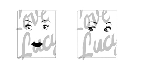
Early sketches for the I love Lucy Poster
That was really the most challenging thing about this project – trying to figure out the the heart of these classic shows – getting down to the DNA and figuring out what it was that was special, unique or iconic. It’s actually the same thing we do on any branding project – discovering what it is that makes a client distinct. You have to do that first, then you can translate it into a unique visual language.
My process on the CBS prints was first to figure out what made the shows iconic. So I watched episodes and intros on YouTube and did research about each show. Most of them I was very familiar with already so I had a strong understanding of the visuals that were associated with these brands.
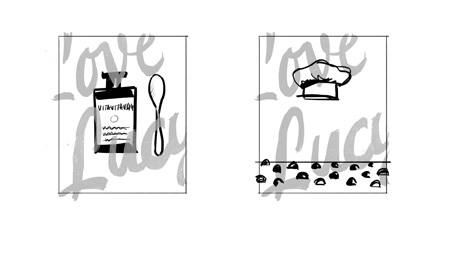
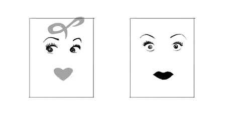
Early sketches for the I love Lucy Poster
From there I would create quick thumbnail sketches in Adobe Photoshop using a Wacom Cintiq. This allows me to work very quickly at the conceptual level. I did a few ideas for each show and would share these with the client. Working with CBS was fantastic. We worked quickly and they had great notes on everything. I think they selected the strongest concepts as well.
Finished art work for CBS
Once the client selected the concepts they wanted to move forward with, I used Adobe Illustrator to take each concept to the final, finished art.
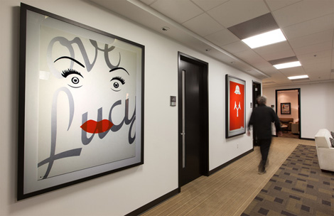
The posters were silk screened on paper. Some of them we did really big and it proved very difficult to find a silkscreen printer who could print bigger than 24×36. That was the biggest challenge of the project overall. But once we got the finished prints up on the walls in the CBS, they really looked incredible.
How has your process evolved since you first started designing? Are you a creature of habit or do you like to try new technologies, applications, and features?
It’s hard to say how my process has evolved, other than I do feel like I’ve become more considerably faster and I am more comfortable in it. In terms of execution…I am probably more of a creature of habit…when I don’t have to think about the technology, that’s when I appreciate it the most.
How do you like to share your work with the creative community? Is the feedback you get valuable and does it influence your work going forward?
I typically can’t share work in progress with the larger creative community until it’s complete…but once we do finalize work, we’ll typically share via the site, newsletter and social media.
Analytical tools are now ubiquitous, and because of this designers are often asked to back up their work with data and research. With this in mind, how much of your work is based on intuition — and what role should intuition play in design today?
Well, I think all of my work is a reflection of my intuition in some way. Every project is the culmination of hundreds and thousands of decisions. This typeface or that typeface…this color or that color…this much space…or that much space…etc etc. And most of those decisions are intuitive… The truth is, our deliverables are subjective. No two design firms are going to create the same logo for the same client, so a designer’s intuitive sensibility is always one of the reasons that we’re hired in the first place. I think research and data are very important at the beginning of a project. Good work is smart work, not just beautiful work. Smart work requires “research” to a certain degree. The more information and data you have about a brand or the audience, I think that is a good thing. I think that knowledge can give a designer more opportunities to pursue at the beginning of a project. But I don’t think research and data have any place at the end of the creative process to “qualify” or “validate” creative. I love Steve Job’s quote about this, “It’s really hard to design products by focus groups. A lot of times, people don’t know what they want until you show it to them.”
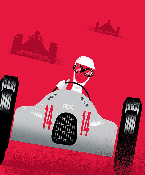
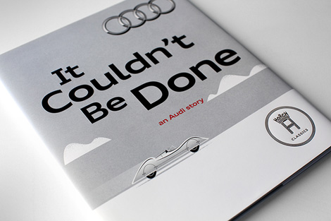
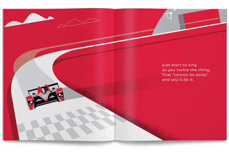
Recent work for Audi celebrating the legendary carmaker’s rich history of innovation.
What are your passions and interests outside of design and why?
Well I’m a dad. I have a 3 year old and a 1 year old…so I’m passionate about my kids and my family which take up most of my time outside of work. I try to get a trail run in once a week. And I’m attempting to learn how to play electric guitar.
——
We would like to thank Ty for taking time to share with us. You can see more of his work at mattsoncreative.com.
This interview is part of the #designinprocess series brought to you by Adobe. Read all of the interviews here and follow along on Twitter and Pinterest at #designinprocess and #newcreatives.
——
Also worth viewing…
Mike Cina Interview
Eight Hour Day Interview
Eli No!
Not signed up for the Grain Edit RSS Feed yet? Give it a try. Its free and yummy.
TagsIllustration, Interviews


