Mira Design

Mira Design

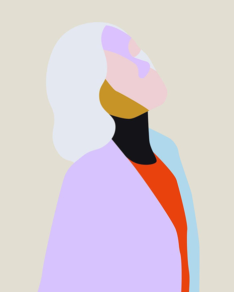
Miranda Mayne launched Mira Design in 2015 with the intention to work with small businesses and socially conscious enterprises. Recent projects include One Tenth – a clothing company that supports survivors of human trafficking in Kolkata. For this collaboration, she crafted simple geometric illustrations to be implemented on t-shirts. Mimicking the movement of water and tides, the graphics represent the changes One Tenth hopes to evoke in the lives of others. Her love for minimalism is also present in her fine art. Reducing objects down to their most basic forms, she paints clean, yet striking compositions on handmade cotton papers.

(more…)

Magdiel Lopez

Magdiel Lopez

I love personal design projects, so I was thrilled to discover Magdiel Lopez’s daily poster series. Since October 2016, he’s designed a poster every single day. This daily exercise allows him to explore new skills and techniques including painting and pixel sorting. The themes and styles featured in his work transition throughout the year as he often references pop culture and recent events. To see the entire collection as well as time-lapse videos of his technical process, visit his Instagram.

(more…)

David Rudnick

David Rudnick

David Rudnick’s passion for music and art history fuels his work as the artistic director of Making Time, a club night focused on transcendental and futuristic sounds. For the event posters, he layers a mélange of elements to create compositions that are just as fluid and vibrant as the music itself. Pulling from a wide variety of materials, his inspirations range from 90’s fashion photography to religious Renaissance paintings. The visuals are then integrated with custom typefaces (often designed himself) to form cohesive pieces that are dynamic and original.

(more…)

Shawna X

Shawna X

With bright neon colors and lush gradients, Shawna X crafts illustrations that illuminate today’s hottest political issues. In her recent exhibition, Alone Together, she focused on matters that have heightened post-election, such as discrimination, climate change, and sexism. The title of the series is shown most clearly in the mural above. Here she conveys a growing disconnect amongst the American public. Shawna explains, “We allow ourselves to stay within our comfort zones—our pools—but we don’t reach out to the other side for more open dialogue and understanding. We’re either thriving or dying. We’re both awake and ignorant. We’re isolated yet we’re next to one another.”

(more…)

Triangle Studio

Triangle

Triangle Studio strives to design with “rational strategy and emotional harmony” in mind. This mentality helps them create clean and balanced compositions that shine with vivid colors and playful patterns. Based in Seoul, they craft packaging, branding, and editorial work for an array of clients. In addition to their professional projects, the studio releases a quarterly publication called Try Angle Papers. Here they experiment with different techniques, including marbling and papermaking, to create unique notebooks, posters, and postcards.

(more…)

Marylou Faure

Marylou Faure

Specializing in character design, Marylou Faure creates colorful worlds filled with fearless fashionistas, tattooed hipsters, and adorable animals. These quirky and emotive characters have led to collaborations with Google and Glow to create stickers for their messaging apps. The success of the stickers inspired her to launch a set of her own titled, The Feels. Here she proves her whimsical approach to illustration is a perfect match for the medium. Her hungry hamburgers and flirtatious pairs of underwear would make anyone respond with an enthusiastic, “LOL”.

(more…)

Glasfurd & Walker

Glasfurd & Walker

Glasfurd & Walker crafts memorable brands that burst with personality. Based in Vancouver, they collaborate with an array of Canadian businesses including salons, retail shops, and dining establishments. I am especially impressed with their identity system for Park, a restaurant and distillery inspired by its unique location in the Banff national forest. As an ode to its surroundings, the system features bold typography and retro color schemes reminiscent of WPA posters of the past. This is further reinforced in the packaging for a line of liquors that features illustrations of the area’s beautiful mountain ranges. For visiting campers, the studio designed a plethora of souvenirs including, mugs, pocketknives, merit badges, and matchboxes. These elements come together to create a whimsical brand that celebrates the town’s rustic lifestyle.

(more…)

Brandon Land

Brandon Land

Flipping through Brandon Land’s portfolio, I can’t help but smile at the clever nature of his work. He often creates logos that feature optical illusions and double meanings. I’m particularly impressed with his emblem for the fundraiser Run for Lungs, in which a pair of sneakers resembles a set of lungs. This wit is also present in his personal work and satiric illustrations for Super Deluxe. Referencing politics, pop culture, and sports, these drawings serve as social critiques that shed humor on today’s hot topics.

(more…)

Jose Mendez

Jose Mendez

Jose Mendez’s gangly characters and bright berry color palettes are hard to ignore. His wavy strokes and letterforms derive from his love for graffiti, while his skilled use of contrast stems from his studies in graphic design and animation. Utilizing these signature elements, his illustrations dissect human behavior and explore themes such as consumerism, subcultures, and sexuality. While investigating these topics, Mendez finds himself often drawing food. These illustrations have caught the attention of international culinary publications and led to collaborations with Lucky PeachNoblerot, and Eat Magazine. Today, Mendez bring his unique aesthetic to an array of clients including, the BBC, Converse, and The New York Times.

(more…)

Elliot Kruszynski

Elliot Kruszynski

Elliot Kruszynski’s illustrations fill me with delight. Using simple shapes, he crafts lively scenes in which everyone, even inanimate objects, proudly sport large toothy grins and are consistently excited. Even when tough situations arise, his characters take them in stride and still find joy. This is often reflected in their amplified expressions that are hilariously relatable and almost emoji-like. Kruszynski’s skill for capturing life’s ups and downs has led to collaborations with a variety of clients including, Anorak Magazine, The Telegraph, and Vice.

(more…)