

- Olle Eksell Site & Shop
- This Is Forest — Joel Speasmaker
- MVM — Magnus Voll Mathiasson
- Art School Cliche Spotting
- Posters Discovered in Notting Hill Gate Tube Station
- Vinyl Documentary: To Have & To Hold
- Partisan Memorials in Former Yugoslavia
- Up in the Air- Opening sequence
- Geoff Mcfetridge: Where the Wild Things Are Title Design
- Nikkatsu – Japanese actions films

Kendrick Kidd
Kendrick Kidd is a freelance designer out of Jacksonville, Florida, whose work spans type, identity, packaging and editorial. His work is playful and fun, yet skillfully executed.
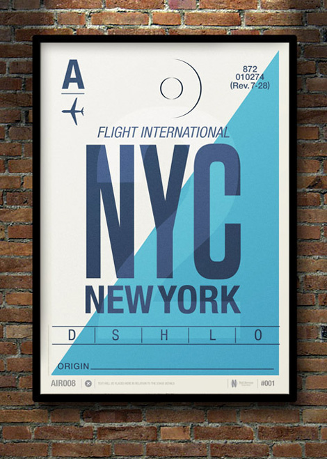
Flight Tag Prints
Inspired by vintage airline baggage tags, UK illustrator Neil Stevens (aka crayonefire) created these stunning posters. If they prove popular he will make them available in his online shop this Spring. Lets make that happen! Drop Neil a note here.
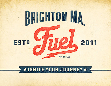
Commoner Inc.
Commoner, Inc. is a Boston based design studio consisting of Richie Stewart and Brook Towlson. They may be small, but their custom typography and branding have come together to produce multiple dynamic projects. Stewart’s ability to effectively mix vintage typography with modern design elements create works that are clean and memorable.
Founded
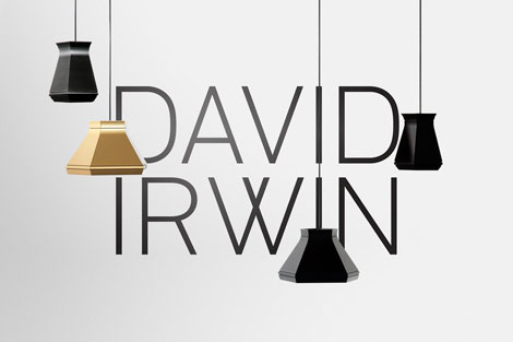
Founded is a Newcastle-based studio specializing in branding, packaging and environmental projects among other things. To me, their strong suit are their branding and identity projects. They do a great job of making subtle references and effectively using restrained typography while still managing to be witty — all within a very clean, minimal style.
Strohl for Lekerlee
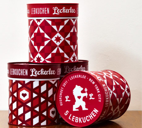
I have been an avid consumer of this German treat for years, but I can guarantee you that it was never the packaging that drew me in. SF Based Strohl took Lekerlee to the next level by creating packaging that is sleek and modern, a sharp contrast to the traditional gothic type and overly-illustrated german villages that usually adorn the cookies’ container.
Belinda Love Lee
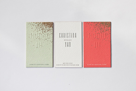
Belinda Love Lee is a freelance designer out of Cardiff, UK, whose talents span print, web, and branding. Her business cards designed for prop stylist, Christina Yan, feature foiling, gold edging, and embossing that make for a beautiful presentation. Her attention to detail aids her in creating a design that is modern with a touch of whimsy.
Albert + Marie
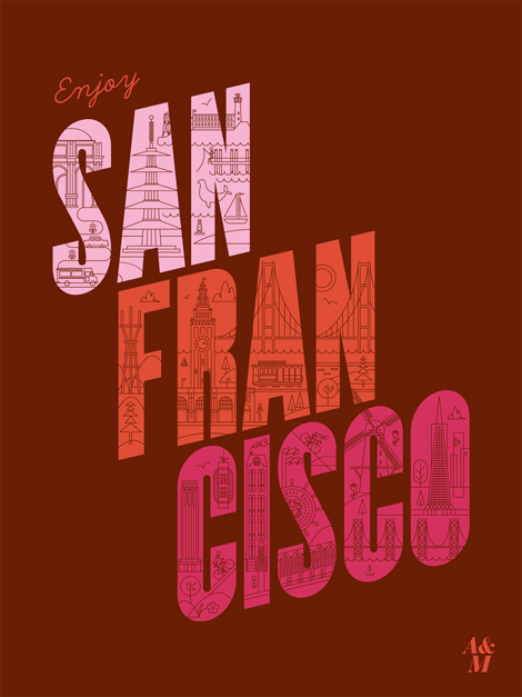
The work of SF based Will Ecke and Liz Doering a.k.a Albert + Marie can be described in one word – charming. The talented husband and wife team have a knack for creating bold and playful work that brightens up your day. Check out their Etsy store and add some sunshine to your life.
Pagan and Sharp
One of the newest and most interesting typographic duos that has emerged lately, Pagan and Sharp—run by Carlos Pagan and Lucas Sharp—has released a new typeface called Sharp Sans. Based on the wonderfully simple vision of geometric styling, and a touch of humanism type theory, Sharp Sans does well in so many modern treatment situations that call for a bit of fun.
Along with Sharp Sans, they have produced Malleable Grotesque and the beautiful serif face, Hera Big. Pagan & Sharp are the creatives behind such notable work as the the latest Print 20 under 30 branding, Pinterest Logo, and recent New York Lottery campaign (Carlos’ work at DDB). With such lovely projects, they are well on their way to making a big splash in the typeface design world. Keep up with their latest news by following their twitter and keep an eye out for hopefully many more typefaces to come!


