TwoPoints.Net

Two Points

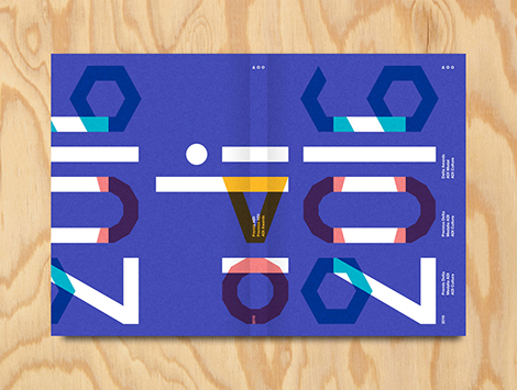
Founded by Lupi Asensio and Martin Lorenz, TwoPoints.Net is a design studio known for their flexible visual identities (FVI). Rather than being static and repetitive, the studio believes that an identity system should be adaptable. This can easily be seen in their work for ADI’s Delta Awards. Using a series of icons, they created a versatile system that could be incorporated into the event’s branding, typeface, and awards.

Two Points’ appreciation for the efficiency of FVIs also fueled the studio to develop a program that helps their clients create designs on their own. While working with Tonangeber, a website for sharing playlists, Two Points created “supertool” — a program that guides DJs through the design process while maintaining the constraints of Tonangeber’s identity system.

(more…)

Neo Neo

Neo Neo

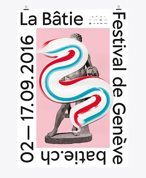
Neo Neo is a Swiss design studio led by Thuy-An Hoang and Xavier Erni. They collaborate with cultural institutions around the world, including Geneva’s Contemporary Art Center and Tokyo’s National Film Center. Not afraid to get a little funky, the studio uses bold and sometimes surprising visuals and mediums within their designs. For Geneva’s La Bâtie Festival, an event in which the city celebrates music and art, the studio employed a long splash of toothpaste as the festival’s key graphic. No matter what they decide to use, their pieces are always chic, fresh, and a testament to the current state of Swiss design.

(more…)

Kyle Metcalf

Kyle Metcalf

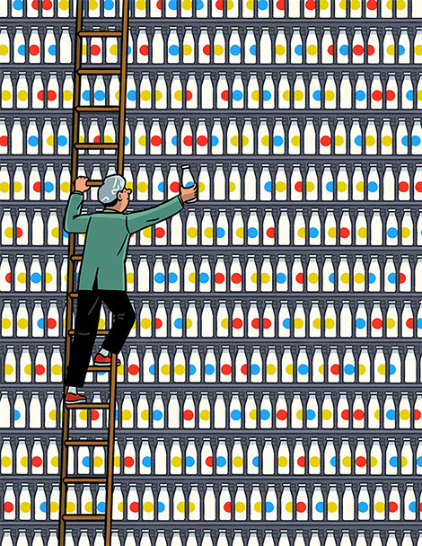
Kyle Metcalf is a Canadian illustrator whose work has graced the pages of The Walrus, Swerve Magazine, and The New York Times. Using thick black outlines and soft colors, he creates charming characters that are often caught in comical situations. Much of this humor comes from a sense of nostalgia that is present throughout his work. Many of the personalities found in his illustrations seem bewildered by their middle age and yearn for their youth. These themes are also present in his still life compositions that portray novelty toys and articles from the past.

(more…)

Janne Iivonen

Janne Iivonen

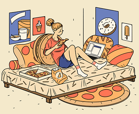
Janne Iivonen is a contemporary devotee of ligne clair, a drawing style made popular by Hergé, the creator of The Adventures of Tintin. Inspired by observing the world around him, Iivonen beautifully captures modern life and the behavioral idiosyncrasies that come with living with today’s technologies. His charming illustrations and relatable characters have helped him accumulate an impressive portfolio of clients including The GuardianTime Magazine, and GQ.

(more…)

Upland Sour Ales

Upland Sour Ales

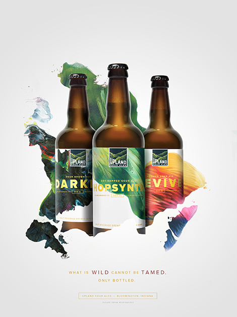
Young & Laramore teamed up with artist Michael Cina to brand Upland Brewing’s wood-aged sour ales. Cina crafted abstract compositions that represent the brewery’s careful blending of different batches to create complex flavors. This collaboration resulted in a vibrant packaging and advertising campaign that signifies the craft and artistry that is put into every bottle.

(more…)

Instagram: Finds From the Field

Grain Edit Instagram

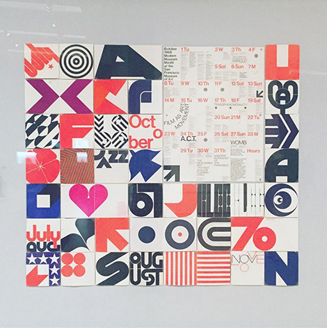
From museums to estate sales, our Instagram feed is brimming with great finds including Barbara Stauffacher Solomon’s printed work at the SFMOMA.

(more…)

Studio Moss

Studio Moss

Eric Palmér and Karolina Eriksson run Studio Moss in Gothenburg, Sweden. The designers strive to utilize analysis and research to form concepts that fuel their designs. They often collaborate with artistic exhibitions and festivals throughout Gothenburg and have won multiple awards, including a Kolla! Gold in 2014. Passionate about art education, the designers also teach workshops and tutor at design schools.

(more…)

Anna Kulachëk

Anna Kulachëk

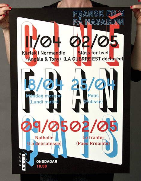
Anna Kulachëk crafts vibrant posters for schools, festivals, and entertainment venues throughout Russia and the Czech Republic. Her compositions range from sparse and minimal, to active arrangements brimming with large typography, geometric accents, and bold grids. Her use of saturated colors and emphasized modularity make her pieces ingeniously alluring.

(more…)

Marius Roosendaal Update

Marius Roosendaal

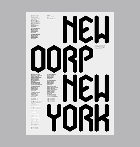
Marius Roosendaal has continued to craft impressive work since we last featured him. He’s invested in a number of self-initiated projects in which he’s designed typefaces inspired by geometry and gothic scripts. I’m especially impressed with his typeface, Causeway, which is highly customizable and can be shaded to appear three-dimensional in isometric perspective. In addition to his typographic work, he’s also released prints of complex explorations with geometric patterns and organic forms. Roosendaal’s work is a great example of how artists can use passion projects to heighten their curiosity, expand their creativity, and refine their skills.

(more…)

Steve Scott

Steve Scott

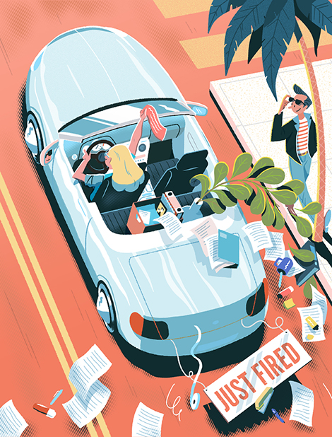
Steve Scott is a London-based illustrator who often tells multiple stories within a single illustration. Like an author writing a novel, he crafts details that enrich the themes of his narratives and reveal the purpose and motivation of each of his characters. He thoughtfully executes his dense compositions by utilizing only 3 or 4 colors at a time. The brightest colors highlight essential elements and guide the viewer’s eyes throughout the piece.

(more…)