Baby spells “bee” with Harry Bertoia and Eames
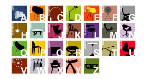
1950s-alphabet.jpg
Joel at Blue Ant Studio has designed a wonderful alphabet for kids using iconic mid century modern furniture. The design was originally limited to wooden building blocks, but now theres plans for a poster as well. Why didn’t I have something like this when I was a kid? Learning the alphabet would of been a piece of cake. I can see all the spelling bee trophies I would of won thanks to Eva Zeisel and Hans Wegner.

Wim Crouwel interview part 2

wim_crouwel-video-2.jpg
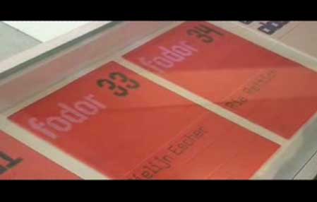
This is part 2 of an interview with Wim Crouwel at Galerie Anatome in Paris, 2/2007

Wim Crouwel interview part 1

wim_crouwel-video-1.jpg
This is part 1 of an interview with Wim Crouwel at Galerie Anatome in Paris, 2/2007

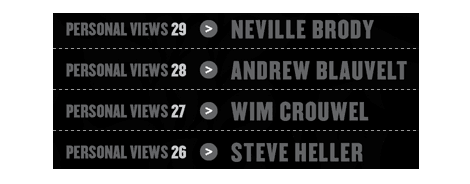
Personal Views – Lecture Series

wim_crouwel-lecture.gif
Now in its 4th year, Personal Views is a unique series of conferences that brings together an unparalleled group of designers, writers and educators from the world of graphic design. Coordinated by Andrew Howard, and taking place at the Escola Superior de Artes e Design in Matosinhos, Portugal, the series aims to examine contemporary definitions of graphic design by asking these professionals to talk about the values and objectives that have value for them. It is an attempt to explore where the boundaries of contemporary practice lie, to discuss what we might expect of ourselves, and to examine what social and cultural objectives we seek to fulfill.

Available online are lectures by Experimental Jetset, Ellen Lupton, Erik Spiekermann, Wim Crouwel, Steven Heller and Neville Brody among others.

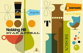
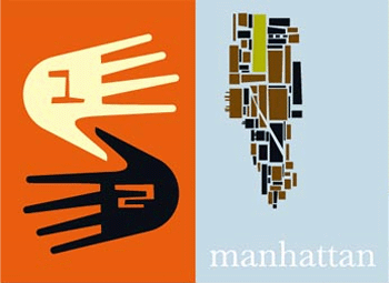
Illustrations by Bo Lundberg

bo lundberg
bo lundberg

We’re really diggin the online portfolio of Bo Lundberg. He draws influence from modern antiques, objects and patterns that he stumbles across in everyday life.

Marian Bantjes – Illustrator & Designer

Marian Bantjes

Marian Bantjes considers herself “independently pursuing a combination of illustration and design.” She really understands how to capture a spirit in typography. Ironically, she designed the Design Matters Live poster, an event we featured earlier this week. Take a look at Marian Bantjes’ website to gain a better understanding of where her organic typography stems from.

Justin Quinn

justin_quinn_2.gif
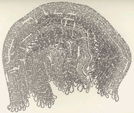
If you like experimental typography, art, Moby Dick, and the letter ‘E’ this is the exhibit for you. Hailing from the midwest, Justin Quinn makes fascinating typographic compositions based on Herman Melville’s epic. Using only the letter ‘E’ and graphite, Quinn recounts entire chapters from Moby Dick. For example, the above piece is entitled “Moby Dick Chapter 55 or 9200 times E.” That’s a lot of E’s. If you’re in the mood for more typography a la concrete poetry, please see Justin’s work at MM Galeries.

Wayne and Garth meets Chermayeff & Geismar.

pt_2.jpg

Self described as “Wayne and Garth meets Chermayeff & Geismar,” Post Typography, from Baltimore MD, was originally conceived and founded in 2001 as an avant garde anti-design movement by Nolen Strals and Bruce Willen. They specialize in graphic design, conceptual typography, and custom lettering/illustration with additional forays into art, apparel, music, curatorial work, design theory, and vandalism.

Drool! Drool! on Sanna Annukka

sanna_annukka.gif
Drool! Drool! ( As my wife would say) I’m just drooling over Sanna Annukka’s online portfolio. She has a great sense of color and composititon. I definitely see a link between her work and traditional Finnish Folk art, which would make sense because she is from Finland. Do yourself a favor and goto her website now! No, scratch that, do me a favor… Please goto her site.

Minty squirrels

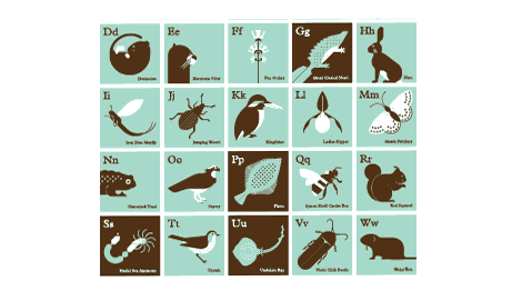
alphabet of endangered species in the british isles

Endangered animals always look so cool in teal. Now you can get all your favorites in Present&Correct’s alphabet of endangered species in the british isles chart. I’m loving the spatula tailed dinosaur and the iron my laundry fish.

Page 117 of 118« First...116117118