Mast

Mast

Mast is a studio that loves telling unique stories through their designs. Partnering with companies of all sizes, they create clean and modern branding based on the client’s history and personality.

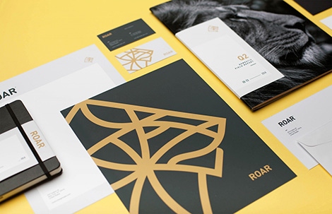
This is evident within their work for ROAR, a new digital marketing agency. Mast crafted an artful lion logo that emerges within a gold and charcoal color scheme. These elements reflect the brand’s agility and commitment to quality work.

(more…)

The Suffolk Punch Press AKA Adam Avery

Suffolk Punch Press

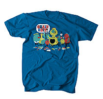
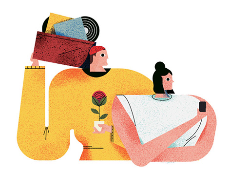
Working under the moniker, The Suffolk Punch Press, Adam Avery illustrates some of today’s hottest topics such as online education and renewable energy. His characters’ eccentric eyes and disproportionate bodies intrigue the viewer and beckon a closer look. Equally captivating, are his colorful blotchy textures that contrast with the clean lines and geometric shapes found within his compositions.

(more…)

Post Projects

Post Projects

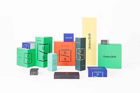
Post Projects is a Vancouver-based branding and design agency that crafts intriguing projects for clients in Canada and the U.S. I’m especially fond of their work for the home décor brand Umbra Shift. Pairing contemporary color schemes and minimal layouts, their editorial and packaging work perfectly reflects the whimsical, yet sleek line of accessories.

(more…)

Snask

Snask

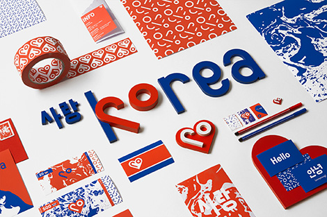
When describing themselves, Stockholm-based design studio, Snask, proudly states, “We worship unconventional ideas, charming smiles and real emotions. We see the old conservative world as extremely tedious and as our biggest enemy.” This passion for shaking things up and thinking outside of the box is obvious throughout their design, stop motion, and live action work. Taking on bold projects, like rebranding North Korea and crafting campaigns for female empowerment, the studio has proven that they aren’t afraid of taking on controversial topics in a fun and boisterous way.

I am especially captivated by their inventive use of different materials throughout their designs. From wood, to paper, to cake, they’ve built typography and props with just about everything. For the 2014 Malmö Festival, they created an impressive wooden typographic installation. Measuring 13×8 meters, it was one of the largest physical graphic identities in the world.

To use their creativity in other areas, Snask has submerged itself into a number of projects. The studio started a record label, launched its own line of beer, co-founded Yay Festival, and wrote a book about their failures and successes entitled Make Enemies & Gain Fans. Snask also travels around the world giving inspiring lectures on creative entrepreneurship.

(more…)

Wang Zhi-Hong

Wang Zhi-Hong

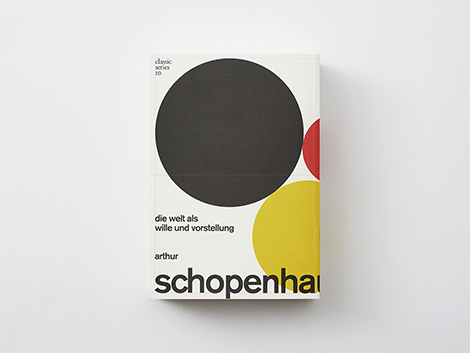
Although I’ve been told not to judge a book by its cover, I want to read every book designed by Wang Zhi-Hong. From typography manuals to Albert Einstein’s Ideas and Opinions, Wang has tackled a range of translated volumes for Asia’s book market. Often employing geometric illustrations and minimal layouts, his work is clean, bold, and intriguing. His approach has earned him international recognition including six of Taiwan’s Golden Butterfly Awards, Kasai Kaoru’s Choice Award, and Excellent Works from the Tokyo Type Directors Club. To see designs from throughout his career, check out his book Design by wangzhihong.com: A Selection of Book Designs 2001-2016.

(more…)

La Boca Update

La Boca

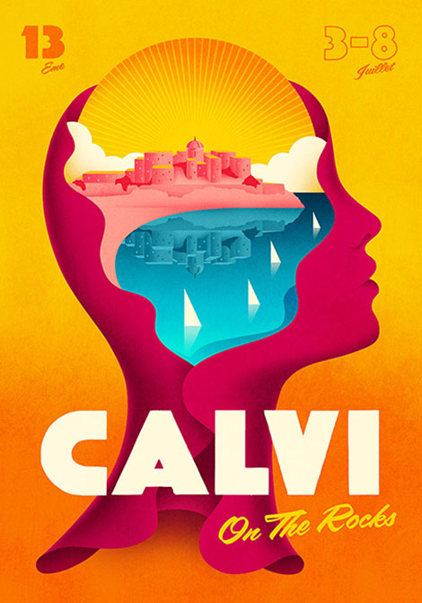
Since we last featured La Boca, they have continued to craft vibrant and work that summons feelings of nostalgia. Striving to create emotional connections through pop culture, they design retro-inspired posters, book covers, and album sleeves for clients such as 21st Century Fox, Penguin, and Adele. Their thoughtful and unique approach has not gone unnoticed and has earned them a slew of awards including numerous European Design Awards and Annual Design Awards. To get your hands on their colorful prints make sure to check out their shop.

(more…)

Aleksandar Savić

Aleksandar Savić

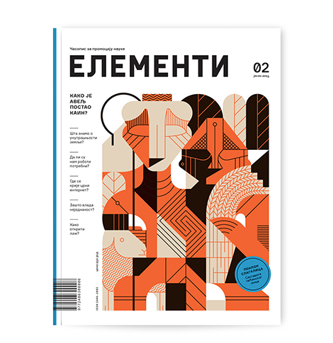
From Fortune Magazine to restaurants in Croatia, Aleksandar Savić crafts illustrations and infographics for a range of clients around the world. Employing geometric shapes and muted color schemes, he crafts artful compositions that are playful yet refined. I’m especially impressed with his collection of portraits. Although the faces are built with flat shapes, his tactful use of color and striped textures make them dimensional and emotive.

(more…)

Jay Fletcher

Jay Fletcher

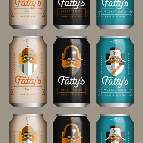
From sporting goods to upscale restaurants, Jay Fletcher works with a variety of clients and tackles a range of design styles. Although he collaborates with large companies like the NFL and Smirnoff, Fletcher is also passionate about working with small businesses, especially in his home of Charleston, South Carolina. Utilizing simple forms, he crafts branding systems that burst with colorful narratives and are instantly recognizable. His inventive work has been recognized by numerous publications including Communication Arts, Print Magazine, and LogoLounge.

(more…)

Gizem Vural

Gizem Vural

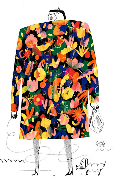
Brimming with puffy clouds and the familiar textures of colored pencils, Gizem Vural’s illustrations are deceptively simple. With a balance of sophistication and naiveté, she tackles serious issues such as education standards, carbon emissions, and mental health. This can be seen in the juxtaposition between colors and textures. Employing black and white wiry lines and loose squiggles, she conveys forms of negativity and loneliness. These chaotic strokes often provide a contrast against her robust and colorful characters. Her work has earned her recognition by the Society of Illustrators and a feature in American Illustration 35.

(more…)

Zup Design

Zup Design

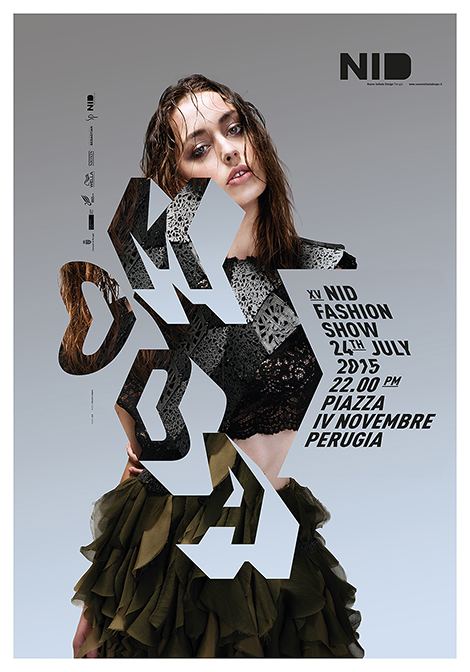
With a passion for graphic and industrial design, Zup crafts two-dimensional projects with three-dimensional elements. This can be seen in their poster series for the NID Fashion Show in which they employ expressive typography that engages with and accentuates the models’ clothing. Building from the shirt’s pleating, the typographic characters add a structural quality that mimics elements of the garment and adds volume to the ensemble.

(more…)