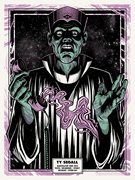
Andrew Fairclough Interview
I love getting lost in Andrew Fairclough’s illustrations. Not only do they hold the drama and charm of vintage comics, but they also possess “true grit” – an expression he uses to describe his love for halftone patterns and grainy visual noise. These elements add a sense of nostalgia and tactility to his art and were prominently featured in his first solo show, Total Control, at China Heights gallery in Australia. In today’s interview, we discuss the exhibition, as well as his passion for teaching and his latest side project – an online shop for textured Photoshop brushes and vectors.
This is the second part in a two-part interview series in collaboration with our friends at Skillshare. For a limited time, you can take Andrew’s class (as well as many other classes) for free. Click here to learn more and receive 2 months of Skillshare Premium for free.
And now on to the interview…
Where are you from and how did you become interested in design and illustration?
I live in Sydney, Australia but I originally grew up a few hours north in a small beachside town called Sawtell.
As a kid and most of my teens I spent a lot of time either skateboarding, surfing, listening to or playing music or drawing things related to skateboarding, surfing and music. Logos, tricks, portraits of my heroes, album covers, Powell Peralta, Vision and Santa Cruz skate graphics, ramp and skate shoe designs as well as perfect waves I could mind-surf when the waves were flat.
To me sports like skating, surfing and snowboarding were more than just cool, subversive pastimes, they had this bubbling undercurrent of art, music and film that was a huge part of the culture and that really drew me in. I always knew that I could probably never be a pro-skater but I could probably become a pro-artist and make graphics in that world.
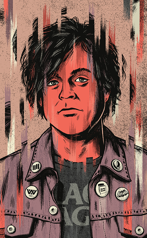
Illustration for Rolling Stone Australia
From album covers to editorial illustrations, you’ve tackled a wide range of projects. What types of projects are you most passionate about? What attracts you to that type of work?
Any project that allows me to progress my work and really express some of my own creative urges. Those kinds of projects don’t come along that often and for me it’s really important to experiment and push myself by making time for personal projects, self-promotional pieces and art shows.
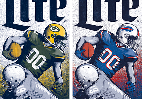
In a commercial sense music projects and editorial illustration are often fertile ground for conceptual and stylistic experimentation with the added bonus that these projects usually involve working with trusting and skilled art-directors who understand the creative process and take a collaborative approach to any project or design problem. That’s not to say that highly commercial advertising or branding assignments can’t elicit a similar response.
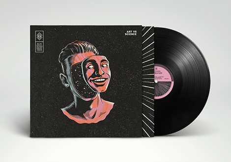
Album artwork for Art Vs Science
Your work is distinct and instantly recognizable. Is this a result of a natural progression or was it more intentional?
I would say semi-intentional. I mean, I don’t quite see my work as being instantly recognizable because I feel it has evolved and mutated over the years but at one point a light bulb definitely went on where I knew the direction my work was heading and the broader aesthetic I was pursuing.
I think as you develop as a designer, artist or illustrator you get comfortable in the way you do things and that becomes like a visual fingerprint that you can never scrub from your work.
I’ve long admired the textures you incorporate into your work and have been curious as to your process. With this in mind, I was excited to discover your Skillshare class – “True Grit: Handmade Textures & Halftones for Designers & Illustrators“. Can you share what led to the creation of the class?
The Skillshare team approached me about putting together a class via my Illustration agents in Melbourne, The Jacky Winter Group. I was a little hesitant at first I must admit, partly due to time constraints and the logistics of creating a great class, talking to the camera and getting your point across without sounding like a fool.
I’d had quite a few requests on social media to teach a class and around the same time I met up with Dan Kuhlken from DKNG whilst visiting LA and he really got me hyped after explaining what a great experience teaching on Skillshare had been for them.
*For a limited time, you can take Andrew’s class (as well as many other classes) for free. Click here to learn more.
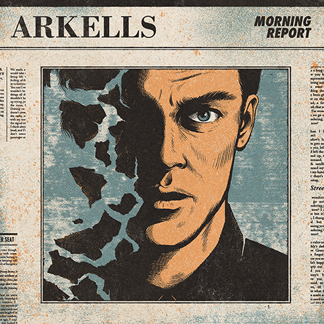
Illustration, Design and Art Direction for Juno Award winning Canadian band Arkells’ Morning Report LP
The class has gained a lot of attention. What do you think has led to its popularity? What do you hope students gain from it?
If I knew I would bottle it. Like in a really nice bespoke medicine bottle with a screen printed label.
Jokes aside, I think the success of the class is the result of the fun, hands-on approach to making textures, a focus on outcomes, an easy to follow structure and good production values thanks to my good friend Daniel who took time out from his usual job directing commercials to help produce the class.
I really analyzed my own skill set and tried to craft a course that I knew from interaction with my own social media following wasn’t being catered to at the time. There were lots of short courses on distressing logos in Photoshop or Illustrator but no-one was really teaching the fundamentals of creating hand-made analog textures and processing them for use digitally.
The class is mostly the result of stepping back and asking what I would want to have learned from someone with my skillset 5 or even 10 years ago.
In what ways do you feel the increased access to free and affordable design resources and classes have affected the design community?
From a pure problem solving perspective we’re so lucky to have such easy access to cheats and workarounds to solve simple software problems and fill very specific knowledge gaps (e.g. how to fix a bug, use the Clone Tool or install a Photoshop Brush). I do think that it is a trade off though and junk that’s free is still junk especially when it comes to the multitude of free patterns, brushes, actions and fonts lurking around the more opportunistic corners of the design internet.
I think Skillshare is really breaking down some of the geographical and economic barriers to creative skills development. Skillshare presents a great opportunity for designers to learn from not only giants of the design world like Aaron Draplin and Jessica Hische but from lesser known, seasoned and highly skilled pro’s who are making valuable years of collective knowledge so easily accessible. This is especially beneficial to the design community when you consider the impossibility of learning such skills through pure chance, circumstance or persistence.
As with anything, it’s not the skill but how you use it and the real long term value lies in students transforming these newfound skills into unique and original work that defines careers.
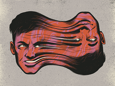
Fine art print for “Building” group show at Ludlow Gallery
What single most important piece of advice would you give to students and young designers trying to establish themselves in the industry?
Don’t wait for a brief, write your own. Create a personal project, work hard at it and put it on the internet. When you’re finished do it again whether it was a success or not. Embrace failure and keep an eye out for happy accidents, that’s where the magic happens. Be 100% batshit crazy delusional about how good you are, share your work, email your heroes but don’t let the knockbacks or unanswered emails get you down. Your career is a work in progress and establishing yourself takes time, energy and persistence.
OK, that’s more than one piece of advice but the basic theme is work hard while you wait.
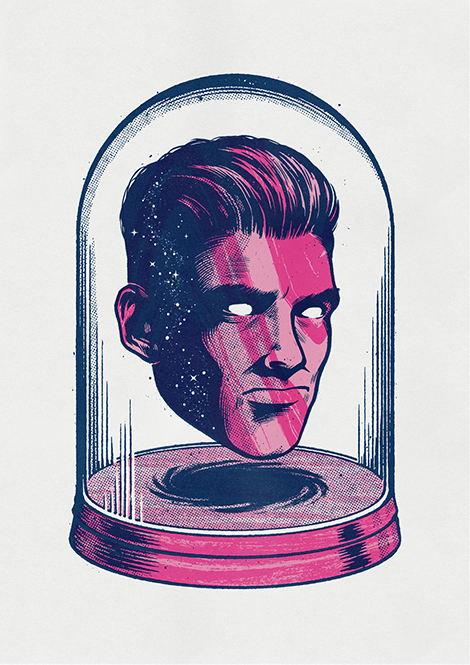
Two color risograph print for the Look/See “Future” group show held as part of the Look/Hear creative conference

Illustration for American Express
Last year you founded True Grit Texture Supply, an online shop that sells textured Photoshop brushes, vector packages, and other resources. What led to its creation?
Over the years a lot of students as well as established illustrators and designers had asked me if I had thought of selling any of my textures or brushes and I’d given it some thought but never quite made the leap. The success of my Skillshare class really opened my eyes to the value that my years of experience had and that a market existed for well crafted textural design tools made by someone who uses them every day. And now here we are.
You recently launched your first solo exhibition, Total Control. Tell us about this collection and the themes you explored within the work.
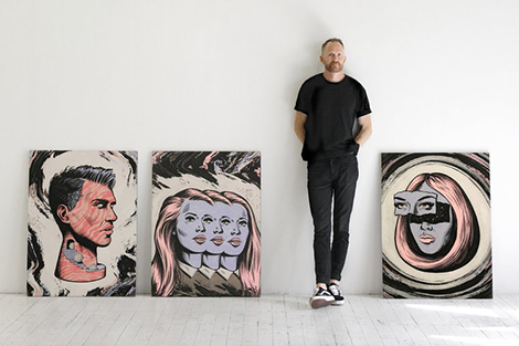
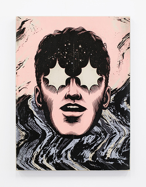
The show featured 12 mixed media works on framed wood panel combining illustration, painting and screen printing.
I wanted to explore themes of introspection, confusion, duality and impulse control all viewed through this inescapable dead-gaze of technological distraction that has crept into pretty much all of our lives.
In the lead up to making of the work I had been reading a lot about tech addiction, impulse control and media distraction and Adam Curtis’ dystopian documentary HyperNormalisation also had a real impact on me during the making of the show.
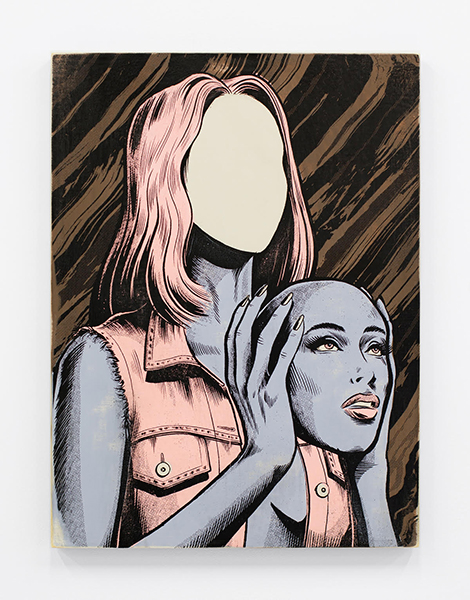
‘Obsequium’ from Total Control
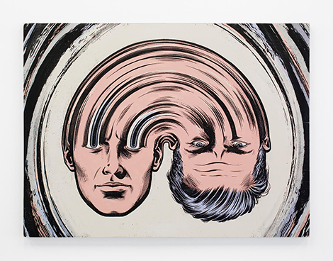
‘Chemtrails’ from Total Control
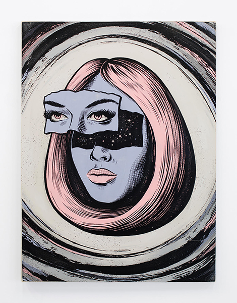
‘Ascendancy’ from Total Control
‘Manipiulator’ from Total Control
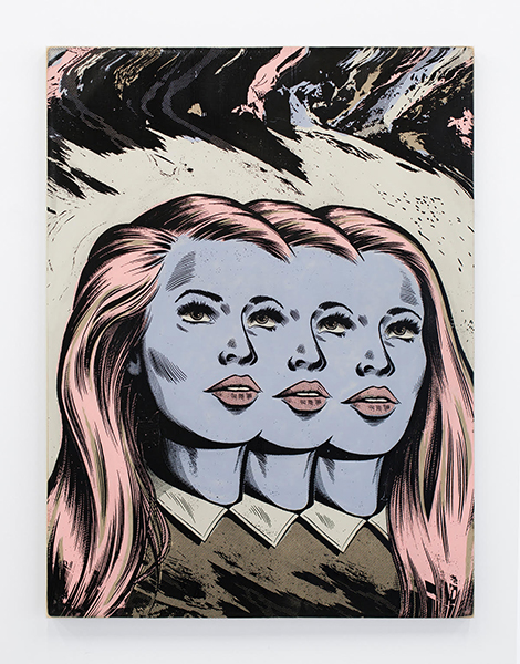
‘Belief Relief’ from Total Control
——————–
This post was brought to you by Skillshare, which aims to close the professional skills gap and provide universal access to high-quality learning.
Skillshare is graciously offering Grain Edit readers 2 months of Skillshare Premium for free. Click here to learn more.
Interested in sponsoring Grain Edit? Visit our sponsorship page for more info.
——————–
Also worth viewing:
Kindred Studio
Kate Bingaman-Burt Interview
Try Skillshare Premium for Free
Follow us on RSS, Instagram, Pinterest, Wanelo,
——————–
Save
Save


