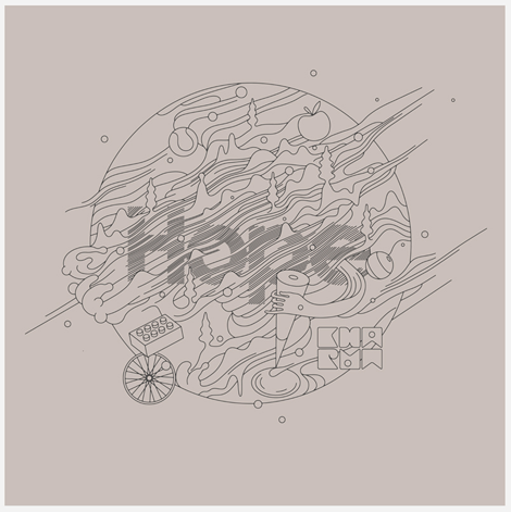
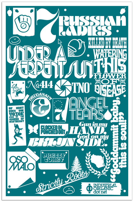
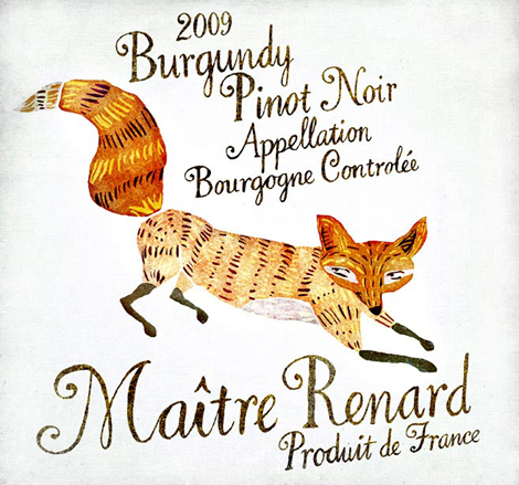
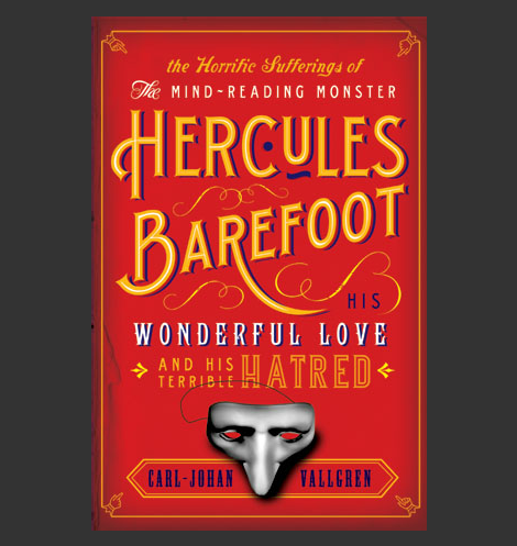
Jen Mussari

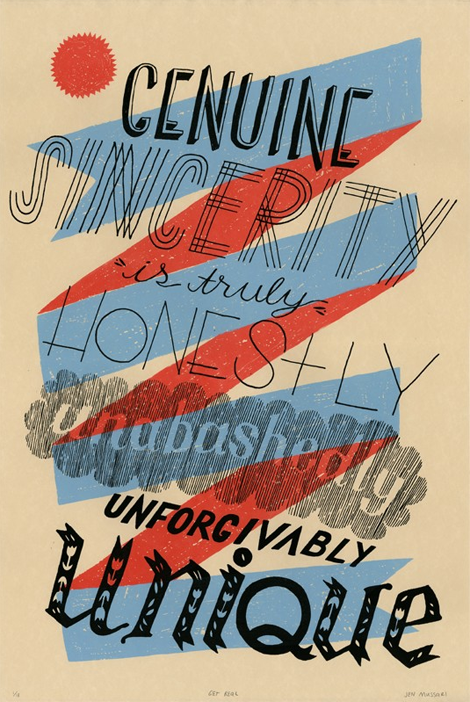
The portfolio of Jen Mussari is an refreshing mix of quirky handrawn lettering and illustration. What I really enjoy about her style is that it seems very personal and focuses on art-making rather than the production of a commercial product. Jen, with some of her friends, recently launched a really cool project, S Magazine, featuring a lovely cover illustration. (more…)

Chris DeLorenzo

chris delorenzo

Chris DeLorenzo is a graphic designer based out of Andover, Massachusetts, whose modern design style demonstrates what I think of as extremely current and fresh. His work has a sort of comic book inspired feel, while bringing a perfect-fitting hand lettering style to the table. In his own words, Chris notes his influences range from, “pop art, to 1940’s cinema, to graffiti and folk art” which really makes his work unique.

(more…)

Mario Hugo

Mario Hugo

Each new piece that I see from Mario Hugo is better than his last. Perhaps it is his unique grasp of what makes a composition beautiful, or the way he uses his incredible drawing ability to render incredibly intricate works of art. Most artists stray from typography in a rebellion of (literally) spelling out their idea to the viewer, but I love how Mario has embraced type and made it a central focus in his work.

(more…)

Justin Thomas Kay

Justin Thomas Kay has been a staple in the elusive editorial side of the type world since graduating from Milwaukee Institute of Art & Design in 2004. With clear influences from 70’s display typography (à la Lubalin), J.T.K. really captures an era of typography that focused on the potential of using type as image. As a new venture, he recently opened the Version Type Foundry, and I’m excited to see where this new chapter takes him.

(more…)

Grady McFerrin

The name Grady McFerrin should be easily recognizable if you’re a reader of The New Yorker or New York Times, where his illustration work shows up frequently. But, what I like to (of course) focus on is his lovely lettering style. The thing that makes Grady’s work unique is the un-rendered, folk quality of his text; paired with his minimal color palette, he manages to create pieces that could have come straight out of early Americana. What Grady does is highlight the old and oft-forgotten, and sends the viewer a beautifully nostalgic feeling of the past.

(more…)

Will Staehle

Will Staehle

The work of Will Staehle is inventive with an incredible range of style and content. You might know of him because of his artwork aptly named the Silhouette Masterpiece Theatre, using silhouettes and some delightfully snarky text. Most of his design and type work is with his studio, Lone Wolf Black Sheep—producing iconic book covers, recognizable as some of the best selling books in recent years. He also has a really interesting blog of sorts, called the Dollar Dreadful Family Library, featuring amazing Victorian display type.

(more…)

André Beato

André Beato is an incredibly talented typographer from Portugal that I came across lately. The thing that strikes me most about his work is the fact that he creates unique minimalistic compositions while maintaining interesting & intricate typographic forms. The balance that he has found in creating his projects is quite inspiring. Check out the rest of his site and don’t forget to download the great iPhone wallpaper that he made to support Japan relief efforts.

(more…)

Jessica Walsh

Jessica Walsh is one of those people that, as a designer, is everywhere at once. Since her work encompasses such a wide array of styles that you’ve probably seen something that she has created without knowing that she did it, which is probably what makes Jessica such an excellent Art Director. She has a great way of putting a fresh spin on each project that comes her way, and I’m excited to see what she produces in the future as an artist & at her latest postion with Sagmeister, Inc.

(more…)

C. S. Neal

cs neal

The work of Christopher Silas Neal is a lovely break from the chaotic mess that is the internet. It’s not often that you come across beautiful hand drawn type, mixed with completely original illustration, so it is a really great treat for the eyes. Also interesting is that his work always has a sense of movement to it. Even his typography, which is predominantly script, seems like it’s rushing across the page.

(more…)

Erik Marinovich

grain edit / erik marinovich

You need to take a gander at Erik Marinovich‘s work. It mirrors our current holiday climate quite well — bold and bright with a lot of busy hustle and bustle. Erik’s work defies any sort of specific style or set of rules (aside from the majority of it being typographic). The variety and amount of work contained within this portfolio is wonderful and exciting and void of plainness.

(more…)

Page 2 of 3123