Alexander Girard nativity poster

alexander_girard_nativity_poster.jpg
I was blown away when I saw this nativity poster by Alexander Girard. The poster is for an Exhibition at the Gallery of Art in Kansas City in 1962. The exhibition included 170 Nativity scenes from Girard’s personal collection. Imagine being in a room with 510 wise men and 170 Jesuses!

Thanks to Andy at Reference Library for posting this. If you haven’t been to his blog yet, Please go now! This is a really cool blog.

Rolf Harder but, before you drink

rolf_harder_graphic_design.jpg
This is a man that must have alot of stories to tell. For everyone that has seen the classic Noah Baumbach movie Kicking and Screaming; this man might of been the new leader of the cougars. Go cougars!

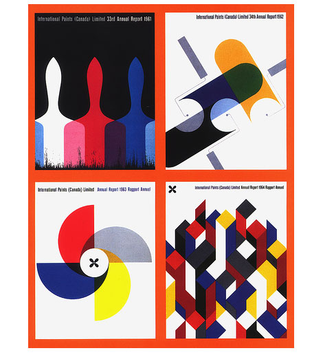
So now that we’ve established that Rolf Harder has the coolest name in graphic design, let’s get on to his work. I was blown away when I stumbled upon Rolf’s designs for International Paints Canada yesterday. I love his use of the paint brushes for the 1961 annual report. This design could of doubled as a poster for Krzysztof Kieslowski three colors trilogy. Like the Kieslowski films, I would guess that these colors represent the colors of the French flag considering International Paints was based out of Quebec.

The society of Graphic Designers of Canada has a bio on Rolf Harder for those interested in reading further.

Thanks to element kuuda for posting these great designs by Rolf Harder as well other Canadian designers on Flickr.

Hey Jose!

Jose Rodriguez graphic design

My favorite thing about Jose Rodriguez is not his great work, nice type, or his motion reels. It’s his URL: HeyJose.com! It’s probably the hottest domain name on the web right now. Anyway, the work is definitely on par with the URL. That’s right, solid gold! From the long-suited men of “beginning” to the technical-but-beautiful diagrammatic analysis of FF-Meta, this Sarasota, FL, designer is making some really great images. Go over and check out Hey Jose!

Corporate Identity vs logo lunch

lufthansa_logo.jpg
While I was doing some research on corporate identity and logos for a post, I kept finding all these Logo buffets. You know, the ones where you can get 13 web 2.0 logos for the price of a sandwich. It was frustrating because I just wanted to find a site that archived some of the better examples of branding. Well I finally found it. Heres a great list of corporate identity projects.

Each case study includes the Designer, year of creation, typefaces/ pantones used for the logo etc. Its a rather large list and includes many classic designs.

Sippin on Savignac

raymond_savignac_poster.jpg
I’m just waiting for the day when gangsta rappers start rapping about design nerd stuff. When that day comes, some one has to do a song called “Sippin on Savignac”. It would have to be a posse cut for sure. Each dude talking about how they were rolling through Japan looking for obscure French posters. No doubt in my mind this will be certified Ghetto Gold.

It might be a while before that day comes so in the meantime I’ll have to live with an internet trip to Japan’s own Guy antiques Raymond Savignac poster gallery. You can browse through the posters or drop some cash and buy an original.

And we have a winner…

book_designers-1.jpg
Congratulations to Anne from Oakland! She is the lucky winner of our Book Design of Graphic Designers in Japan book giveaway. Last night we randomly pulled her name from a bright orange trash can. Thanks to everyone for entering our drawing.

Be on the look out for our next giveaway.

Say yes! to analog design

yes_studio_design_the_stands.jpg
Yes studio hooked up a sweet 12″ cover for the UK band the stand. The album is from 2005. Multiple designs were created, colors were mixed by hand and large format prints produced at K2 Screen, London. The resulting artwork was then re-photographed and used on the lp and poster design.

Looks like the length of this record was longer then the band’s career. The band broke up after 3 years and moved onto other projects and their website is now an internet parking lot. At least, we still have the lp jacket to look at.

33rpm : posters and design studio

33_rpm_posters1.jpg
33rpm_andrio_abero_posters.jpg

I have a very special place in my heart for poster design. Especially poster design that incorporates type in an interesting, fresh way. I mean, how do they do that? It looks too easy! Andrio Abero, the man behind the poster and design studio 33rpm, is a master at “type and image integration.” This is one of the first firms that kick started my obsession with the poster, way back in the early 2000’s.

Non-Format

Magic Waves

3.jpg

Non-Format are a twin-continent based award winning design firm. They also happen to be the kings of super thick and chunky left justified type. They posses the unique ability to seamlessly integrate their big type with organic illustrative elements, with very nice results. In addition to running their studio, they also design Varoom, a journal of illustration and made images, art directed by Adrian Shaughnessy. In addition, they just released a book.

WSDIA Design Studio

WSDIA_Logo_2

I stumbled across WSDIA (We Should Do It All) Design Studio from the winners list of ADC’s 2006 Young Guns Award. This firm has a great eye for type, detail, and apparently skittles! Check out WSDIA’s website as well as an episode of The Creative Backstory: ADC Young Guns, Big/Small, featuring WSDIA. This short series explores the question about a design firm’s size: does size matter?