Marta Cerdà Alimbau

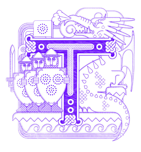
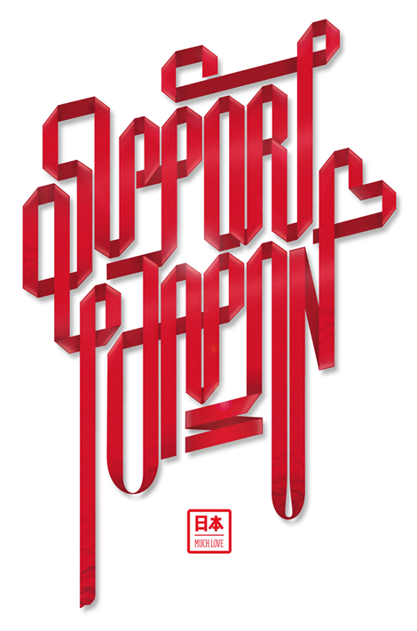
Typographer extraordinaire Marta Cerdà Alimbau brings new meaning to the idea of decorating type. With her modern and elegant letterforms, she creates compositions that put her at the top of her game. I love her penchant for creating 3 dimensional forms with letters that allow the work to extend past their natural 2D state. Marta also often collaborates with another extraordinary typographer and friend of Grain Edit, Alex Trochut. With an amazing roster of clients, this young and talented designer is sure to be one to watch going into 2012.

(more…)

Rifle Paper Co.

I love the work coming from Rifle Paper Co., the small studio of husband & wife team, Anna & Nathan Bond. Sweet and charming, they make work that speaks well to the sentimentality of their illustration style, and embodies the idea of nuanced design.

(more…)

Damien Correll

Illustration superstar, Damien Correll, has been building up quite a portfolio of work in the past few years. Between his solo career as a freelance illustrator and designer, and his joint design-firm venture with Garrett Morin, Part & Parcel, Damien has taken the editorial and advertising world by storm. His most recent project is an art show at Raised By Wolves in Greenpoint, NY, where he features his newest hand-printed works.

(more…)

Jen Mussari

The portfolio of Jen Mussari is an refreshing mix of quirky handrawn lettering and illustration. What I really enjoy about her style is that it seems very personal and focuses on art-making rather than the production of a commercial product. Jen, with some of her friends, recently launched a really cool project, S Magazine, featuring a lovely cover illustration. (more…)

Chris DeLorenzo

chris delorenzo

Chris DeLorenzo is a graphic designer based out of Andover, Massachusetts, whose modern design style demonstrates what I think of as extremely current and fresh. His work has a sort of comic book inspired feel, while bringing a perfect-fitting hand lettering style to the table. In his own words, Chris notes his influences range from, “pop art, to 1940’s cinema, to graffiti and folk art” which really makes his work unique.

(more…)

Mario Hugo

Mario Hugo

Each new piece that I see from Mario Hugo is better than his last. Perhaps it is his unique grasp of what makes a composition beautiful, or the way he uses his incredible drawing ability to render incredibly intricate works of art. Most artists stray from typography in a rebellion of (literally) spelling out their idea to the viewer, but I love how Mario has embraced type and made it a central focus in his work.

(more…)

Gavin Potenza — New Work!

Gavin Potenza

Great friend of Grain Edit and infinitely talented designer Gavin Potenza has just updated his online portfolio with a number of strong editorial pieces. You may know of Gavin’s grainy work through these solo projects, or as one half of creative duo Script & Seal with our very own Liz Meyer.

(more…)

Justin Thomas Kay

Justin Thomas Kay has been a staple in the elusive editorial side of the type world since graduating from Milwaukee Institute of Art & Design in 2004. With clear influences from 70’s display typography (à la Lubalin), J.T.K. really captures an era of typography that focused on the potential of using type as image. As a new venture, he recently opened the Version Type Foundry, and I’m excited to see where this new chapter takes him.

(more…)

Paper Punk

paper punk

Paper Punk is a startup company that’s equal part hands-on toy, art piece and educational tool. Founded by Grace Hawthorne (ReadyMade magazine co-founder), Paper Punk is the result of her many years engaging people with design and encouraging them to create with their hands.

Punks are constructed out of foldable, brightly colored die-cut paper blocks — each kit comes with stickers and instructions for building and customizing your robot, dog, or car. I love the built-in ability to remix and customize your own creations. The systems uses simple shapes and a variety of patterns allowing you to build a wholly unique creation.

(more…)

André Beato

André Beato is an incredibly talented typographer from Portugal that I came across lately. The thing that strikes me most about his work is the fact that he creates unique minimalistic compositions while maintaining interesting & intricate typographic forms. The balance that he has found in creating his projects is quite inspiring. Check out the rest of his site and don’t forget to download the great iPhone wallpaper that he made to support Japan relief efforts.

(more…)

Page 2 of 3123