Steve Mehallo / Jeanne Modern typeface
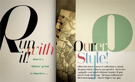
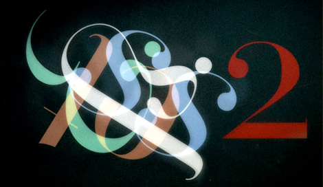
I’m really excited to show this new typeface from long time Grain Edit friend and design-champ Steve Mehallo. Jeanno Moderno consists of nine faces, and bridges over two centuries of type history. Plus, it has some of the spiciest italics you’ve ever seen.
MyFonts is having a great sale on the family right now: For a limited time, save 25% on any single font from the Jeanne Moderno family. This is going on until April 19th. (Perfect idea for my birthday on the 14th). Or you can pick up the entire family for $99.
Get more details here
More words from Steve:
A synthesis of Bodoni Italic and 19th Century Ultra-Bold “Fat Faces” – distilled with personality taken from early 20th Century Modernists; the Futurists, Dadaists, Suprematists, Constructivists.
Spatter in a few later influences – from De Stijl, the Bauhaus, the types of Herbert Bayer, Josef Albers, Paul Renner – plus a twist of Art Deco and High Fashion – Jeanne Moderno is a remanifestation of 19th + 20th Century Modernist thinking; traditional + revisionist, raw and elegant!
Jeanne Moderno can best be used for magazines, advertising, posters, flyers, fashion reports, letterpress experiments, silkscreen endeavors, exhibitions, DMV signage, paper money, revolutionary political statements as well as formal declarations of peace or war.
Jeanne Moderno is about the future, the past. The Avant-Garde. Humanist geometry + vintage footwear. Form, function, style, art and life.
Tagscontemporary, Designers, graphic-design, Typography, USA
03.06.09 in Found design by Ethan
Share on Facebook


