Erik Nitsche : General Dynamics annual report
[pictobrowser 10159078@N03 72157603417455746]
General Dynamics annual report 1958 designed by Erik Nitsche


[pictobrowser 10159078@N03 72157603417455746]
General Dynamics annual report 1958 designed by Erik Nitsche
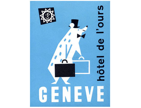
Luggage label for hotel de l’ours – Geneva, Switzerland c1950s ?
This is exactly how I wanted to be greeted if I ever make it to some fancy Swiss hotel. I want freshly shaven polar bears with bow ties grabbing my luggage!
[pictobrowser 10159078@N03 72157600940947322]
—
* Update – The long-awaited reissue is now available. Pick up a copy at Amazon or your local book store.
—
As far as I know this is the only kids picture book illustrated by designer Saul Bass. Saul provides a 60s pop color backdrop for the text written by Leonore Klein. The book was published by Young Scott books in 1962.
Henri’s walk to Paris is the story of young boy who lives in Reboul, France that dreams of going to Paris. One day, after reading a book about Paris he decides to pack up a lunch and head for the city. Along the way he gets tired and falls asleep under a tree. This is when the story really gets good. I’m not sure if I should spoil the end for you, but lets just say it involves a pencil stealing bird with a band aid on its face.
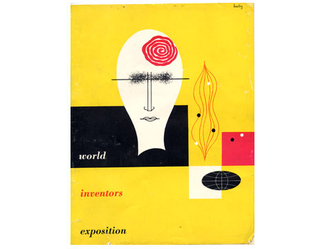
World inventors exposition 1947 : Cover design by Alvin Lustig
I found this brochure recently at a flea market near my house. I have never seen this Lustig design before. His use of simple organic shapes reminds me of the cover of Anatomy for interior designers ,which he created 2 years previous, as well as his work for the new classics series published by New Directions.
If you like the cover design above, I highly recommend you visit the official Alvin Lustig website.
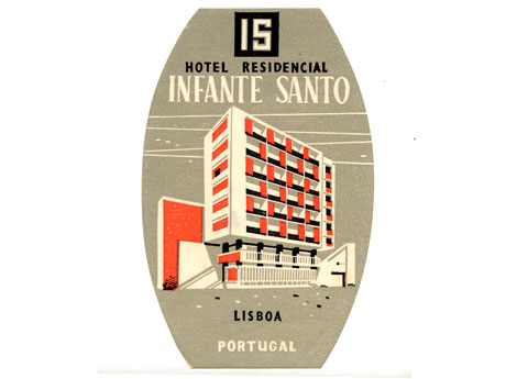
This is one of my favorite luggage labels out of portugal. Most likely from the late 1950s. I love the colors. Who wouldn’t want to stay in a hotel with bright orange panels as part of the facade? This hotel still exists and it really does have orange panels. At openline Portugal you can see a photo of the Hotel Infante Santo as it exists today (scroll halfway down the site).
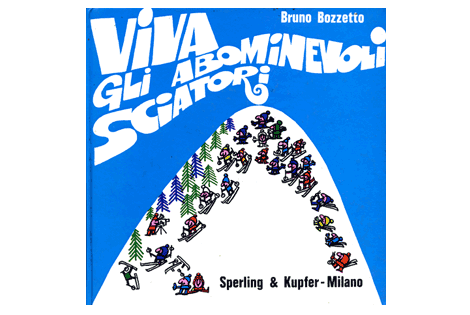
Bruno Bozzetto : Viva Gli Abominevoli Sciatori
Cool cover for this obscure kids book by Mr. Bozzetto from the 1970s. Bruno is mostly know for his contributions to animated film. He has created hundreds of animated shorts and was nominated for an oscar in 1991 for a film entitled “grasshoppers”. You can read his complete biography at the official Bruno Bozzetto website.
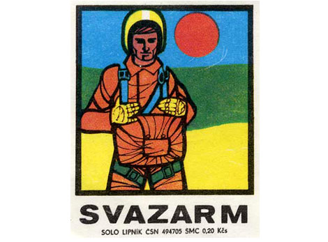
I go bananas for these Eastern European matchbox labels. I bought a complete run from 1958-1978 about a year ago and I still can’t get over how sick these things are. Most of these labels are 2-3 tones and some are completely off register. They look like little silkscreen posters (Most of these labels are 1.5 inches wide by 1.75 inches tall) . These labels make perfect posters for your kid’s doll house or inspirational art for your hamster to look at as he is jogging in his exercise wheel.
Plenty more of these little guys coming!
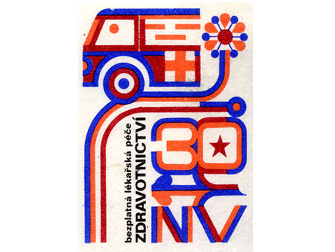
Great match box label from Czechoslovakia. The label is from the late 1970s. We will be posting more labels from our collection over the next week.
[pictobrowser 10159078@N03 72157603295091286]
10 years of Vendre design magazine covers (Best of 1952-1962)
Vendre was a monthly trade magazine for graphic designers in France. It was founded by Etienne Damour in the 1920s. The magazine’s chief editor was Roger-Louis Dupuy, who in addition established one of the first advertising agencies in France. Paul Nicolas would later become chief editor and guide the magazine through the 1950s and 60s. During this time period the magazine was mostly text-based. The articles dealt with the creative and technical challenges its readers would of faced.
The issues above are some of my favorite cover designs for Vendre between the years 1952 and 1962. Illustrators and designers for these issues include Rene Chag, Ducordeau, M. Legand, Paul Funken, Roger Troubat, Francois Szalay and Henriette Mayo.
If you are interested in Vendre or the history of French graphic design, I highly recommend you pick up a copy of Michel Wlassikoff’s The Story of Graphic Design in France. It is an excellent overview of the design work this country has produced in the last 100 years.
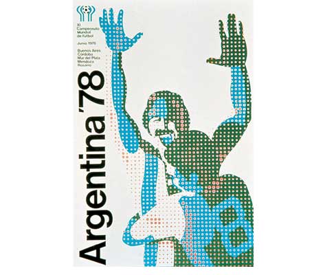
The 1978 World Cup was held in Argentina between June 1 and June 25. Argentina would go on to beat the Netherlands 3-1. The men in this poster seem to be celebrating victory, but this seemingly innocent poster has a very dark story to tell.
Argentina had suffered a military coup only two years before the cup and was in the middle of a dirty war against left wing sympathizers. Up to 30,000 people “disappeared” during this time. These events coincided with a campaign of political repression involving dictators from other South American countries dubbed “operation condor“. Thousands of people were tortured and many lost their lives.
(via iso50)