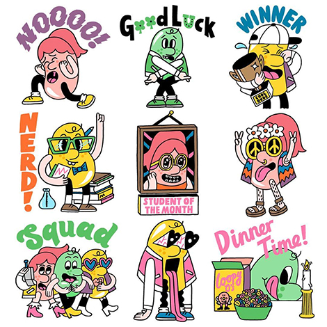
Chen Winner

Chen Winner

Chen Winner is an Israeli graphic artist and filmmaker currently working in London. Highly influenced by printmaking, her animated films contain layered colors, distressed textures, and other elements usually associated with screen printing. This is especially notable in her collaboration with CNN. For the network’s Econundrum series, she created an episode on the ecological dangers of plastic water bottles. Featuring witty and informative imagery, the project won a 2017 World Illustration Award in the Research New Talent category. To watch the video, along with her other films, visit her Vimeo channel.

(more…)

Steve Wolf

Steve Wolf

Steve Wolf is a designer and illustrator who utilizes simple forms and stippled textures to craft gorgeous identity and packaging work. These stylistic elements are particularly evident in his collaboration with Sibling, an ad agency that specializes in culturally inclusive marketing. Wolf crafted naïve, yet intriguing arrangements for a promotional poster series for the brand. The abstract nature of the compositions conjures the audience’s curiosity and interest in the company.

(more…)

Everyday Practice

Everyday Practice

Everyday Practice is a Korean design studio that has a passion for experimenting with different mediums. From animated GIFs to fine art sculptures, their portfolio is full of innovative projects made from a variety of materials. The studio is especially inventive when it comes to constructing unique typography. A very clever type treatment can be seen in their work for the 2017 Seoul International Handmade Fair. Taking the event’s theme to heart, they crafted a colorful tapestry that features hand woven letterforms. The beautiful weaving was photographed and paired with digital type to create the event’s poster.

(more…)

Johnson/Kingston

Johnson Kingston

Ivan Weiss and Michael Kryenbül of the design studio Johnson/Kingston aim to create inventive work that challenges the norm. To keep their designs fresh and unique, they often craft bespoke typefaces and unconventional layouts for posters and websites. They then pair these elements with intricate textures and distorted imagery that signifies the mood of the event they are designing for. I’m especially fond of their work for the 2016 B-Sides Festival. The event’s poster features jagged graphics and an ornate typeface that characterizes the music festival’s edgy, yet playful atmosphere.

(more…)

Chiii Design

Chiii Design

Chiii Design collaborates with organizations focused on art and culture. Based in Macau, the studio crafts work for creative events throughout the region. Last year, they designed the branding system for the Y Show, an exhibition that presents the portfolios of local and international art graduates. The identity features purple and pink letterforms strung across an elastic strand that represents the vibrancy of the young artists in attendance.

(more…)

Fol Studio

Fol Studio

Fol Studio is a multidisciplinary design firm that strives to be a “brand development partner” for their clients. Their strong branding skills are especially evident in their poster work for exhibitions and film festivals throughout Turkey. I’m particularly fond of their work for the art space Arter. For a retrospective on the controversial artwork of Jake and Dinos Chapman, the studio crafted eye-catching posters that feature mutated letterforms and bright splashes of color. These elements characterize the brands of both the gallery and the artists by featuring the bright hues of Arter’s identity system and signifying the audacity of the Chapman’s portfolio.

(more…)

Kate Prior

Kate Prior

Kate Prior is a London-based artist currently working as an in-house illustrator for Urban Outfitters. Her quirky aesthetic fits perfectly with the brand and speaks to its hip and outgoing customers. Her humorous drawings have also caught the attention of Google. Last year, the tech giant commissioned her to create a set of stickers for its messaging app Allo. For the project, she crafted the Cool Beans, a gang of bean-shaped characters that hilariously reflect the wide range of emotions one often shares with friends.

(more…)

Tishk Barzanji

Tishk Barzanji

Tishk Barzanji crafts surreal illustrations inspired by modernism and London’s architecture. Brimming with massive windows and shadowy figures, his pieces explore themes of deconstruction and man’s interaction with space. These concepts are also present in his animated work, which demonstrates how objects would move through his mysterious landscapes.

(more…)

Jon McNaught

Jon McNaught

Jon McNaught is an illustrator and comic book artist who captures the small comforts of everyday life. He often draws characters enjoying quiet activities like reading books or making coffee. An avid printmaker, he enjoys crafting linocuts and screen prints comprised of humble shapes and limited color schemes. These simple elements add an extra dose of harmony to his wholesome and serene compositions.

(more…)

Cécile + Roger

Cecile and Roger

The Geneva-based studio, Cécile + Roger, crafts exceptional work for the Mirage Festival in Lyon, an annual celebration of art and digital culture. Over the past five years, they created promotional materials that capture the innovative spirit of the featured installations and performances.

This year, the festival’s theme was “(Im)materialities”, the idea of transforming a perceived truth. To express this concept, the studio developed an identity system consisting of round splotches, line patterns, and bright hues. The elements hark back to the event’s vibrant laser beams and often unite to form abstract faces. This materialization represents the phenomenon of pareidolia – the imagined perception of pattern or meaning where it does not actually exist – a mirage.

(more…)