July 2017

You are currently browsing the monthly archive for July 2017.

Joohee Yoon Update

Joohee Yoon

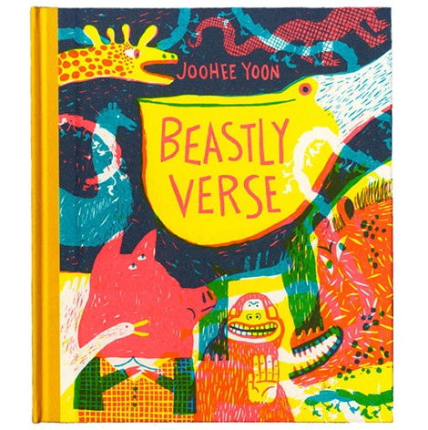
Printmaker, JooHee Yoon, has continued to craft whimsical illustrations and prints that vibrate with color and personality. With Enchanted Lion Books she’s published two charming picture books, The Steadfast Tin Soldier and Beastly Verse, both printed with just three colors. She’s also done much editorial work, regularly illustrating for The New York Times, Plansponsor Magazine, and other prominent publications. To keep up with her work and to buy some of her pieces, make sure to follow her on Instagram and to check out her shop.

Read the rest of this entry »

The Rodina

The Rodina

The Rodina is the independent practice of Tereza and Vit Ruller. Interested in the connections between culture, aesthetic, and technology, the duo explores these subjects through a wide range of medias. Their work is often experimental and utilizes whimsical elements such as neon colors, playful textures, and even the occasional emoji. This quirky nature is especially evident in their identity for the music festival, Itch My HaHaHa. Blending colorful patterns with 3D “blobs”, they crafted animal-like characters that represent the ever-mutating creature that is pop culture. The critters roam through every piece of the campaign as their unique patterns and bright hues represent the different types of music performed at the event.

Read the rest of this entry »

Amber Vittoria

Amber Vittoria

Amber Vittoria is an illustrator living and working in New York City. She often employs round organic shapes and loose brushstrokes to illustrate the collections of high-end fashion brands. Hoping to empower the female form, she features the outfits on a variety of body types. She also challenges society’s standards of beauty by highlighting her figures’ disproportionate physiques and thick dark body hair. The juxtaposition of these elements highlight the grandiose and inventive nature of high-fashion while simultaneously defying the physical ideals the industry promotes. Her compelling pieces have graced the pages of prominent publications such as The New York TimesTeen Vogue, and Man Repeller.

Read the rest of this entry »

XYZ Type

XYZ Type

XYZ Type is a new independent type foundry established by Ben Kiel and Jesse Ragan. They currently offer three beautiful typefaces – Cortado, Aglet Slab, and Export. I am especially impressed with Cortado, an elegant script inspired by the lettering of illustrator Cecilia Carlstedt. Designed to look as much like handwriting as possible, the typeface’s OpenType programming subtly changes the shapes of repeated letters and ends words with organic brushstrokes.

Read the rest of this entry »

Recently Received

The NASA Graphics Standards Manual

We’ve received some awesome titles from Nobrow Press, PIE International, Rizzoli, Standards Manual, and more. Also included are rad bandanas designed by Hitch, gorgeous linen journals from House Industries, and a collection of architecturally-inspired rubber stamps by Aurelien Debat. Check them all out after the jump.

Read the rest of this entry »

Büro 146

Buro 146

Büro 146 is an accomplished design studio that collaborates with theaters, schools, and other cultural associations throughout Switzerland. Especially impressive is their work for the Pavillon Le Corbusier, a museum dedicated to the famed Swiss architect. Over the past three years, Büro has crafted promotional materials that beautifully display the institution’s collection. Pulling from the gallery’s iconic multicolored walls, the studio developed a lush tapestry of posters and brochures that highlight the eccentric nature of Le Corbusier’s structures.

Read the rest of this entry »

Atlas

Atlas

Founded by Astrid Stavro and Pablo Martín, Atlas is a brand and design consultancy based in New York and Mallorca. From chocolate packaging to magazine layouts, they consistently craft work that is whimsical yet still remains clean and elegant.

One of their more quirky projects is FS Sally Triestina, a typeface they designed in partnership with It’s Nice That and Fontsmith. The typeface was inspired by Stavro’s hometown of Trieste, Italy and the city’s contrasting architectural styles, cultures, and mindsets. The unique letterforms are beautifully displayed on specimen sheet posters that represent neighborhoods within the city.

Read the rest of this entry »

Stay Nice

Stay Nice

Stay Nice is the studio of Rob and Barry van Dijck. The duo crafts dynamic designs for performances and exhibitions throughout the Netherlands. I am especially drawn to their work for Playgrounds, an annual showcase that celebrates contemporary animation, game development, sound and graphic design. The festival’s identity system features lively typography that expresses the exciting and whimsical nature of the event. Flysheets promoting recent guest speakers contain fragmented type that elegantly blends in with the presenter’s artwork. The end results are promotional materials that have proven to be just as striking as the pieces displayed at the exhibition.

Read the rest of this entry »

Design by Toko

Design by Toko

Design by Toko is a multi-disciplinary studio based in Sydney. With a focus in branding and spatial design, they crafted a whimsical wayfinding system for the East Sydney Early Learning and Community Centre. The identity features vibrant colors and a rounded/welcoming typeface incorporated into signs that resemble children’s building blocks. In addition, the wooden frames and geometric compositions complement the building’s architecture and the playful nature of the space.

Toko also has a love for avant-garde design. This passion is manifested through side projects, including Gallery by Toko. Here, they aim to showcase artists and art movements that are rarely exhibited in Australia.

Read the rest of this entry »

Mira Design

Mira Design

Miranda Mayne launched Mira Design in 2015 with the intention to work with small businesses and socially conscious enterprises. Recent projects include One Tenth – a clothing company that supports survivors of human trafficking in Kolkata. For this collaboration, she crafted simple geometric illustrations to be implemented on t-shirts. Mimicking the movement of water and tides, the graphics represent the changes One Tenth hopes to evoke in the lives of others. Her love for minimalism is also present in her fine art. Reducing objects down to their most basic forms, she paints clean, yet striking compositions on handmade cotton papers.

Read the rest of this entry »

Page 1 of 198123...Last »