


Justin Quinn
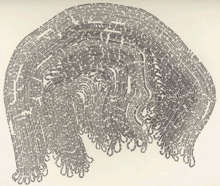
If you like experimental typography, art, Moby Dick, and the letter ‘E’ this is the exhibit for you. Hailing from the midwest, Justin Quinn makes fascinating typographic compositions based on Herman Melville’s epic. Using only the letter ‘E’ and graphite, Quinn recounts entire chapters from Moby Dick. For example, the above piece is entitled “Moby Dick Chapter 55 or 9200 times E.” That’s a lot of E’s. If you’re in the mood for more typography a la concrete poetry, please see Justin’s work at MM Galeries.
TagsART, Typography
